User Label
UserLabel — a component for displaying a user profile or email
Structure
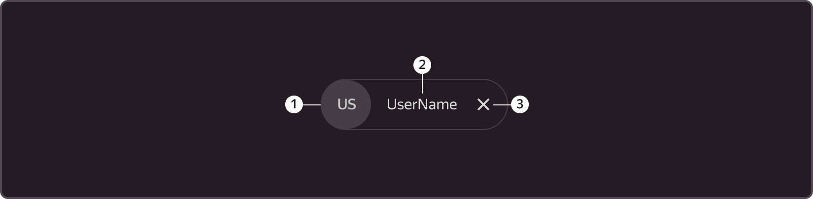
➊ Avatar container (image, icon or initials)
➋ Text container (email, username or login)
➌ Closing icon
Size
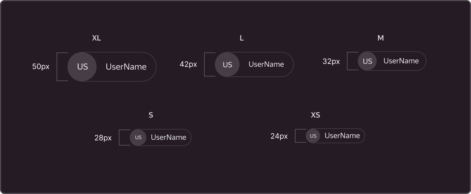
XL - 50x50px avatar + text frame that can be adjusted to the content width
L - 42x42px avatar + text frame that can be adjusted to the content width
M - 32x32px avatar (Default) + text frame that can be adjusted to the content width
S - 28x28px avatar + text frame that can be adjusted to the content width
XS - 24x24px avatar + text frame that can be adjusted to the content width
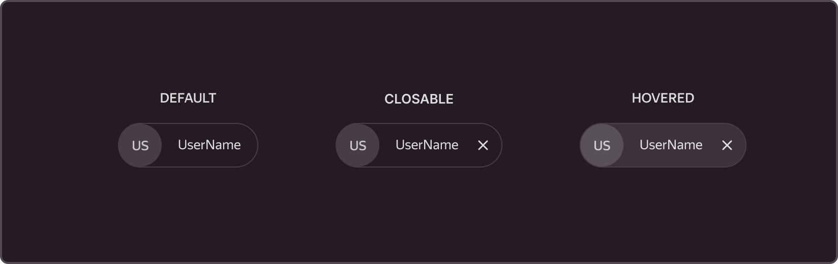
States
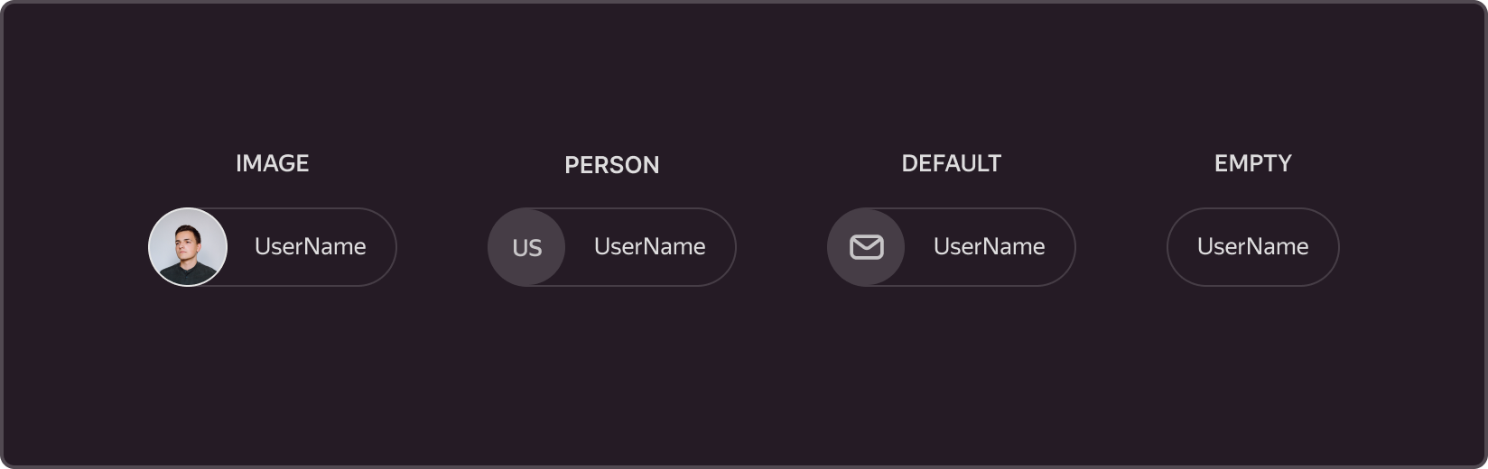
Types of content
Scope
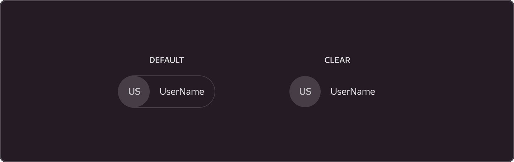
Theme
The component has two themes. In the Clear theme, the outline, background, and icons of the component are disabled.
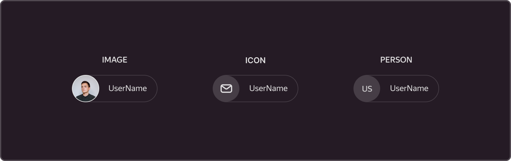
Icon type
The component supports several types of icons by default. User avatars, email icons, or letter-based identifiers. Optionally, the icon can be replaced with a custom one.
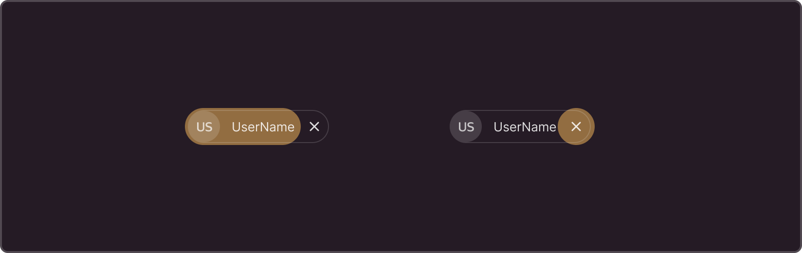
Actions on click
The component allows you to initiate custom events by clicking on the avatar in the component's text area, as well as events that are triggered by clicking on the 'X' icon.