Button
A button is an interactive element of the user interface that, when clicked, performs an action, e.g.: form submission, saving changes, or moving to the next step. If you need to navigate to another page or website, use a link.
Appearance
There are five types of buttons: accent, primary, semantic, raised, and contrasting.
Accent
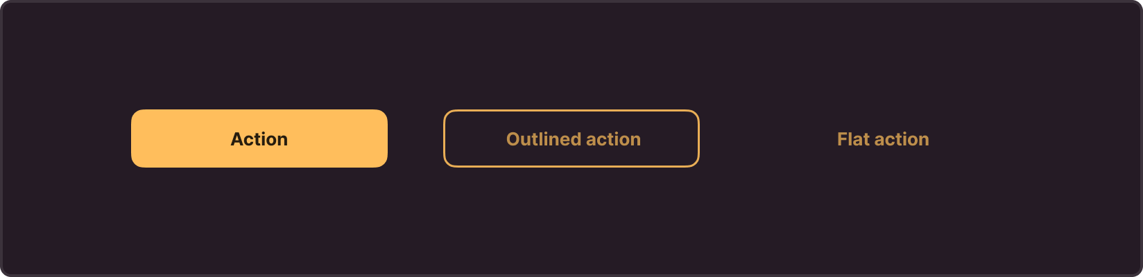
Accent buttons highlight key actions and attract user attention to important operations. They have three main styles: Action, Outlined action, and Flat action
Choose between these types of accent buttons depending on the degree of emphasis you want to place on actions in the interface. Use Action for the highest priority, Outlined Action for medium priority, and Flat Action – for lower priority or secondary operations.
Use accent buttons in the interface sparingly and, if possible, limit their number to one per page (except for dialog boxes). This way, you can emphasize importance and highlight the main action for the user, but mitigate the risk of overwhelming the interface with too many accent elements.
Primary
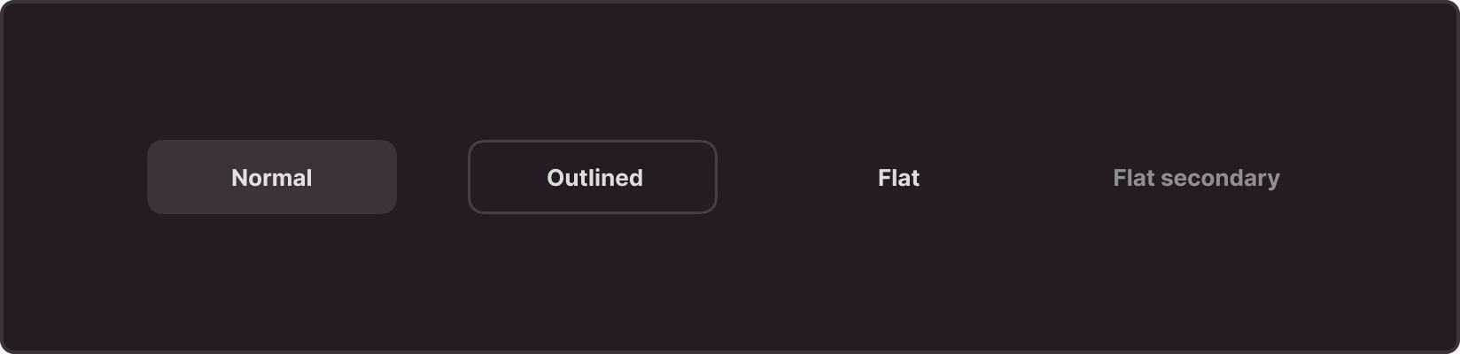
Primary buttons perform main and commonly used actions in the interface. These buttons have several styles: Normal, Outlined, Flat, and Flat Secondary. Choose between these styles depending on the degree of emphasis you want to place on certain actions in the interface. For example, a Normal button is suitable for standard actions, an Outlined button for actions with medium priority, and Flat and Flat Secondary buttons are intended for less important or secondary operations.
Semantic
Semantic buttons convey a specific context or action, carrying a meaning for the user. Use them to help users easily understand what operations are performed and what their meaning is.
Semantic buttons have four main styles: Info, Success, Warning, Danger.
Info
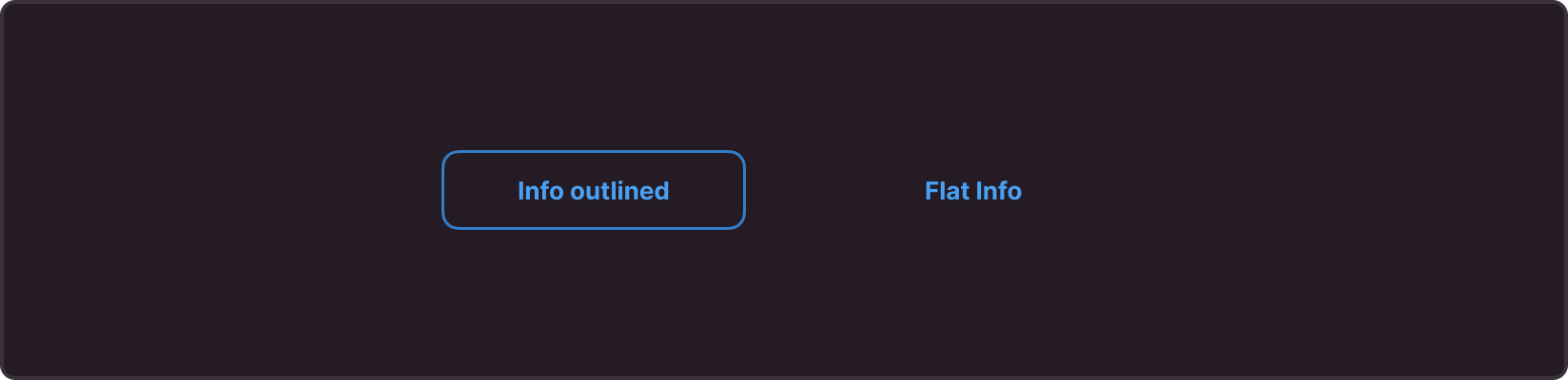
Use them for actions related to getting additional information, hints, or context. Information buttons can also serve as hyperlinks when you need to highlight an option to navigate to another resource. E.g.: More Information, Documentation, Help.
Success
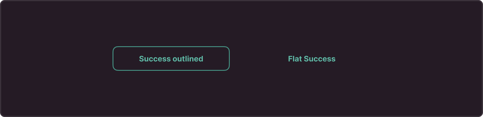
Use them to highlight successfully completed actions.
Warning
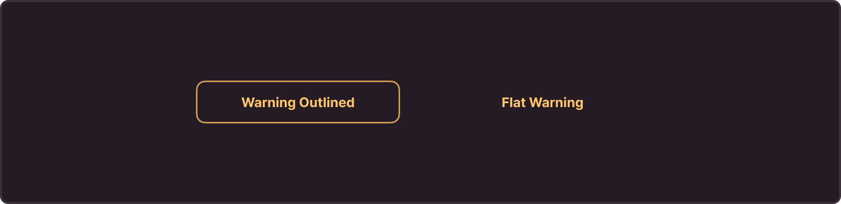
Use them to highlight actions requiring user attention due to potential risks or warnings. These buttons help users understand possible consequences of their action and encourage caution.
Danger
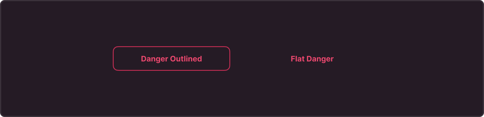
Use them to highlight actions that could be destructive or have negative consequences. We recommend using this button cautiously and only where it is really necessary to highlight potential negative aspects (e.g., deletion, stop, disconnection).
Raised
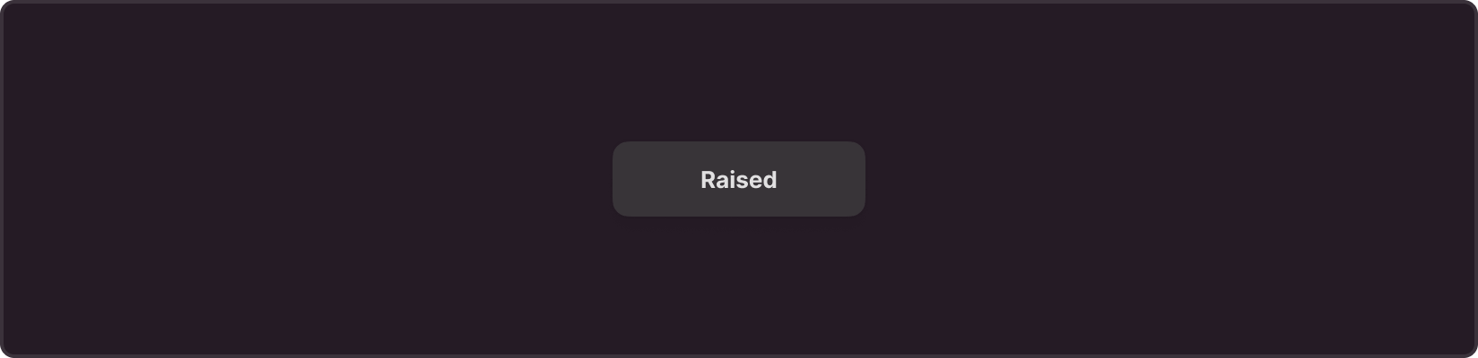
Raised buttons are a type of button that protrudes above the content. Use it to highlight important actions on the screen, usually with a fixed position. This type of button is suitable for key operations that the user should notice immediately.
These buttons are also often used in map interfaces and image-based applications for various actions, such as zooming, panning, or other manipulations with image data.
Contrasting buttons
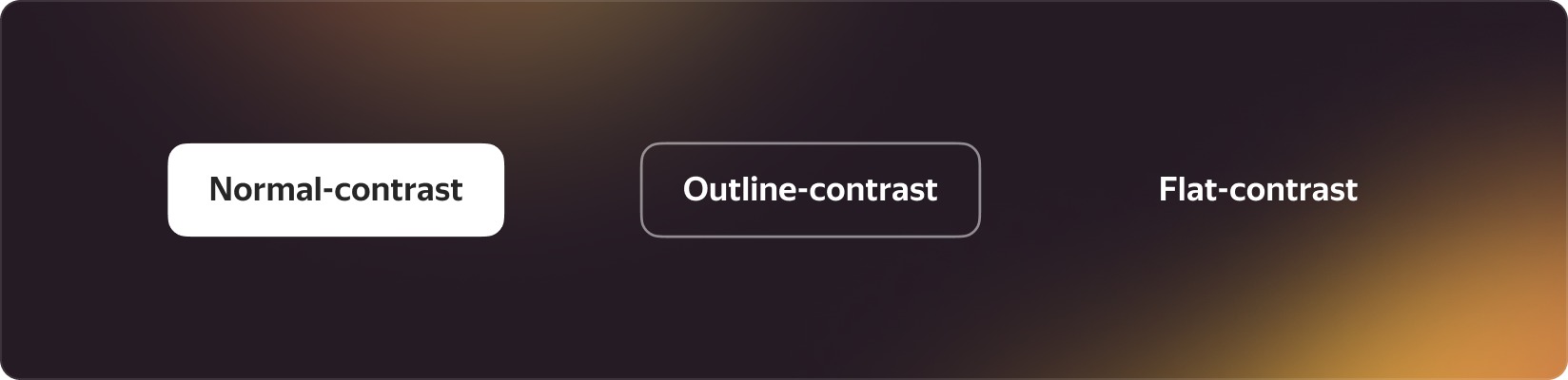
Contrasting buttons are special types of buttons used to highlight actions on a complex background. They create bright and clear contrast, providing excellent visibility even on diverse and saturated backgrounds, such as banners or marketing materials.
These buttons help highlight actions and ensure good visibility on diverse backgrounds, e.g., in banners
Anatomy
The anatomy of a button in the interface includes various design options:
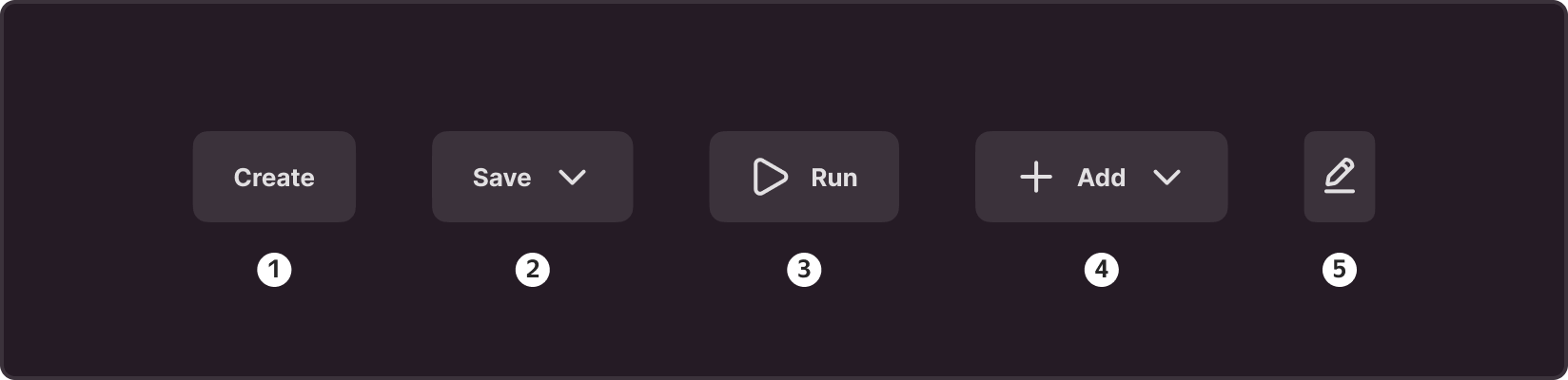
- Text only: Button that contains only text. Such a button is useful when the text clearly and unambiguously conveys the purpose of the button, especially when the text is short and informative. For example, you can use such a button for actions like create or cancel.
- Icons on the right: Button where the icon is placed to the right of the text. This option is useful for presenting different ways to perform the same action. Use such a button, for example, for the save action, where the user has several options to choose from (save as: PDF, RTF, HTML)
- Icon on the left: Button where the icon is placed to the left of the text. Use this option when the icon carries important information and needs to be highlighted. For example, you can use such a button for the start or delete actions.
- Icons on the right and left: Button with icons placed on both sides of the text. Use this option to underline a key action with an icon and provide different paths for its execution. For example, such a button can be used for the add action, where the user has several options to choose from (add: project, resource, document).
- Icon only: Button that consists only of an icon and does not contain any text. Use this option when the information on the button can be understood visually and requires no additional text explanations. You can also use it for grouping multiple actions compactly in a limited space, giving no room for buttons with text labels. For example, a delete button in a list of items. In this context, you can provide the delete option as a trash bin icon without a text label.
States
Every button in the interface has five basic states, which visually indicate the button's availability and current action for the user.
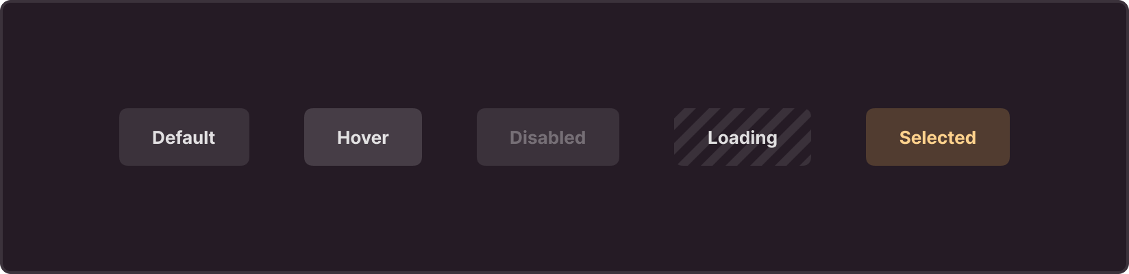
Default: Primary state of the button, in which it is ready for interaction and awaits user actions.
Hover: State in which the button is ready for interaction and awaits user actions.
Disable: State in which the button is temporarily unavailable for interaction. For better user experience, we recommend you to explain why the button was disabled, especially if this is non-intuitive. You can present this explanation as a text next to the button, or as an on-hover tooltip.
Loading: State indicating that the system runs an operation in response to a user-initiated action.
Selected: State used for switchable elements where the user can select one of several options. A button in the "Selected" state indicates the current selected state or option.
Sizes
Each button can have four sizes, which allow choosing the most appropriate option depending on the context.
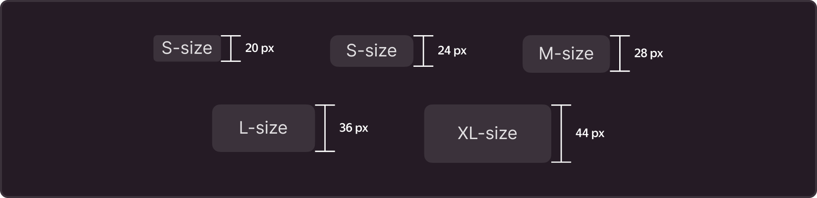
XS is an additional size used for actions in components of limited sizes.
S is used in situations where standard buttons are too large and take up a lot of space, such as tables or small cards.
M is the main size that we recommend by default.
L is used to highlight primary actions, in creation forms, modal, or pop-up windows.
XL is used where actions need to be highlighted and you have enough space on your website or landing page.
Form
With the "pin" property, you can control shape of buttons, setting their style by the following values:
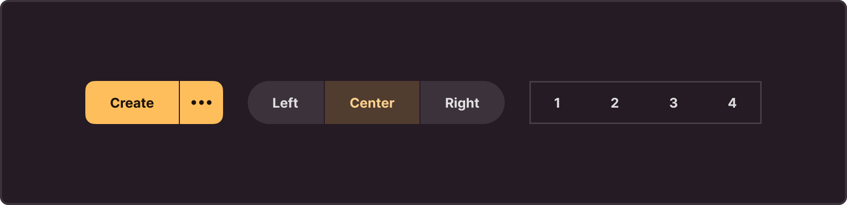
round: Button with a round shape, i.e., rounded corners on both sides. This style gives the button a soft and modern look, making it friendly and pleasant to interact with.
brick: Button with sharp corners on both sides.
clear: Button with sharp corners and no outline on both sides.
circle: Button with a circular shape on both sides.
You can also combine these properties in different variations, creating unique styles for your buttons depending on the design concept and interface requirements.
Width
The default button width automatically adjusts to the text, allowing the button to stretch in width to accommodate all text without truncation. However, if you need to control the width of the button, you can use two main properties: auto and max.
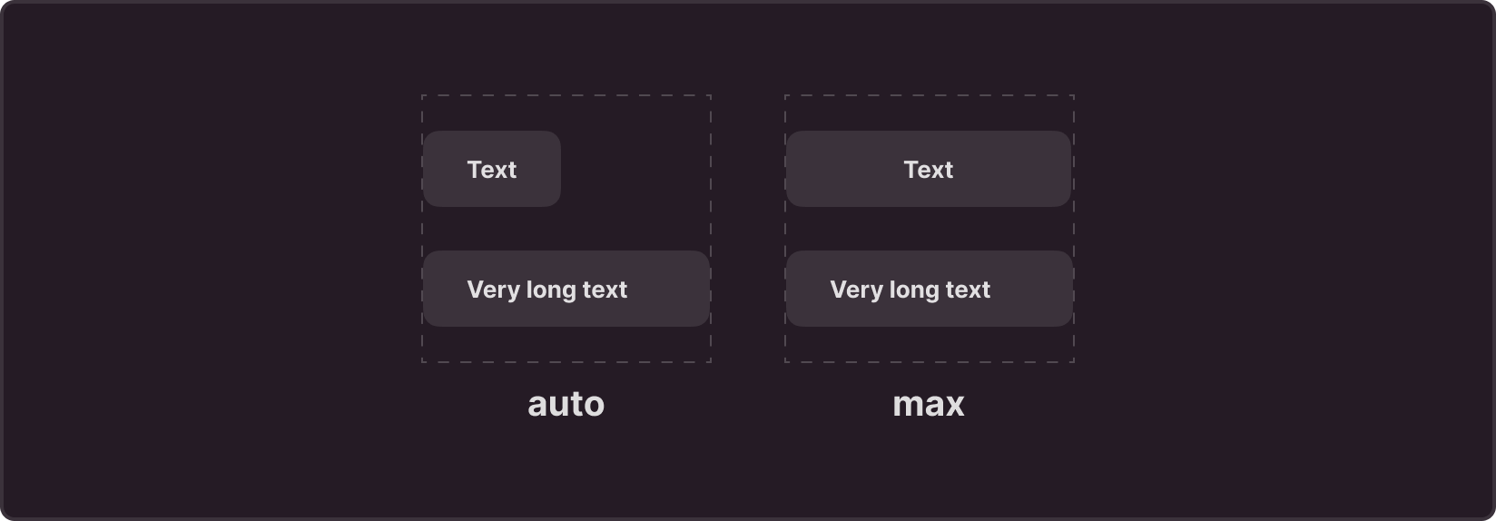
auto: Restricts button dimensions to avoid extending beyond the container limits. If the button content does not fit into the container, it is hidden with an ellipsis, indicating the presence of additional text.
max: Sets a fixed button width equal to the parent container width. If the button content exceeds this width, it is also truncated with an ellipsis, keeping the interface compact and preventing container overflow.
Recommendations
Usage
- Clearly and succinctly phrase the button text so that users immediately understand what will happen after clicking.
- When using icons, make sure they clearly convey their meaning and your users will easily recognize them.
- Maintain a balance between icons and text so that both elements are visible and readable, and neither dominates.
- When using icon-only buttons, add action tooltips on hover so users can see what the icon means.
Writing texts
- Words on the button should clearly and concisely convey the essence of the action that will occur after clicking. Avoid long phrases or unclear abbreviations.
- Use verbs that describe user actions. For example, save, send, delete.
- Avoid negative words or phrases on buttons. Negative instructions can cause confusion.
- Stick to a consistent style and format for text on all interface buttons. This helps users easily navigate and understand what actions are available.