Switch
Description
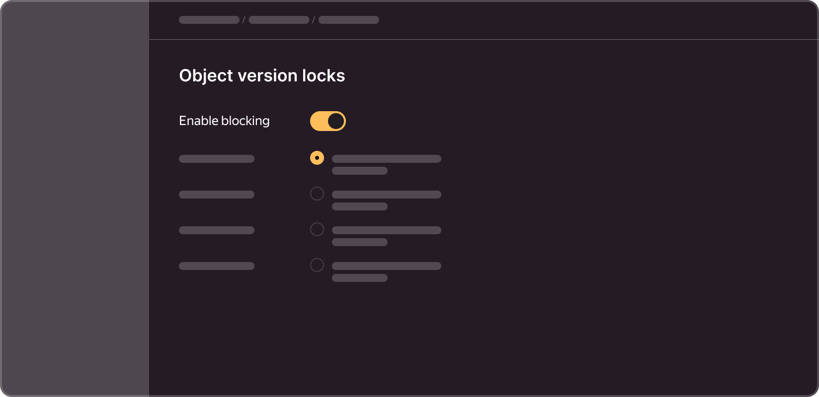
This component is an interactive control that can switch between two states: enabled (on) and disabled (off). It is used to enable or disable certain features, options, or settings.
Dimensions
Switch has two main sizes:

- M (Medium): For standard use cases. It offers most users an intuitive visual experience.
- L (Large): Used when the element needs to be highlighted or when a larger font size is preferable.
States
Switch has four main states:

- Off: an inactive state in which the option or feature is disabled.
- On: an active state in which the option or feature is enabled.
- Hover: when a user hovers over the element, it responds visually to indicate that it can be interacted with.
- Disabled: a state in which the element is inactive and cannot be interacted with.
Properties
The component can enable/disable the label. The label is disabled by default, but it can be enabled using the "Label" property.
Keep in mind that if the element is resized, the size of the label will be adjusted accordingly:

- 13px is the font size for size M labels
- 15px is the font size for size L labels
User guide
To maintain the visual cohesion and consistency of the interface, use a switch if turning it on/off causes immediate changes in certain options or the overall state of the page. We do not recommend using the switch and the action confirmation button together. In these situations, it is better to use a checkbox.