Popup
The Popup element is a hovering element that appears when on hover over or click on an interface element, or when focusing on an element using the keyboard. The Popup also serves as the underlying structure for the Popover component. Use it when the built-in capabilities of the Popover component are insufficient.
When to use Popup
-
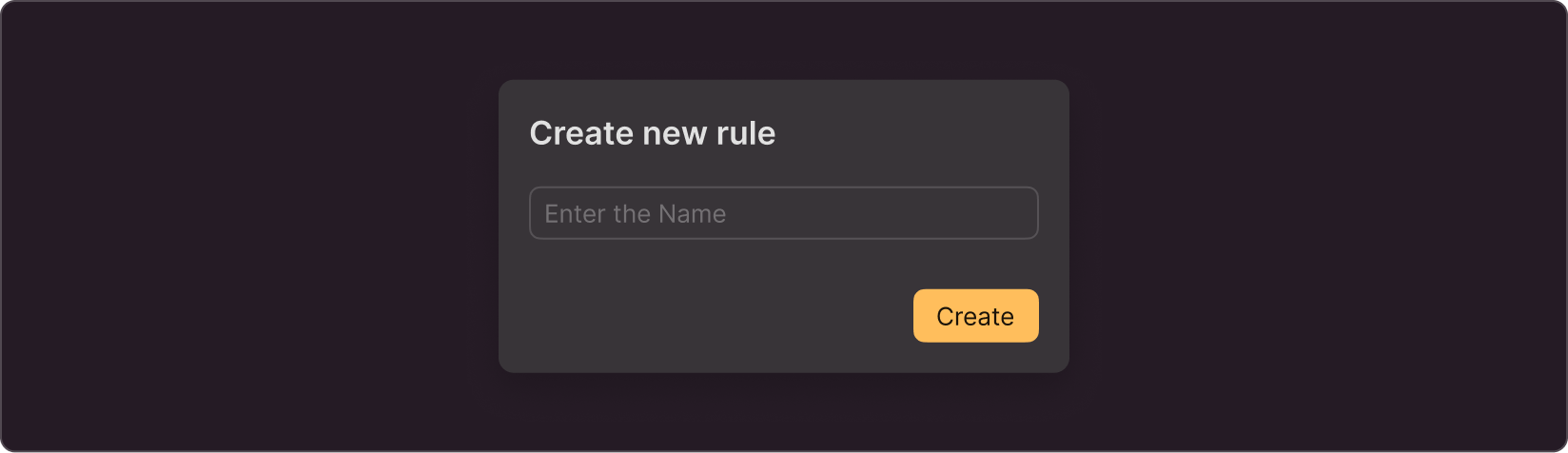
When the hovering element contains an action. In this case, use Popup as an alternative to a dialog box, if you need to keep the context of the current page
-
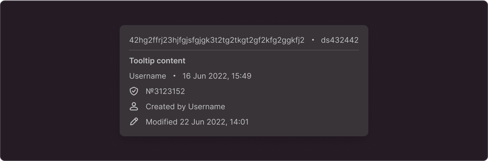
When you cannot use Popover because of too much content. For example, when you need to provide more details about the object in your tooltip, giving technical characteristics and details.
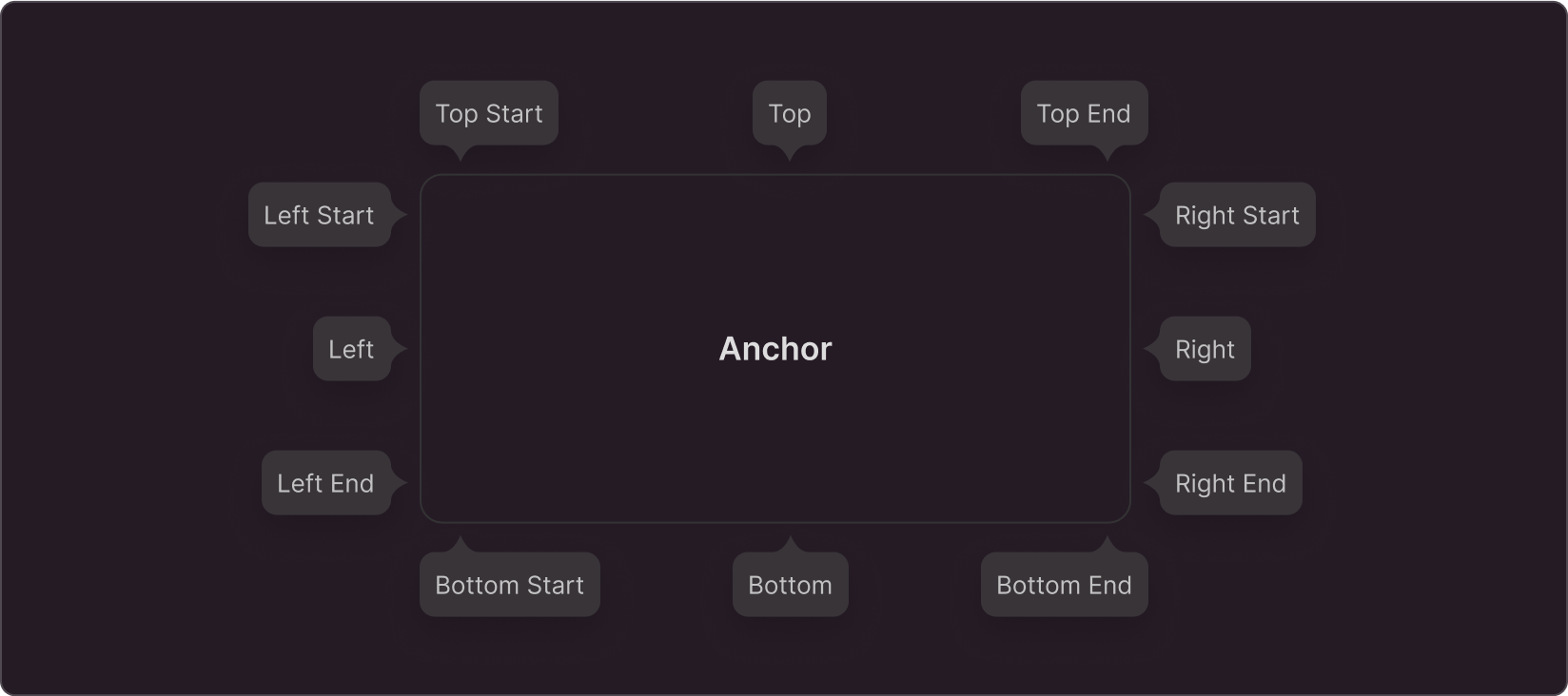
Style
You cannot customize the color and style of the popup. You can only change its location and the presence of a tail:
You can place any content in the popup body. When designing the content, stick to the basic margins of the Popover component and general guidelines. Try not to overload the Popup so that it does not look bulky.
Positioning
You can place Popup anywhere on your page depending on its layout. Make sure that it overlaps as little important information on the page as possible.