List and list-item
List — a universal list component that serves as a container with data rows organized into a single vertical column. The component sorts its child list-item elements, supports multiple sizes, and enables keyboard selection control and filtering.
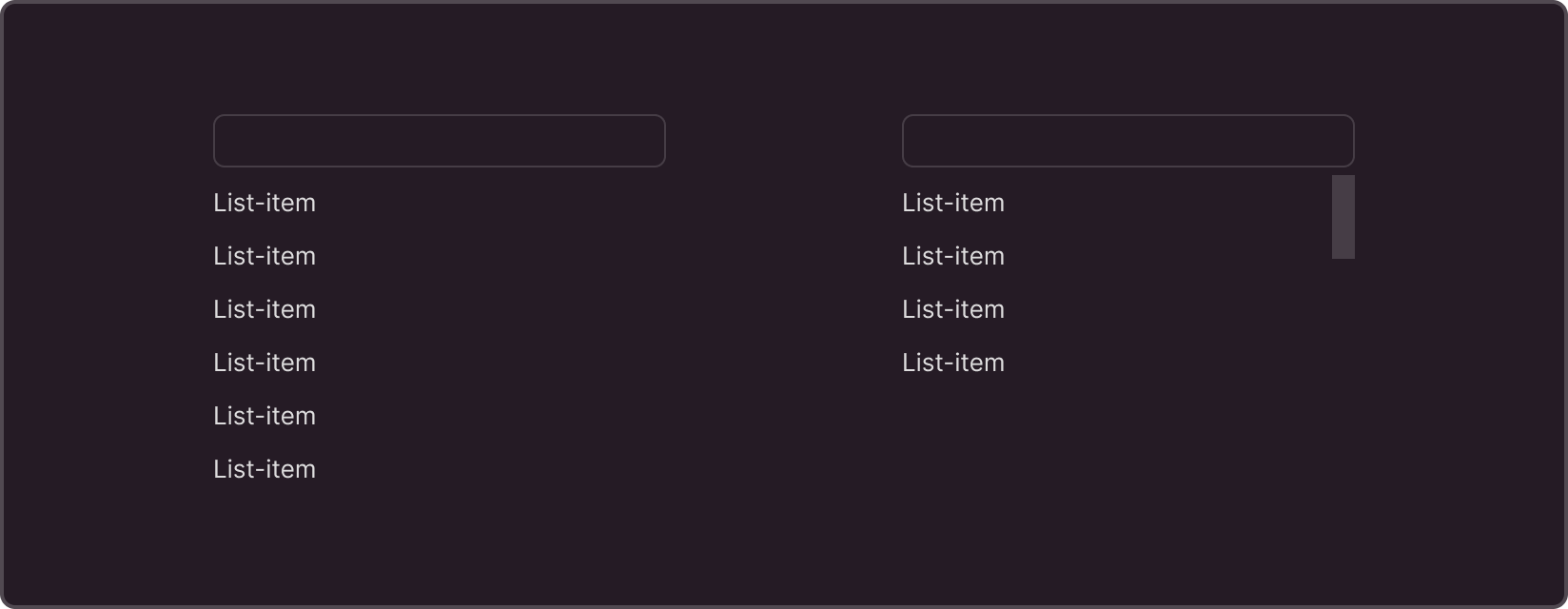
List structure
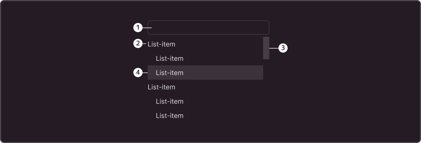
➊ Filter area
➋ List item
➌ Scroll bar (scrollbar)
➍ List item under cursor
List-item structure
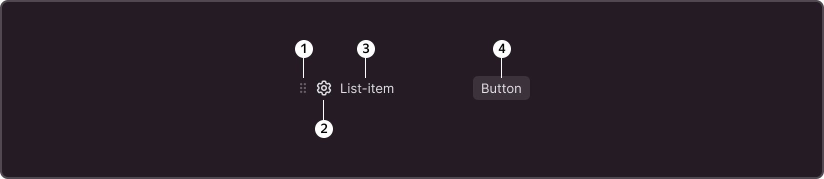
➊ Sorting icon
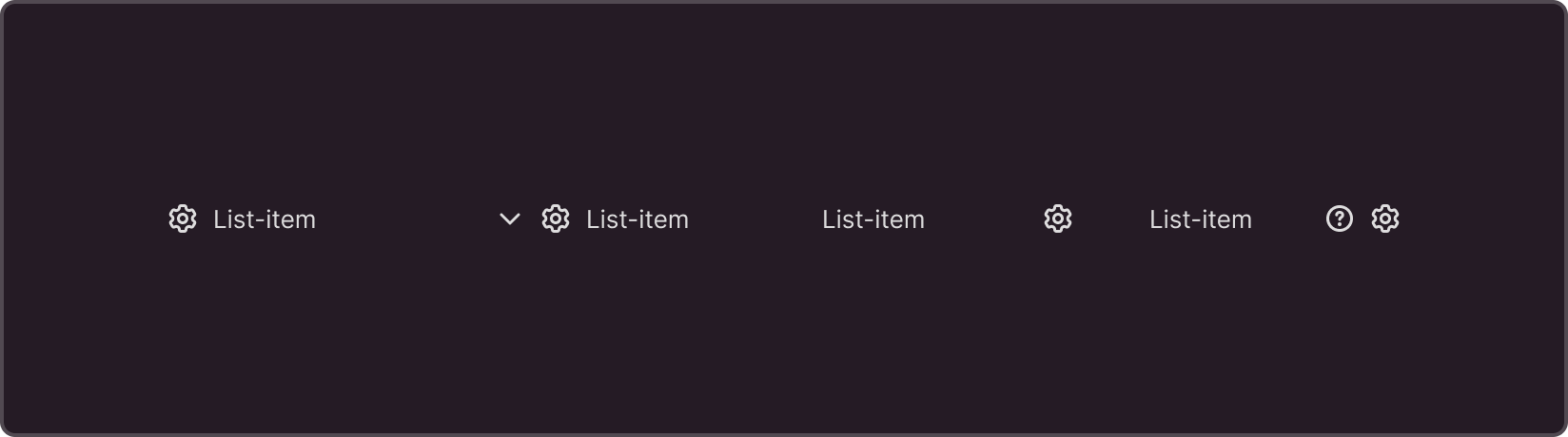
➋ Item icon
➌ Text block
➍ Additional action button (displayed on hover)
Size
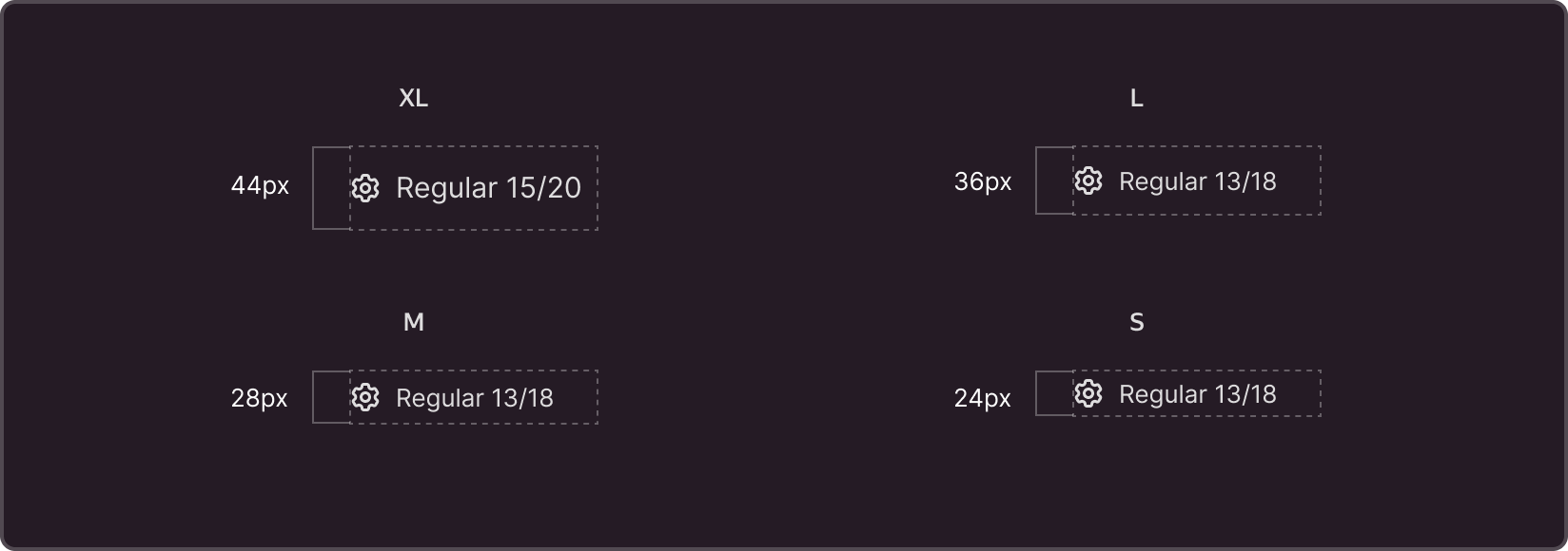
List-item
All list items (List-item) support rendering in 4 sizes: S, M, L, XL. The sizes and paddings correspond to the library items with which the component interacts, such as select, input, and button, which support similar size variables.
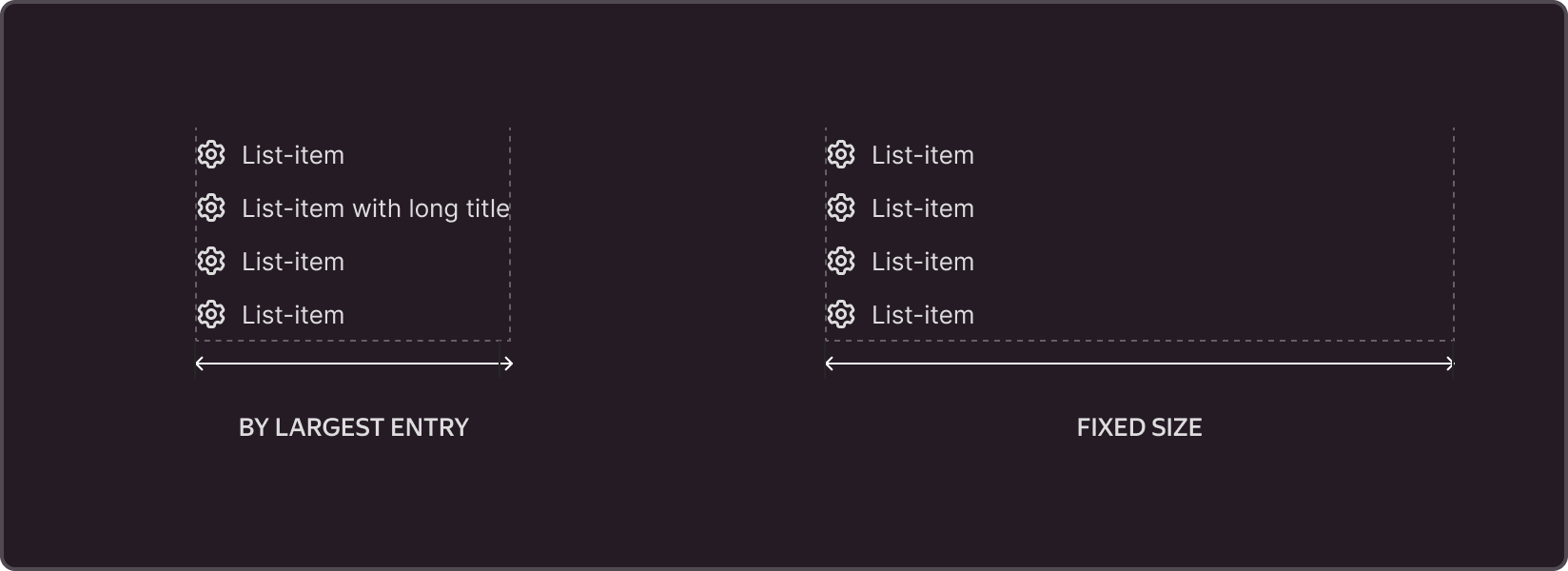
List
By default, the width of the List component is dynamic and is calculated based on the width of the longest item on the list. The width can be set to a fixed value or inherit the width of the object that triggered the display of the list (select, input).
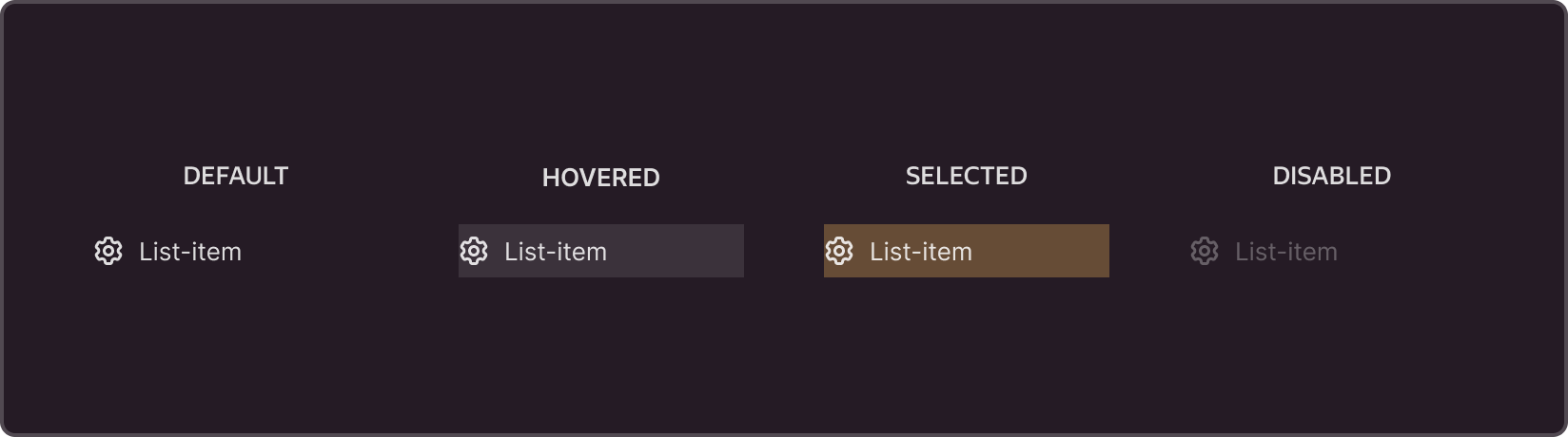
States
Types of content
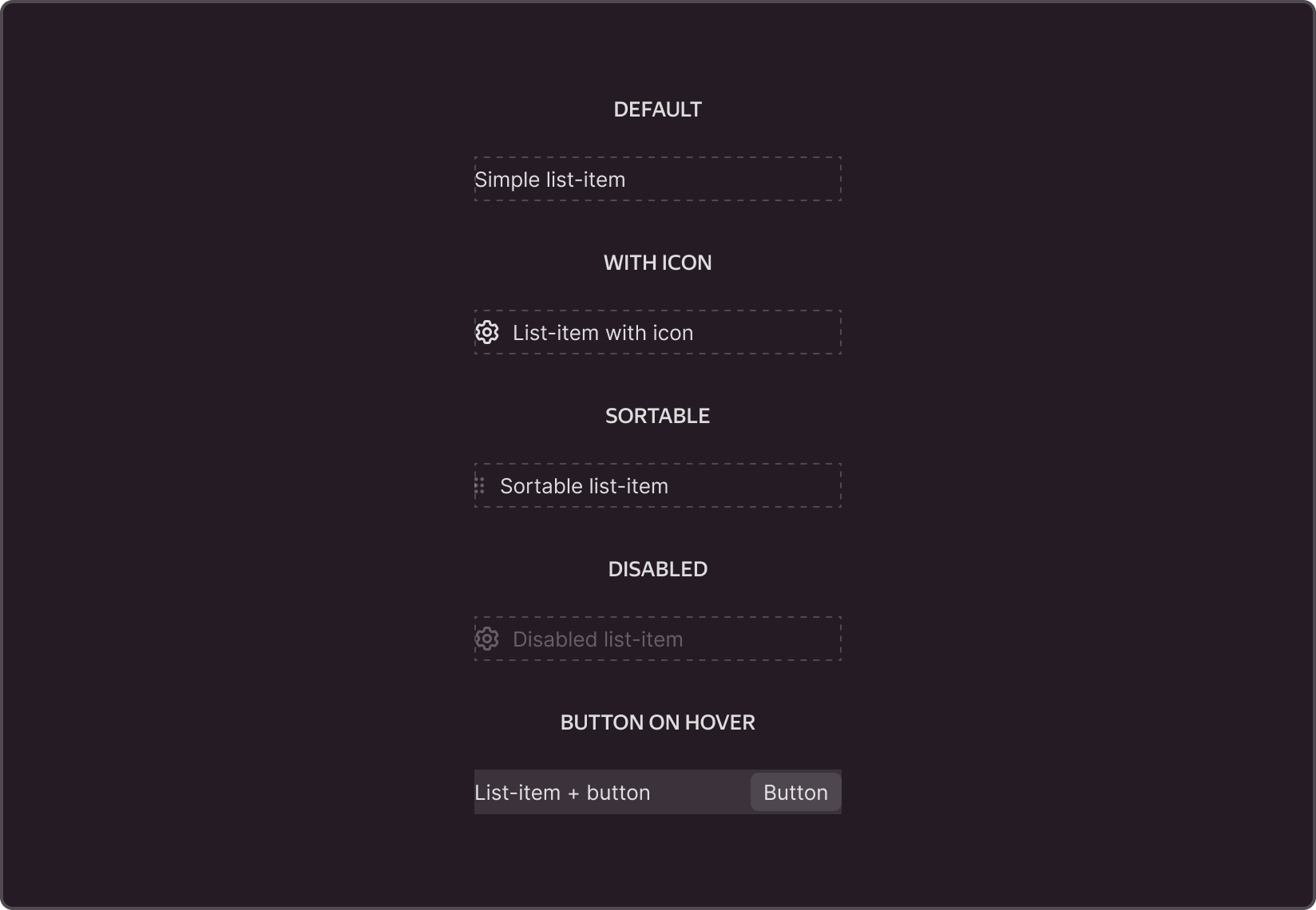
List-item features
Multiple icon support
List-item elements can have one or more icons placed on the left and right of the component.
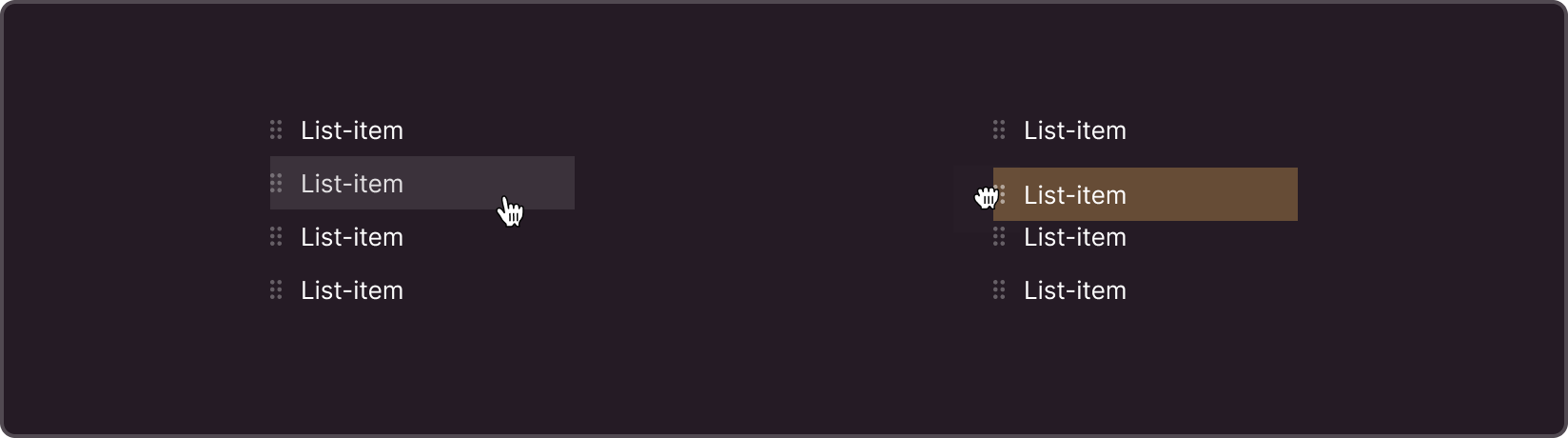
Changing the sorting order
For items in the list, you can activate list item sorting.The sort icon is always displayed at the top of the list by default.
List features
Customizable height for the main container of the list
The height of list items or a function that returns the height value can be dynamically set or specified with an exact value in pixels (px). If the list items exceed the maximum height, a scroll bar appears. The height can be set manually or adjusted dynamically.
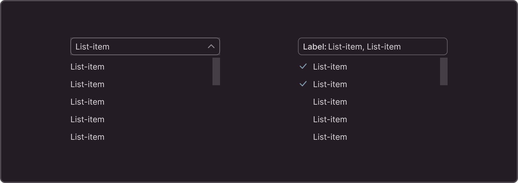
Single and multiple selection
The component supports both single and multiple item selection.
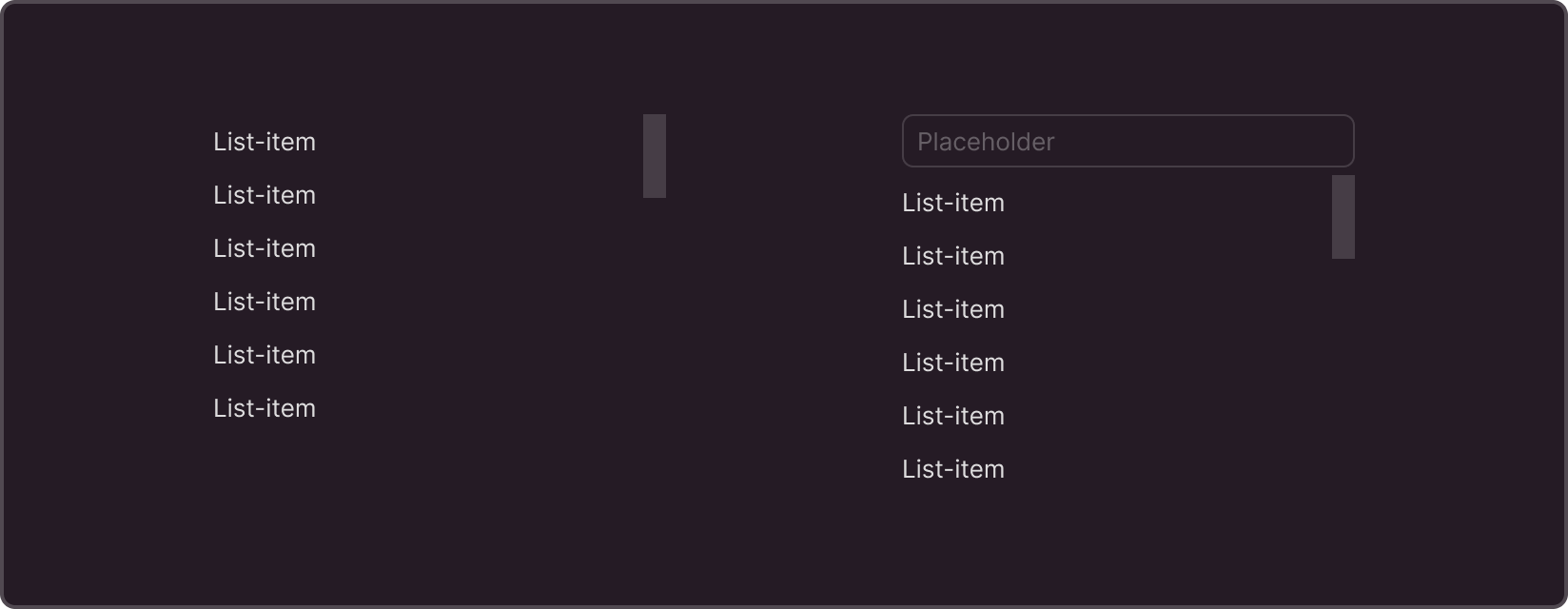
Filter and search
Optionally, the component can include an input field for quick filtering of items in the list. The filter placeholder can be changed by default depending on the component's task.
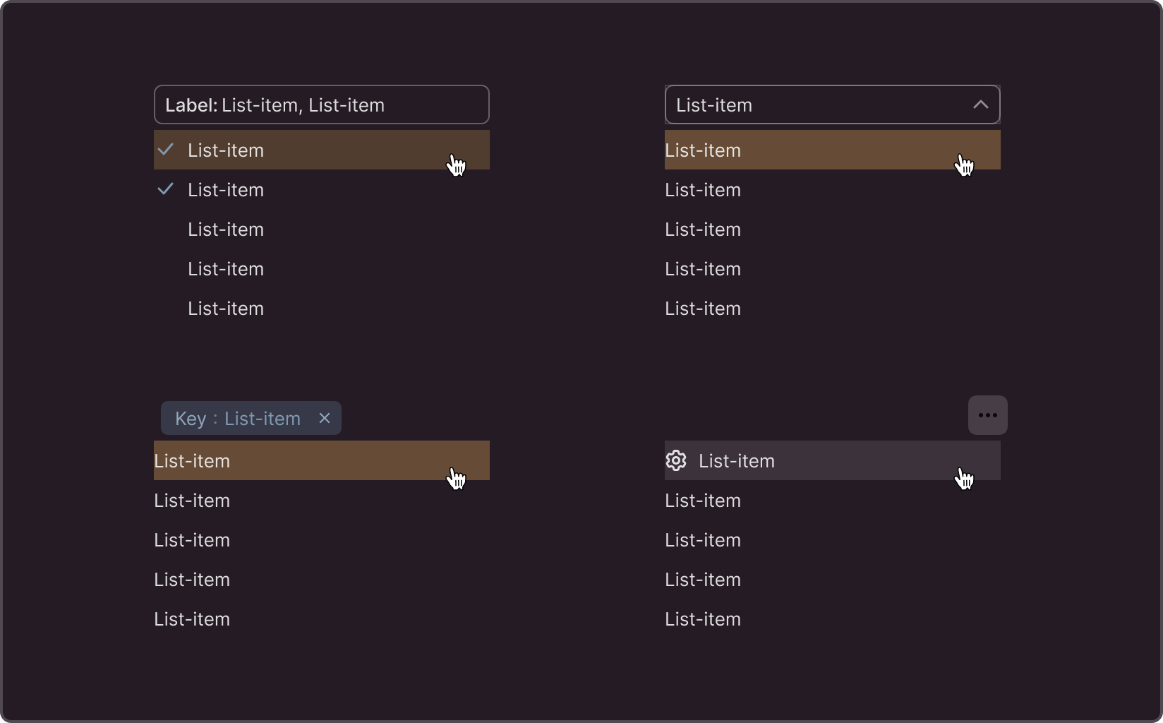
Call triggers
By default, the list component is triggered by interactions with other page elements such as select, label, and button, and serves as a suggestion feature for the Input component.
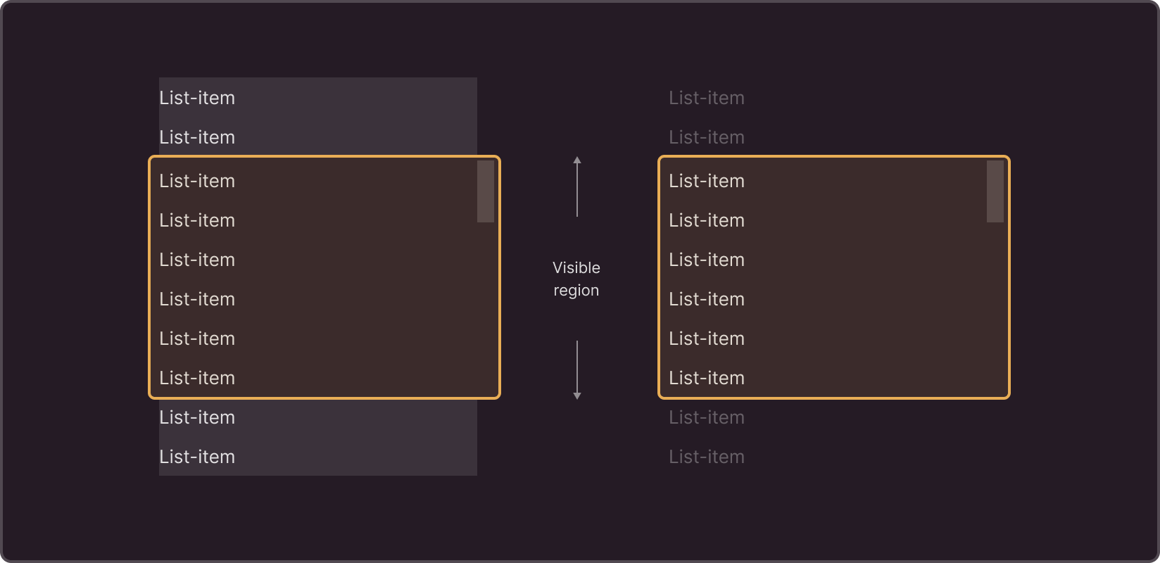
Virtualization
When the virtualization flag is enabled, the browser renders only a subset of rows at a time, significantly reducing the time required to re-render components. With this method, also known as "infinite loading," new items are added to the list as the user scrolls down to a specific threshold item (trigger).