Label
A label is a textual description of the attributes of an object, such as its status or type. Labels are used to categorize, label, or classify entities, as well as to mark them up in a Key:Value format.
When to use
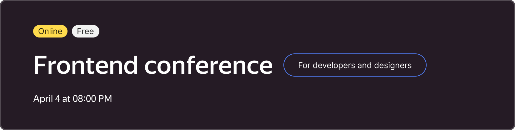
Labels are used everywhere (e.g., in cards, in tables, on entity pages) to indicate attributes of objects and help users quickly identify and categorize content. Labels are usually displayed next to the related objects.
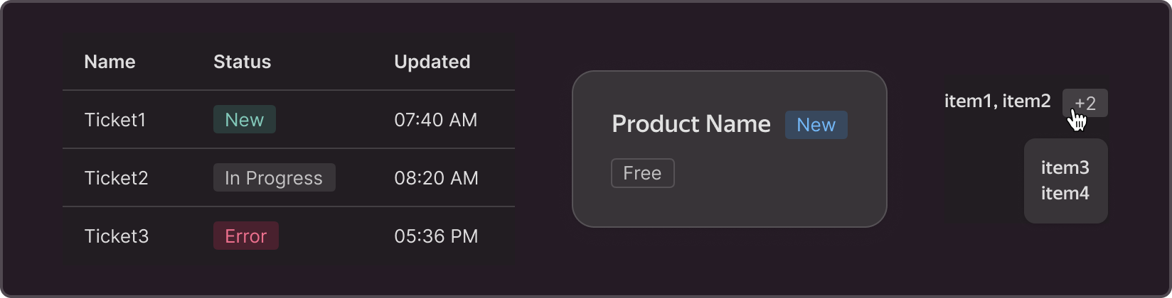
Another application option is displaying the number of objects that don’t fit in the list. In this case, hovering over the label shows a Popover with the list of the remaining entities.
Labels can also be used as tags to organize entities and make working with them easier.
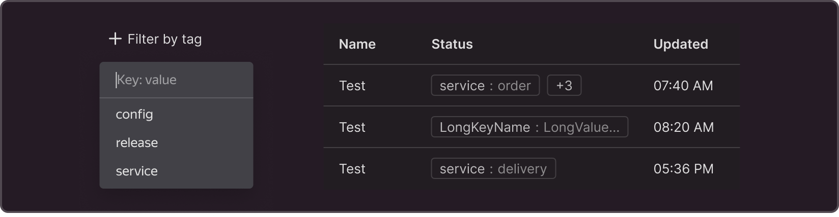
When displaying labels in a table, limit the number of labels in a cell (no more than 2-3 labels in a row and no more than 2 columns with labels in one table) and the maximum number of characters (no more than 20 characters followed by an ellipsis).
Structure

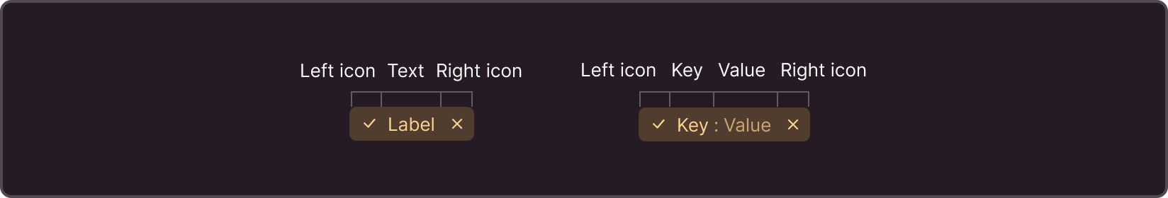
1 — Left icon: optional and non-interactive. Used for faster information retrieval.
2 — Text: a label shouldn’t exceed 20 characters. You can use adjectives (e.g., New, Active, Free), Participles (e.g., Stopped), Nouns (e.g., Discount), and Adverbs. Label text should not contain verbs (e.g., Enable). If you need to use verbs, use buttons instead.
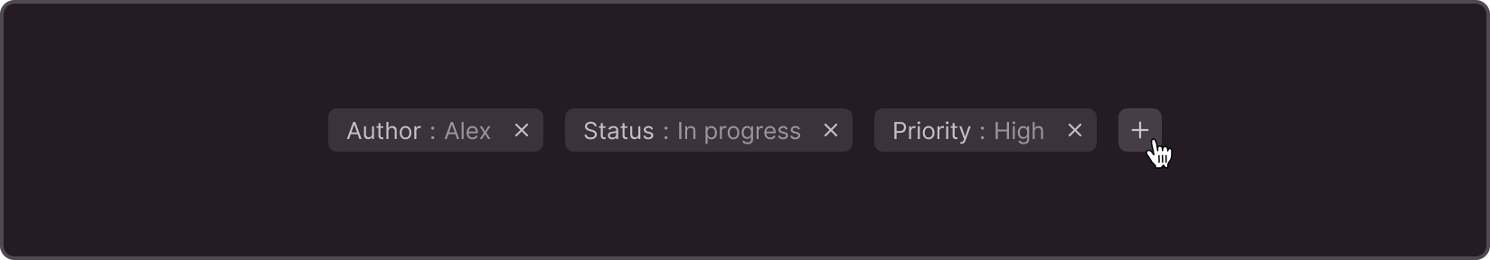
3 — An alternate version of the text in the "Key: Value" format, which is used to manually mark objects. For example, you could label the object "service: delivery" or "release: 23."
4 — Right button: interactive. Can be an exit icon or copy icon.
Sizes
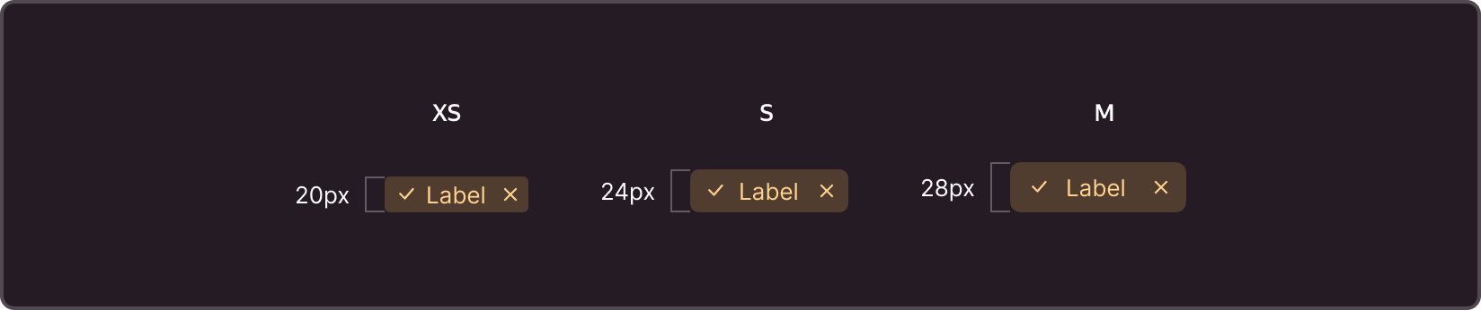
There are three label sizes:
XS - Often used in tables, lists, headers, popups, and entity pages.
S - Used to preview newly added marks on forms and other areas if there is enough space.
M - Used less often because of its resemblance to a button.
Themes
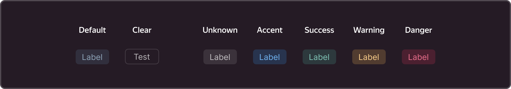
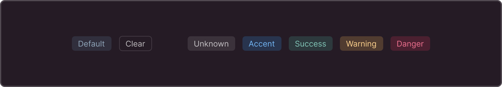
Without semantic color
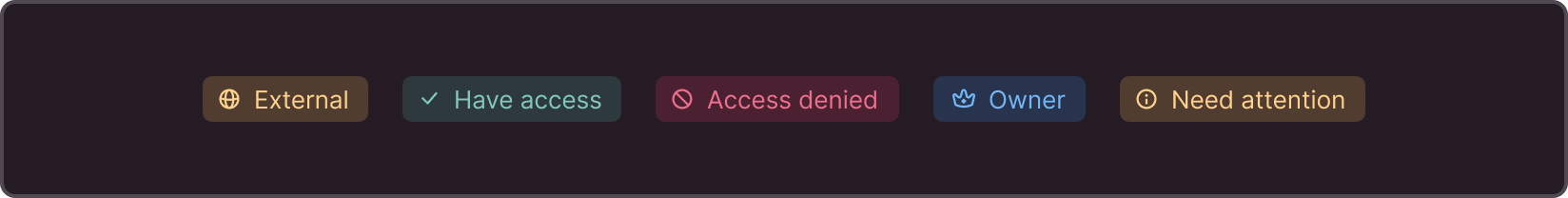
Default — The default label, which is often used to highlight information without semantic coloring.
Clear — Doesn't have a background, only an outline. Used for minimal emphasis
With semantic coloring
Unknown — A neutral option used when there is no need to focus on the information contained within the label.
Accent — Used for highlighting important information and for “in progress” operations.
Success — Used to indicate a successfully completed process or an entity's "health".
Warning — Used for emergency situations, such as to alert the user about something
Danger — To draw the user's full attention, such as when an error has occurred and immediate action is required to fix it.
Semantic Labels vs Buttons
Labels, including those with semantic coloring, are used to indicate states. The only way to interact with them is to hover over the label or click the icon. The label cannot be set to "selected." If you need to create an interactive element based on semantic labels (for example, for status filters), use buttons. They have a pressed (applied) state - selected - and can be used with semantic colors.
Modifications and states
All labels have five states: text only, icon before text, icon after text, icon before and after, and only one icon.
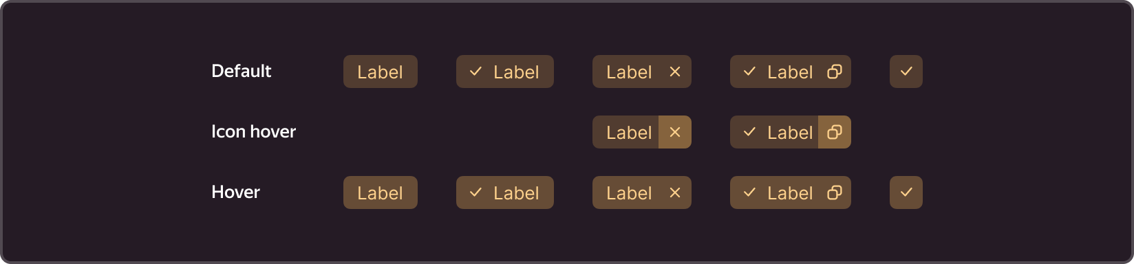

You can interact:
-
With the entire label. For example, to display a Popover with detailed information by hovering over a label.
-
With the right icon only. Depending on the icon, clicking on it may delete the label or copy its value.
When adding label interactions, make sure they are intuitive and straightforward.
Additional features
You can create dynamic filters for sorting content based on the label. For example, clicking on the plus icon adds a new value, while clicking on the cross icon cancels the filter.
If your interface allows users to create their own labels and mark objects, they should also be able to add and delete them.
Customization
The label's colors, fillets, sizes, and paddings can be customized. The text contained within the label should be easy to read.
Change the appearance or color of a label when a user hovers over it to indicate the possibility of interaction.