Corner Radius
The corner radius of controls can be overridden. To do this, use the following variables:
- --g-border-radius-xs: 3px;
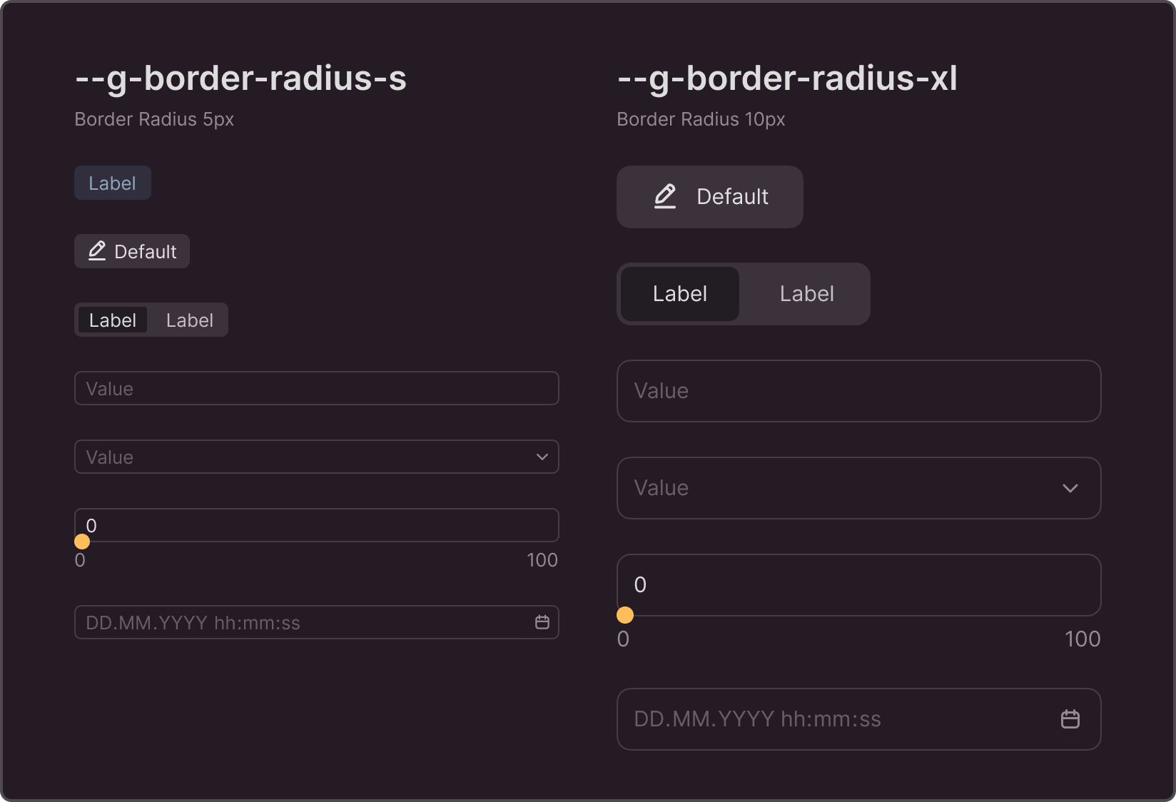
- --g-border-radius-s: 5px;
- --g-border-radius-m: 6px;
- --g-border-radius-l: 8px;
- --g-border-radius-xl: 10px;
- --g-border-radius-2xl: 16px;
You can override the values in Variables
Variables are used in controls of corresponding sizes. If you change the variable's value, the corner radius of all controls of the same size will change accordingly. The controls affected by this variable are listed on the Branding page of the Figma library. Since different controls have different size ranges, sets of controls may not match. Labels, for example, do not come in sizes larger than L, so variables beginning with --g-border-radius-l are not used in this component and have no effect on its appearance.
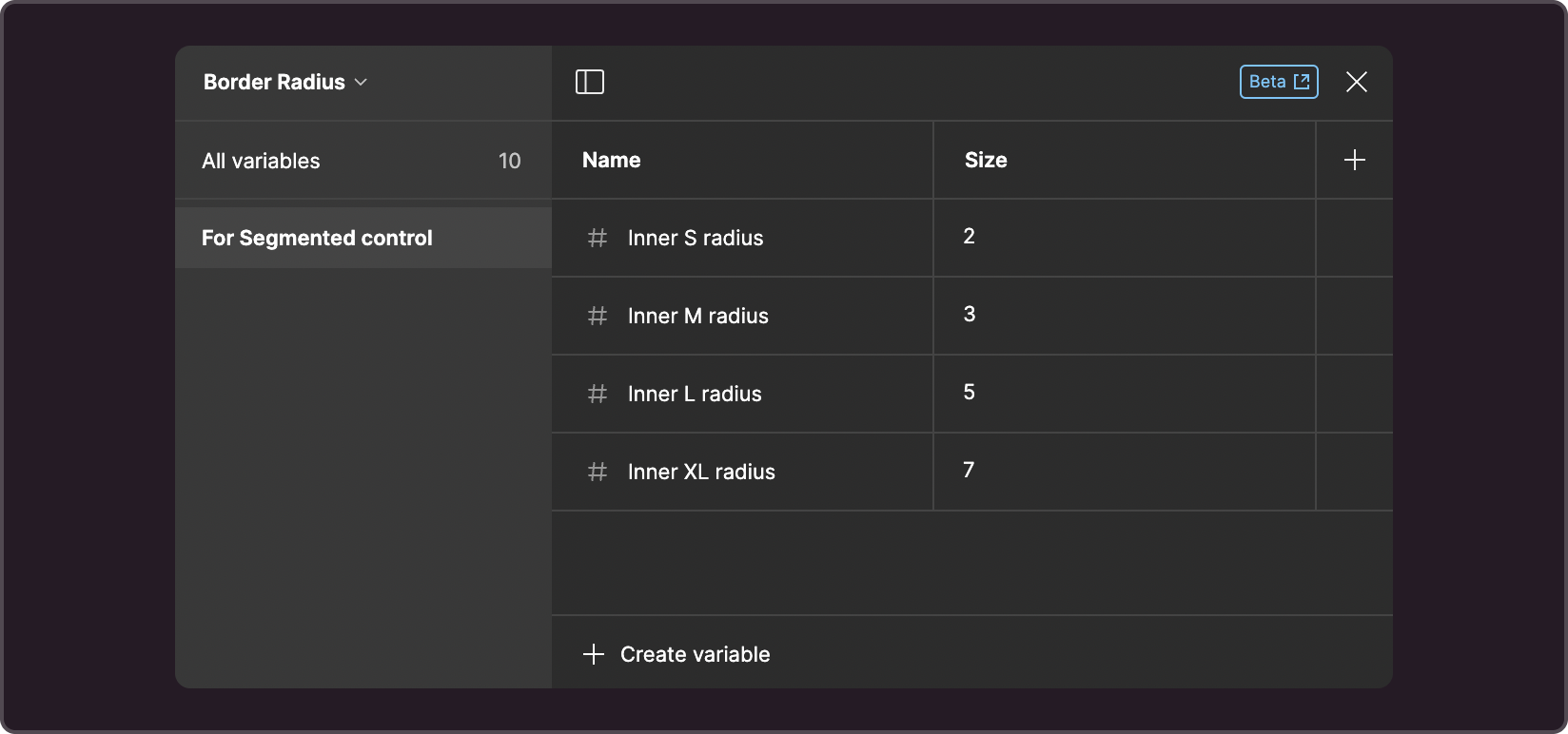
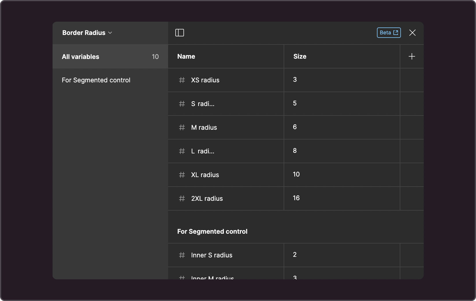
The corner radius of the nested element for the check-button is determined by the tokens and is calculated using the formula "token value - 3" (where 3 is the distance between the internal and external elements). In the current version, you have to perform the calculations manually and enter the results into the following tokens: