Popover
A popover is a tooltip that appears when hovering over or clicking on an element, or when focusing on an element using the keyboard.
It is used to provide context or additional details without leaving the current screen. Popover enhances the user experience by providing quick access to the required information without cluttering the main interface.
Types of popover
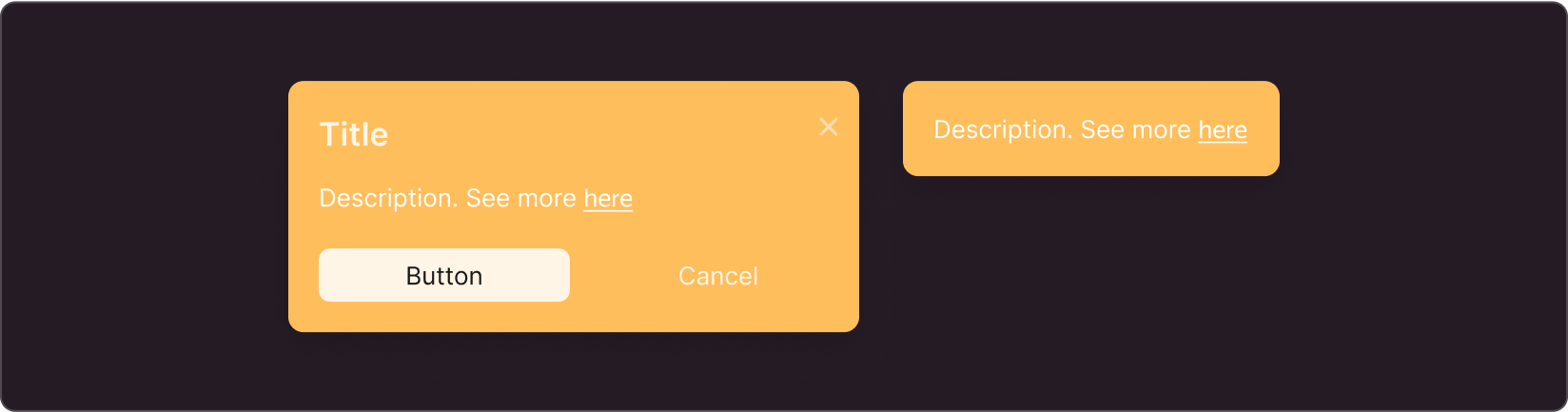
Info
For use in regular interfaces
Special
For use in promos
Announcement
Use for moderate highlight in announcements and notifications
Parameters
The below parameters can be configured for all types of Popover: Info, Special, and Announcement:
- Sizes
- Content type
- Positioning
- "Close" button
- Opening and closing method
- Timing
Sizes
The component sizes vary in font size and margins from the edges. The width and height of the component adapt to fit the content.
S has the font size of 13 px and side margins of 16 px
L has the font size of 15 px and side margins of 24 px
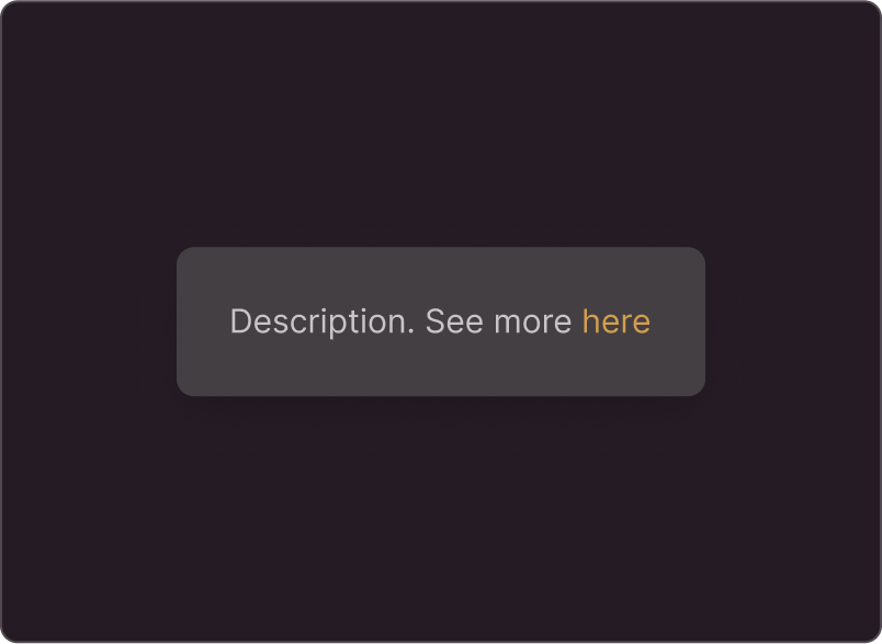
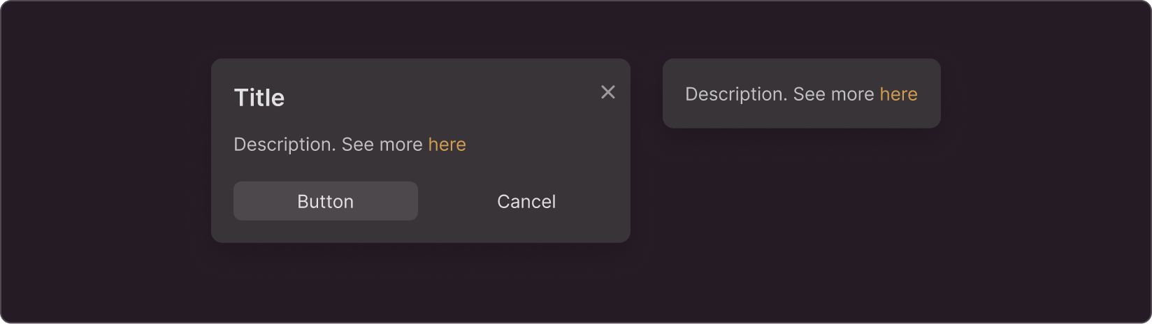
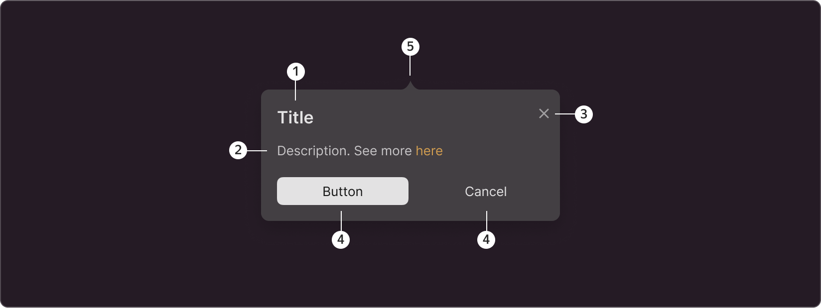
Content type
The component supports the following elements:
- header
- description
- Action buttons (you can use one or two buttons, and swap buttons)
- Close icon
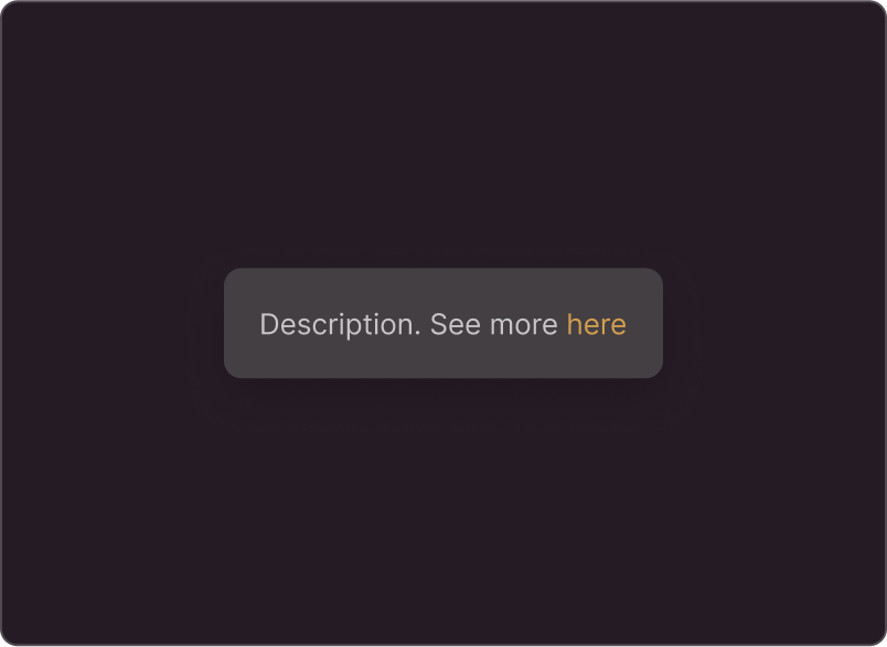
- Pin (tail) is an additional indicator of a link to the interface element. It helps when there are many elements around, and you need to focus user attention on a specific one
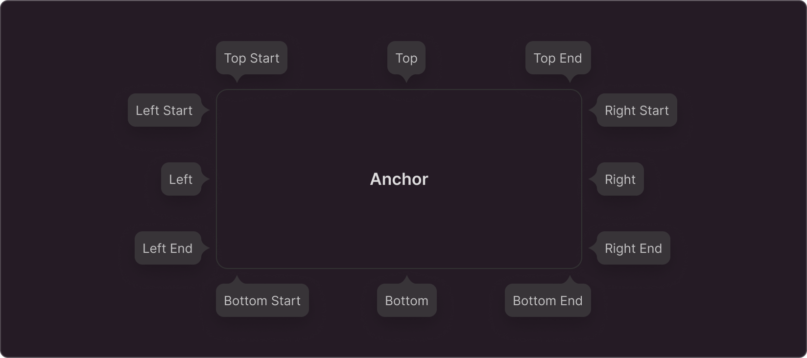
Positioning
The popover can appear on different sides of the element depending on its position in the interface. If you use the pin, it will be directed towards the center of the interface element.
"Close" button
Use the "Close" button to close the popover if you trigger it by a click rather than hover over or focus on the interface element
Method of opening and closing
- On element hover In this case, the component disappears when the user hovers out of the element.
- On element click Use a cross icon to close the component in this case.
- On element focus using the keyboard The popover disappears when the element loses focus.
- Can open spontaneously When the user lands on the page, the Popover will already be open. Suitable for popovers in ads and tutorials. Use the cross icon to close the component.
- In response to any actions in the interface For example, in onboarding, when you provide a series of popovers.
Timing
- Without delays in appearance and disappearance The popover will open and close instantly. Suitable for simple regular popovers.
- With a delay in appearance and disappearance Use a delay in appearance if your page includes many elements that trigger popovers. It helps to avoid accidental hovering over elements and unwanted popovers. Use the closing delay if the tooltip contains buttons. In this case, the user can move the cursor to the button before the tooltip closes.
- With a delay in disappearance Use this option when you do not need to delay appearance, but your popover contains buttons.
Special cases
In most cases, popover is a good choice for providing additional information. However, in certain cases, other components should be preferred.
- If you have a complex tooltip and the number of elements supported within the Popover component is not enough, you can design the tooltip based on the Popup component.
- If you need to provide the user with an explanation or additional information about the action on button click, avoid Popover. Use Action Tooltip or Tooltip instead.