Card
The Card component is used to divide content into semantic blocks. In essence, it is a container for grouping content, with the option to collapse it.
Usage
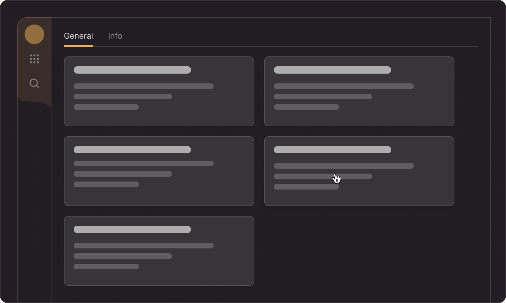
The component comes in four types.
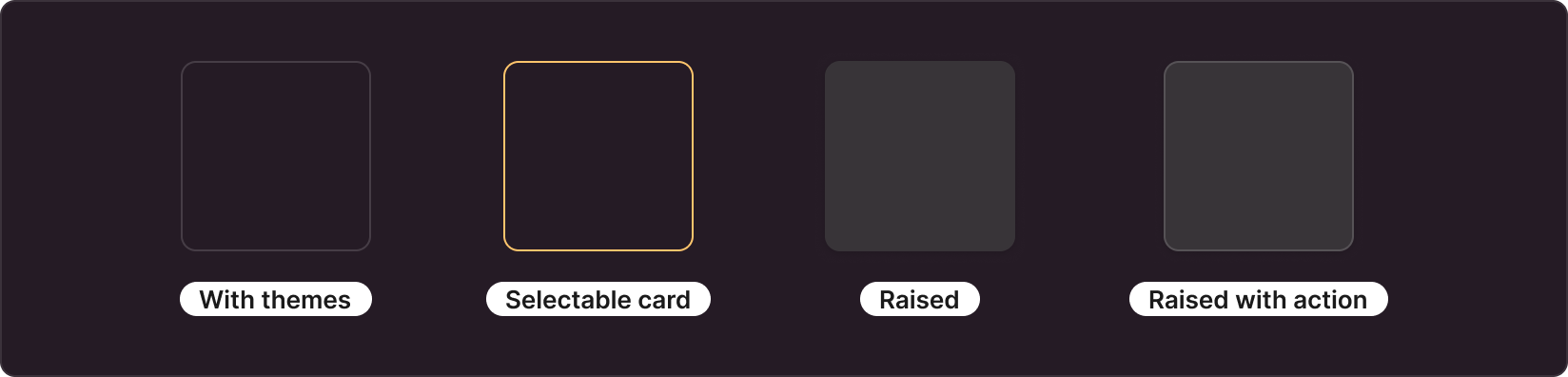
With themes

Cards with themes can change the background or stroke color. Often used to describe the error/success of a block or a user warning. This card is most commonly used to combine content in its default color (normal). The theme parameter specifies the card's theme, while the View parameter determines whether the card is stroked or filled.
You have the following options for cards of this type (container):
View: Outlined / Filled
Theme: Normal, Info, Success, Warning, Danger (color)
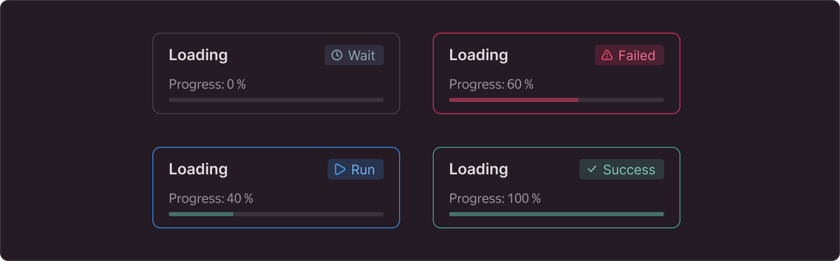
- Normal - the basic state of the card with a stroke, used in most cases.
- Info — used to provide the user with information
- Success — used to indicate events with positive results.
- Warning — used to display a warning
- Danger is a container designed to draw the most attention from the user; it can be triggered by data loss, service interruption, etc.
Selectable card
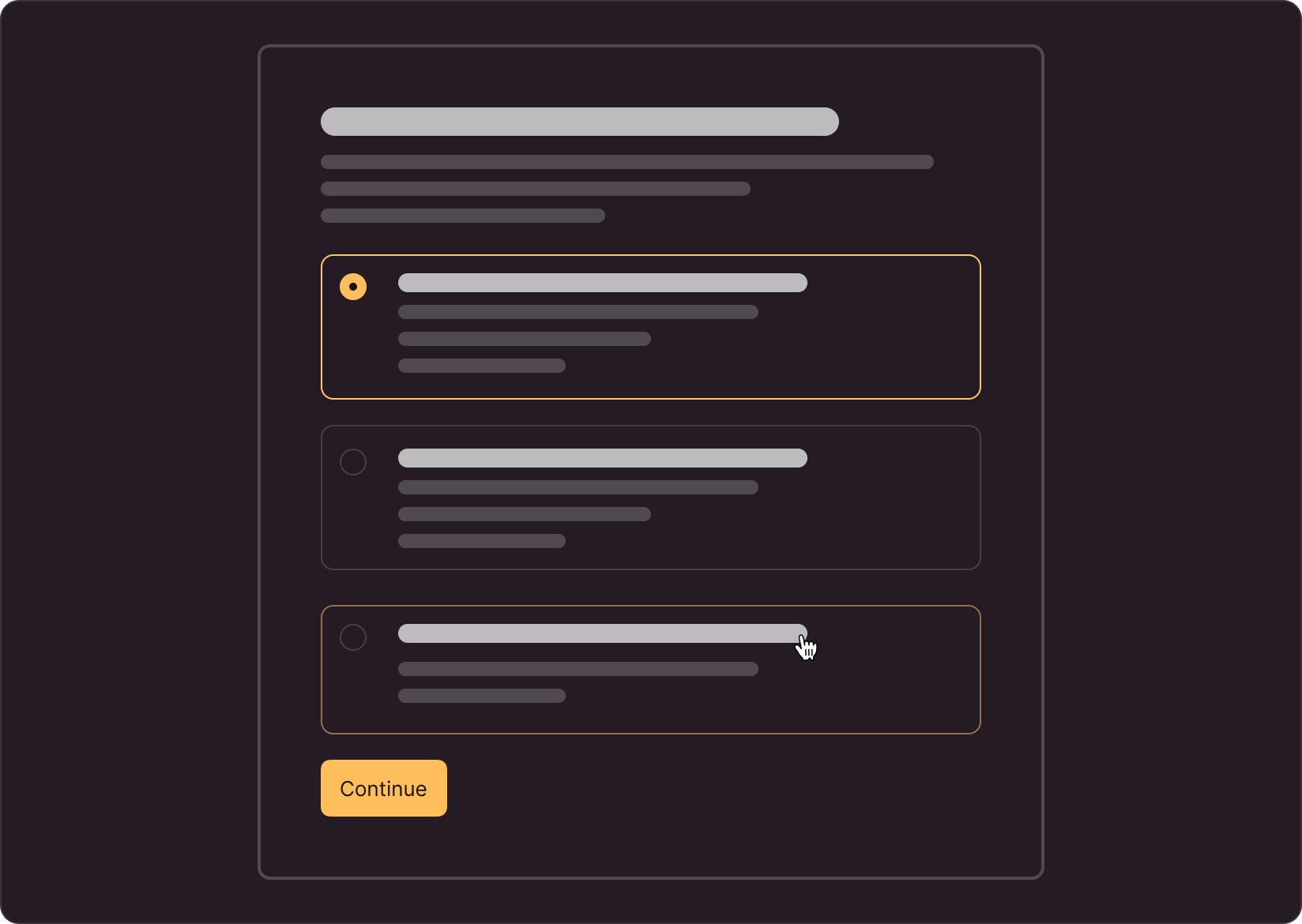
Cards in this category require you to choose from one of the available options. The card has three states: normal, selected, and hovered.
You have the following options for cards of this type (type = selection):
selected: true / false
disabled: true / false
Raised
Used to group content, similar to Normal in the With themes group. The main difference is that this card type has a shadow. We recommend using it in situations where the card needs to be highlighted. For exapmle, with widgets:
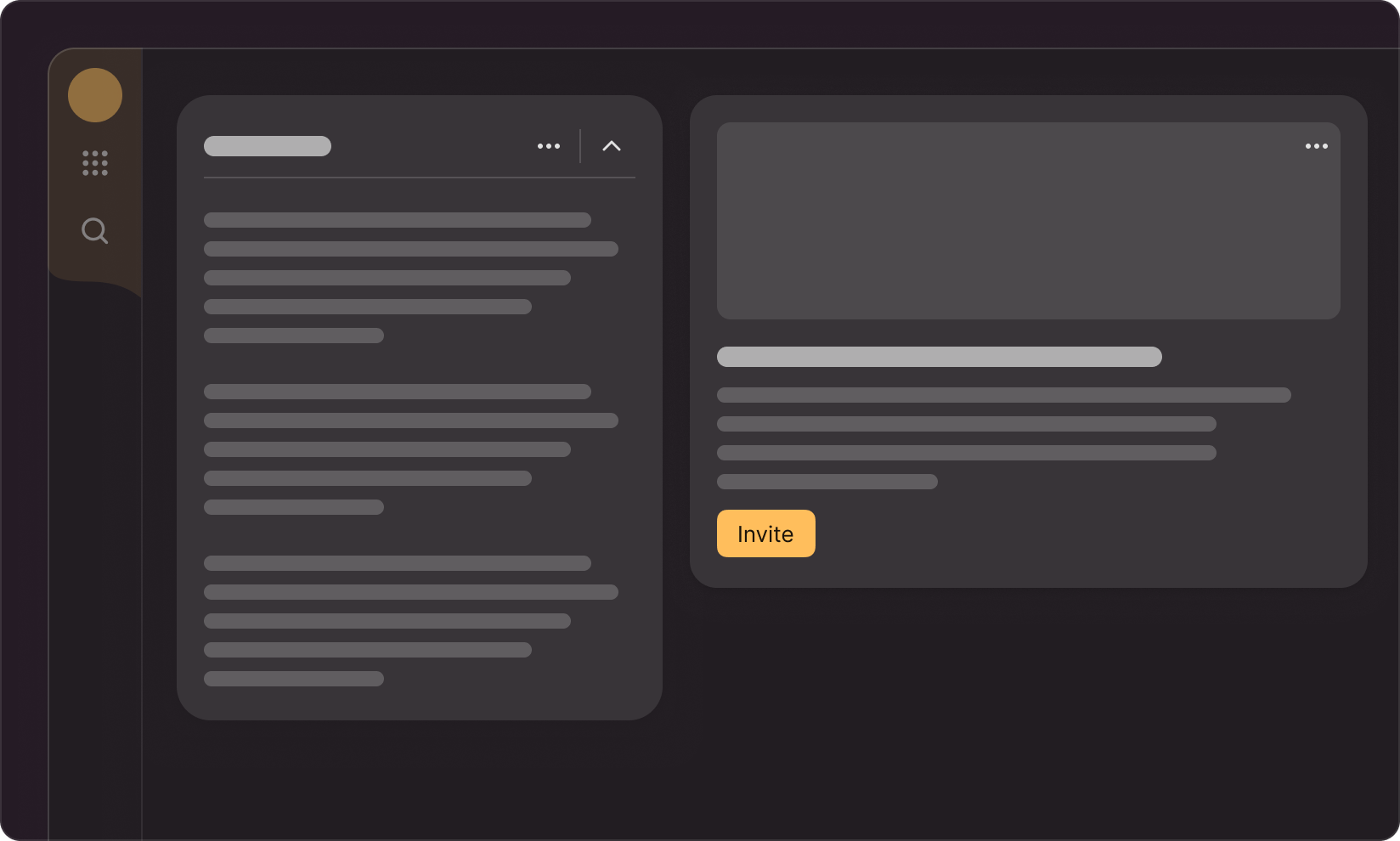
Remember to leave enough space between these cards so that the shadow does not fall on the card next to it.
In the L size, the card has a more 'airy shadow,' so when using this size, it's recommended to choose slightly larger spacing between cards compared to the M size.
type: container;
view: raised
Raised with action
Similar to the previous card, but requires clicking on the card. Unlike the Raised card, there is a hover state but no "selected option" state, as in the Selectable card. We recommend using it when you need to provide the user with a selection option that contains detailed descriptions.
Keep in mind that clicking on it will redirect the user to a nested page. Therefore, users should expect this card behavior. (should be clear from the design of the card)
You have the following options for cards of this type (type = action):
disabled: true / false
Size

Sizes M and L, using the example of cards with a shadow (Raised)
Two sizes available: M and L. The corner radius depends on the size: L radius (8px) and 2XL radius (16px). The choice of size depends on the location, padding, and size of page controls. For example, if the page uses size L for inputs, buttons, and other elements, the card should also be size L.
The width and height of the component are determined by its content. The minimum size can be selected with a slight padding from the content. The maximum size can be equal to 100% of the page width.
Use cases
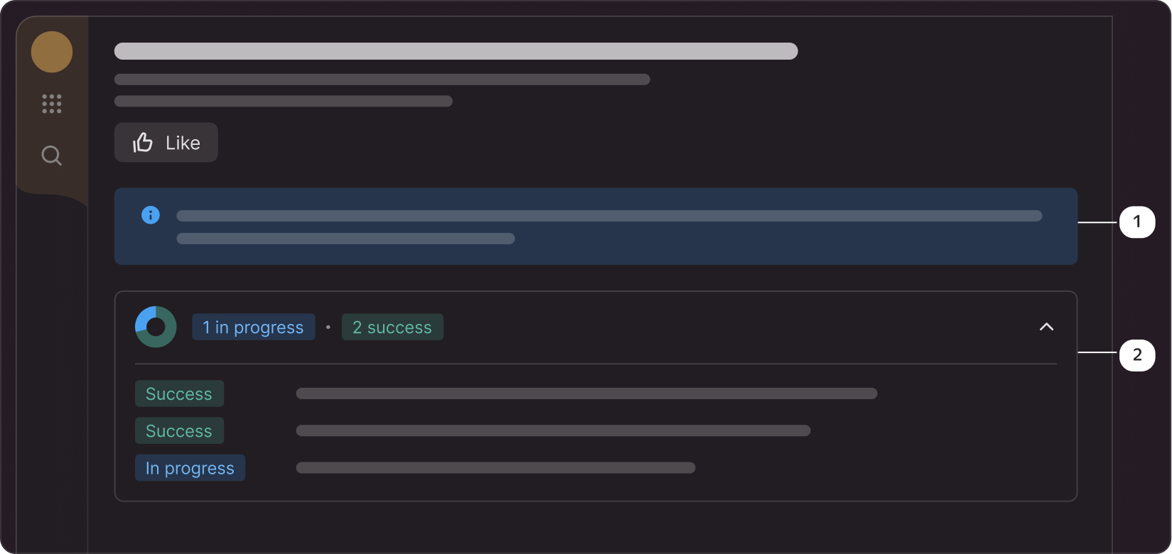
Example of card usage:
1 - themes with fill to inform the user,
2 - card with an outline to group content