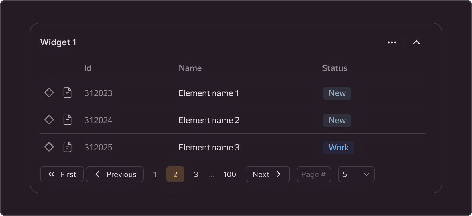
Pagination
This component allows users to navigate the content displayed page by page, for example, in tables.

When to use
✅ When to use
- In all cases with paginated display.
- To enable the user to skip several pages or go directly to the desired page.
- To enable the user to customize the number of displayed rows.
- To fix the size of sections within a page so that the automatic content loading at the top is not shifting the bottom content.
🚫 When to avoid
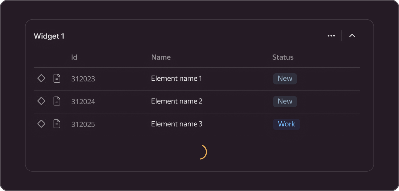
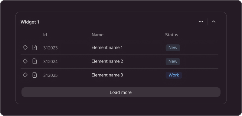
When you need a seamless transition between search result pages, use automatic loading or loading by a button, unless this slows down the page.
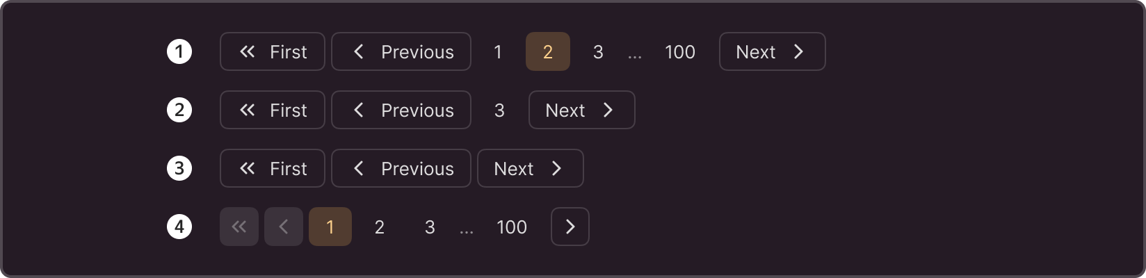
Structure

- Current page. Shows the serial number of the displayed page.
- Previous page. Opens the previous page.
- Next page. Opens the next page.
- Last page of content. Shows up if the total content is known and can be divided into pages right away. Opens the last page by a click.
- Overflow icon. Shows up if the number of pages exceeds four.
- Forward/backward switches. Switch pages one by one.
- Go to the first page. Opens the first content page.
- Go to a specific page. Opens the specified page when the user enters the page number and presses Enter.
- Number of items per page. A switch for the number of elements displayed on one page.
You do not have to use all elements of the structure together. You can find the available configurations under "Modifications".
Sizes
By default, the size of the buttons, input, and select in the paginator is M.

States
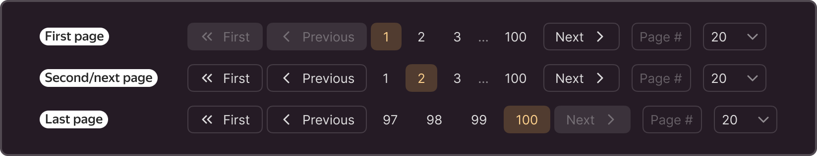
First page shows the first page.
Second/next page shows the second and next pages.
Last page shows the last page.
Modifications
- Page Size Options and Show Input: You can disable these fields if the user cannot go to a specific page or control the amount of content displayed on the page.
- Total Unknown only displays the current page. Use when the total number of elements is unknown
- Hide Pages ensures page switching without serial numbers. Use when the list of elements is dynamic and the number of pages, as well as the serial number, will constantly change and confuse the user.
- Compact is a compact format without text. Use when the interface space is limited (for example, in dialog boxes)
For mobile device interfaces, you can use the mobile version of the paginator.
