Table
The table is used for intuitive display of structured data of any size.
An atomic element of the table is a cell. Cells form columns and rows in the table. The table always has a header.
Table cell
A cell is a container at the intersection of a row and a column of the table, into which you can place other components:
- Text
- Icons
- Buttons
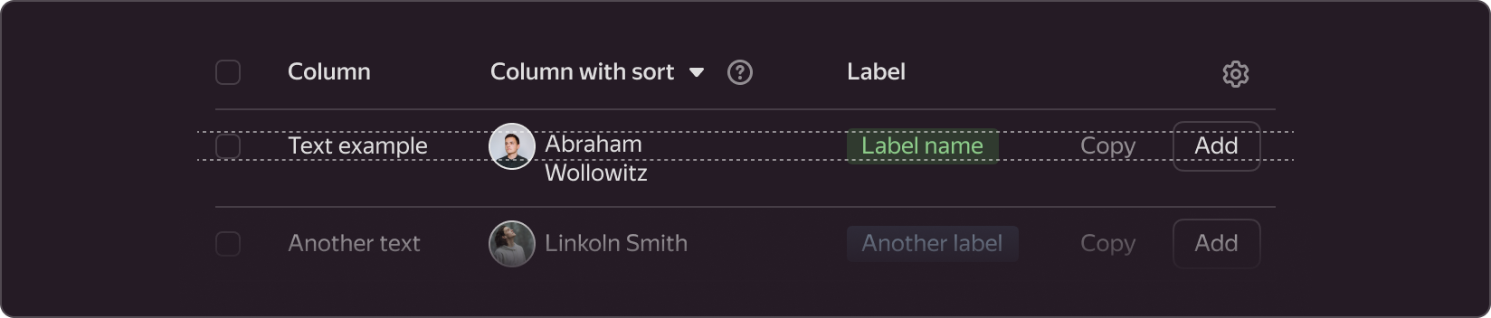
- Labels
- User avatar
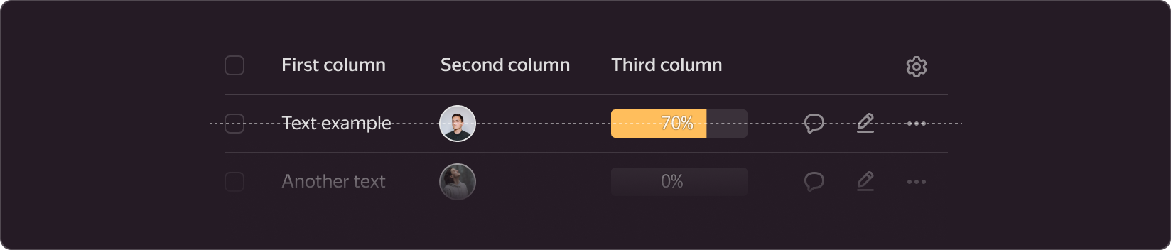
- Progress bar
- Checkbox
- Select
- Input and other components
A single cell can contain either a single component (for example, text), or a combination of components (e.g., a checkbox, text, and icon).

A cell can be empty if there is no data to display in it. Moreover, the cell content can be hidden in its normal state and become visible when you hover over the cell or row.
Recommendations for using components
- Do not use more than three different components in a cell: this makes data in the column with such cells harder to compare, and makes the table less readable. In such cases, you can create a separate column for the property that each component describes.
- Choose the component sizes in the table based on your current task. For plain text data, better use the text-body-1 style without decoration, and for other elements, use size M.
- We recommend to use components of the same size within a cell, for example, labels and buttons of size M.
Cell height and width
The cell size is determined by the size of its content and cell paddings.
The standard cell height with single-line text, styled as text-subheader-1 (line spacing 18px), is 40px. Both the top and bottom cell paddings in this case are 11px.
For a cell with two-line text, the cell height is 58px.

You can use any paddings at the top, bottom, left, and right, but we recommend a system of paddings which are multiples of 4px. The top and bottom paddings are usually the same, but you can make them different. The same applies to left and right paddings (for more details, see the description of the rows and columns in the table). The top and bottom paddings do not have to be equal to the left and right ones.
Separator
Each cell has a horizontal separator of 1px in height. This separator is aligned with the bottom edge of the cell, its width equals the cell width. You may omit the separator for the cells of the last row in the table.
Alignment
The content inside a cell can be left-aligned or right-aligned (for more details on text alignment, see the column descriptions).
Table header
The table header is located at the top of the table and contains column names. In addition to names, the header can also contain checkboxes and buttons.

Avoid two-line column names to prevent line breaks. When the name wraps to the second and other lines, the height of the header increases. Other names and buttons remain aligned to the top in this case.

Table columns
A column is a group of cells arranged vertically. Depending on the type of content in the cells, the data in the column can be:
- Sorted
- Right-aligned
Sorting
If the data in the column can be sorted (e.g., alphabetically, by time, or by size), an arrow icon is placed next to the column name. When the user clicks on the icon name, rows are sorted by this column.

Sorting is an optional functionality in the table. It is available in specific use cases.
You cannot sort the table by two columns in parallel.
Typically, if data in a column can be sorted, such data should have the same measurement unit. To avoid specifying the unit in every column cell, add it to the column name with a comma.
Right-aligned content
This feature is only available for text data and is used for comparing data (for example, time spent or resources consumed). Such data often has the same unit and you can sort it. For right-aligned column data with a sorting arrow, place the arrow first, followed by text.

Column locking at scroll
If the table does not fit within the screen borders, a horizontal scrollbar appears. In such cases, you can lock certain table columns so they always remain on the screen. You can lock the first or last columns of the table. You can use any number of locked columns, but make sure there is enough space for the scrolling columns, considering the minimum supported viewport width.
When locked, these column cells get an additional separator: it is placed on the right if the column is left-locked and on the left if the column is right-locked. This separator will limit scrolling of other cells.

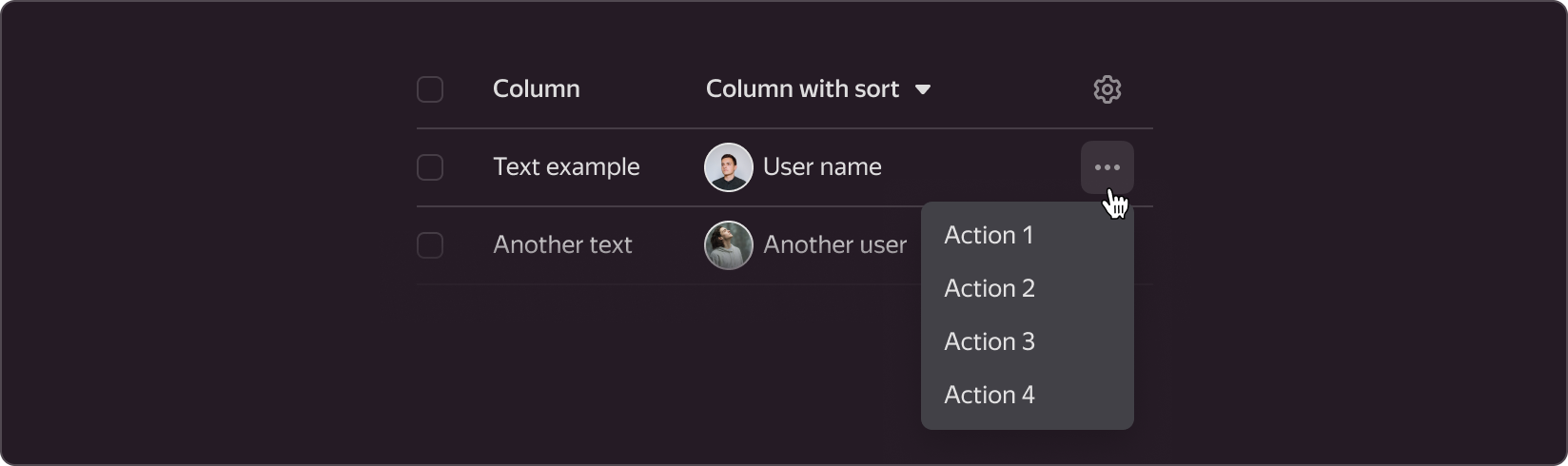
In the rightmost column, you can add actions for a row. These actions can be accessed under a three-dot icon, which expands into a list. Lock this column at scroll so that the user can always access the actions. Place the gear icon, which opens the table column configurations when clicked, in the header of such a column.
Column setup
Users can customize the number and order of columns. For this, add a gear icon in the header of the last table column. When the user clicks the gear icon, a settings popup appears.

Table rows
A row is a group of cells arranged horizontally.
Clickable rows
When users click on a table row, they can be directed to another page, a modal window, or a sidebar. When hovering over such rows, the background color changes to --g-color-base-simple-hover.

For a more neat display of hover over a clickable table row, you can add small margins on the left and right. With these margins, the content no longer aligns to the grid. Hence, we do not recommend these margins in cases without hover.
Rows with bulk operations
You can apply bulk actions to rows where the first cell contains a checkbox. A set of group actions most often matches the set of individual actions with one table row.
If a row is selected, its background color changes to --g-color-base-selection, and an action bar with a list of group actions appears at the bottom of the page.
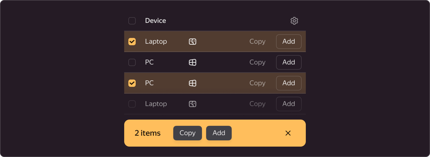
If different actions are available for different table rows, we recommend displaying only those actions in the action bar that are available for all selected rows. Other behaviors can be enabled at the designer discretion.
Content alignment
For rows where the cell height is more than 40px, the content can be top-aligned or centered in cells.
Top alignment is preferable because it improves data readability. In this case, all components containing text should be aligned to the first line.
If a top-aligned row contains icons, user avatars, icon buttons, checkboxes, progress bars, and other non-textual elements, set their top paddings so that their horizontal axis matches the text axis in a one-line cell.
You can use center alignment when it is difficult to fine-tune top cell margins for all types of content in one row, or when alignment does not affect content readability.
Usage recommendations
Use tables:
- To organize a large volume of homogeneous data that describes the properties of an object.
- To sort and compare data on your page.
- To quickly find values by sorting, filtering, and scanning the table content.
We do not recommend:
- To use tables for describing objects with a single property. A list is a better option for such cases. For example, you should use a list to present information about the color name and its HEX encoding.
- To use tables to describe objects that have distinct heterogeneous properties. Better describe each object individually in this case. Say, for example, your task is to describe devices used by an employee. Such devices can include a laptop (properties: OS, storage capacity, screen size), a computer mouse (properties: wired or wireless), and a desk lamp (properties: manufacturer, mount type). Do not add all this data into a single table and try to come up with a different visualization method.