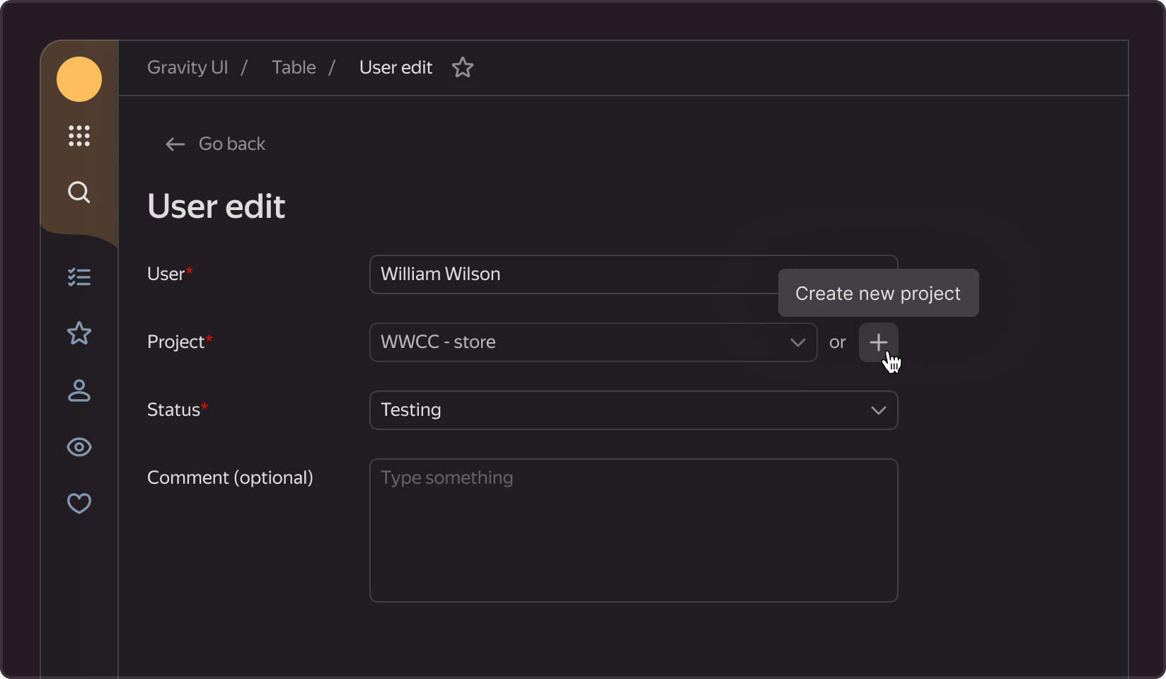
Action Tooltip
A tooltip that appears when the user hovers over a button. Typically, includes an explanation or additional information about the action that will be performed upon clicking the button. Often used for buttons with only one icon, providing users with a clear understanding of the action associated with it.
Structure

- Title is the most important and required element of the tooltip; it describes the primary function of the button. We recommend formulating the title text so that it fits into a single line.
- Description — an optional tooltip element that provides additional information about the title.
- Hotkeys / Shortcut - an optional tooltip element, a key combination that, when pressed, initiates the described action in the interface Used to teach users quick actions to speed up their interaction with the service.
Options
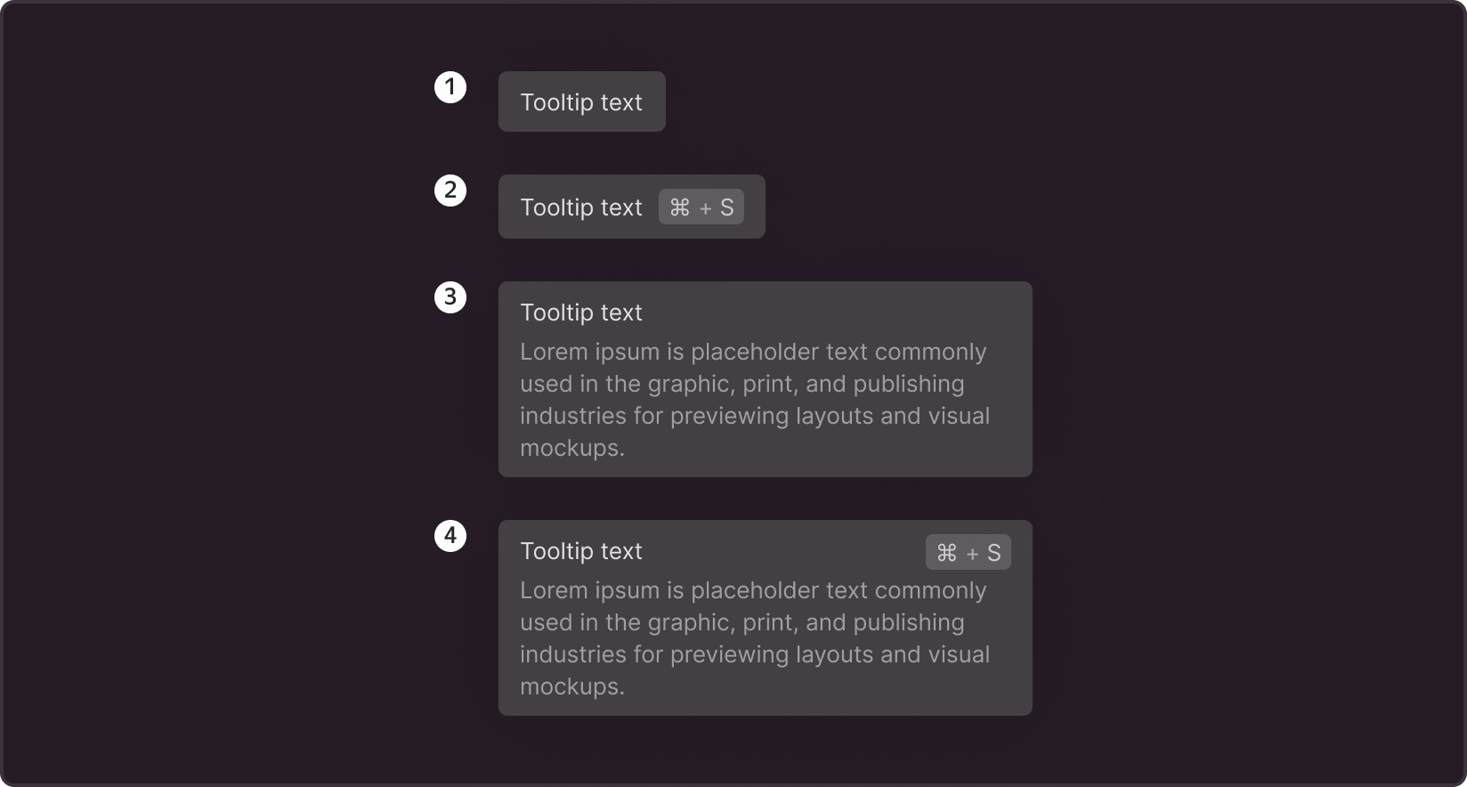
- The title alone is the most commonly used option; the tooltip briefly describes only the action itself. We recommend formulating the text so that it contains no more than 5 words
- Title and shortcut - If an action has a key combination assigned to it, it is recommended to display it for user guidance.
- Title and description - If the action is complex and the title cannot be formulated concisely and clearly, it is recommended to include a description with additional information.
- Title, description, and shortcut - the maximum set for a component, used when all elements are required for the user to make a decision in the interface.
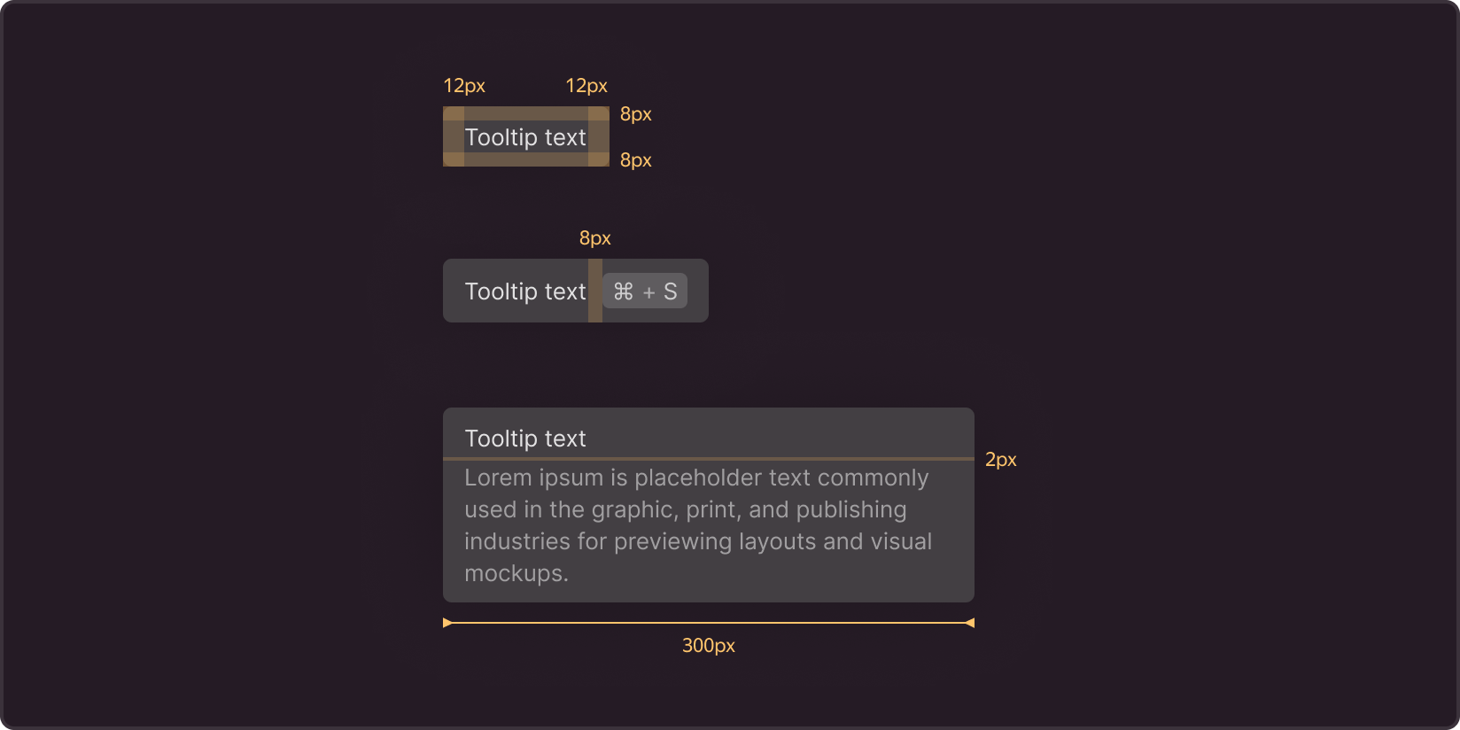
Sizes
When a single title or title+shortcut is used, the tooltip width adjusts to the text. For descriptions, the width is set at 300px.
Padding in all options: 12px left and right, 8px top and bottom.
In the option with shortcuts, the space between the title and label is set at 8px.
In the option with a description (regardless of whether there are hotkeys or not), the distance between the title and description is 2px.
Position
The tooltip's main position in relation to the button is bottom and center, with a 4px distance between elements.

If buttons are positioned at the left or right edge of the page, the tooltip is aligned with the corresponding button edge.

If buttons are at the bottom of the screen, the tooltip is displayed at the top in the position that corresponds to the location of the button: left edge, center, or right edge.

Timing
Depending on its purpose, you can adjust the delay for the tooltip to appear and disappear upon hovering over it. In most cases, the tooltip appears instantly or with a minimal delay of up to 250 ms and disappears when the user moves the cursor away from the button.
If you think that the majority of users will understand the function of the button without a hint, the tooltip can be shown only to those who are having difficulty, and the appearance delay can be increased to avoid annoying users with unnecessary elements.
Use cases