Breadcrumbs
Breadcrumbs are a chain of links that represent the path in the service's structure from the root page to the current page, allowing users to navigate to any page in between. They help the user determine which part of the service they are in and quickly navigate one or more levels back.

When to use
- Use the Breadcrumbs component for nested pages.
- There is no need to use breadcrumbs on the home page.
- Breadcrumbs are usually placed in the action bar at the very top of the page.
Structure
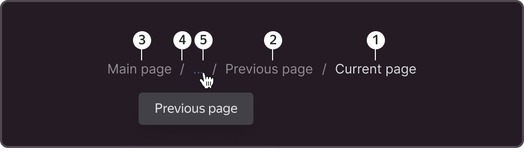
1 - Current page.
2 - Previous page. Best to display first, if the width of the container allows for that.
3 - Root page of the service.
4 - Divider. "/" is used by default, but ">" is also acceptable.
5 - Overflow icon. Appears when page titles do not fit within the width of the container. Pages that take up more space than is available are accessed via a drop-down menu, which is revealed by clicking the ellipsis.
Sizes
The basic font size in breadcrumbs is body-1. The icon size is 16x16 px.

States
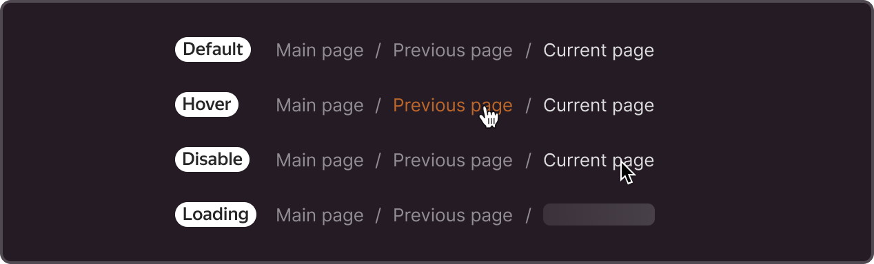
Default - default state.
Hover - hovering over the page title.
Disable - non-clickable. Can be used for the current page or for pages that are not linked.
Loading - the component can display the content of the element by passing a function through the renderItemContent parameter. For example, display Skeleton if the data for the crumbs element has not been loaded yet.
Modifications

Breadcrumbs may contain the following additional elements:
- Action icon - such as add to favorites, copy page title, or context menu.
- Label — a status or another attribute associated with the page.
- Select — clicking on the element enables you to choose between various options.
- Additional text—ID, quantity counter, and other page attributes
A house icon can be used instead of the word "Main" to indicate a return to the home page.
Customization
You can change colors, dividers, and hover styles. Remember to keep a brighter highlight on the current page and enough contrast between elements.