Typography
Typography is based on the use of two fonts and a set of styles that include font, weight, font size, and leading.
Two fonts are used by default: Inter for standard typesetting and headings, and Menlo as a monospace font. Inter is available in Google Fonts, and Menlo is pre-installed on some operating systems. You can change these fonts according to your brand's guidelines.
Font parameters
Size and leading
The leading determines the space between the baselines, and the font size establishes the size of the font. These two parameters determine the readability of the text.
Weight
The weight is specified for text styles (the default for the Body and Caption groups is 400) and display styles (the default for Subheader, Header, and Display is 600). By default, display styles have more weight. However, there may be exceptions.
Style groups
Body
Used for all types of text. Inter is set as the default (400).
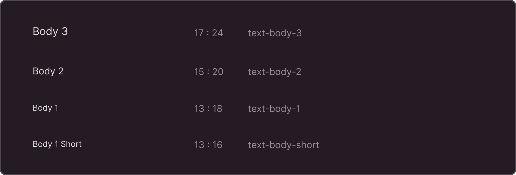
Body 1 Short has reduced leading and is used within narrow content blocks (up to 300–400px in width).
Caption
The smallest fonts of all available fonts. Used as styles for captions, footnotes, and any additional information. Inter is set as the default (400).

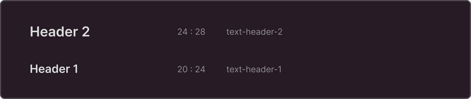
Header
Most commonly used as headings in interfaces where information density is crucial. Inter is set as the default (600).
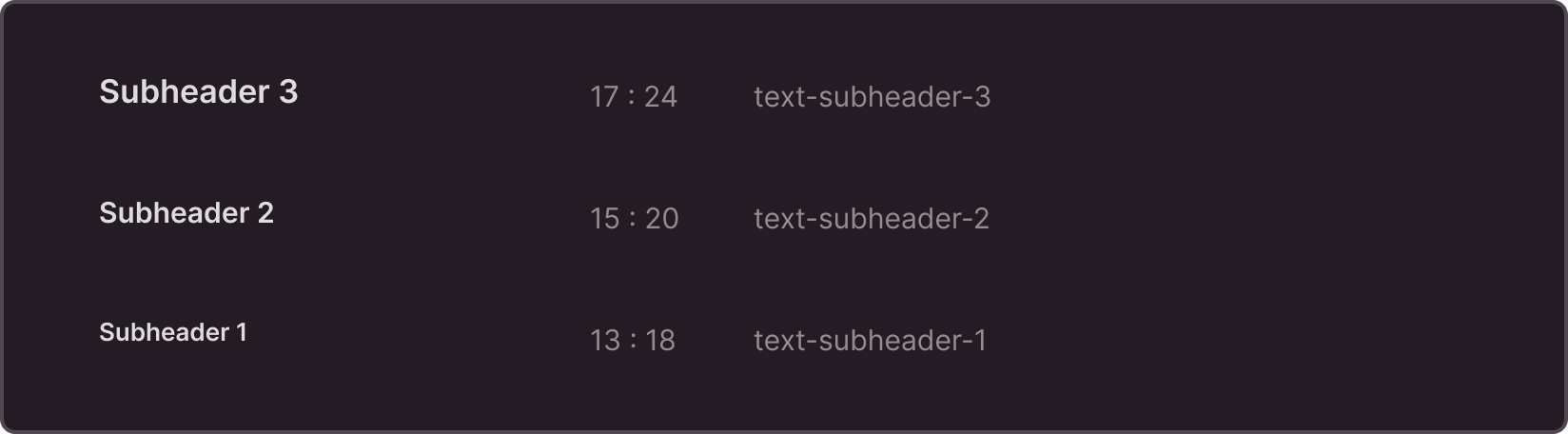
Subheader
Can be used as subheadings or as accents when paired with appropriate body styles. Inter is set as the default (600).
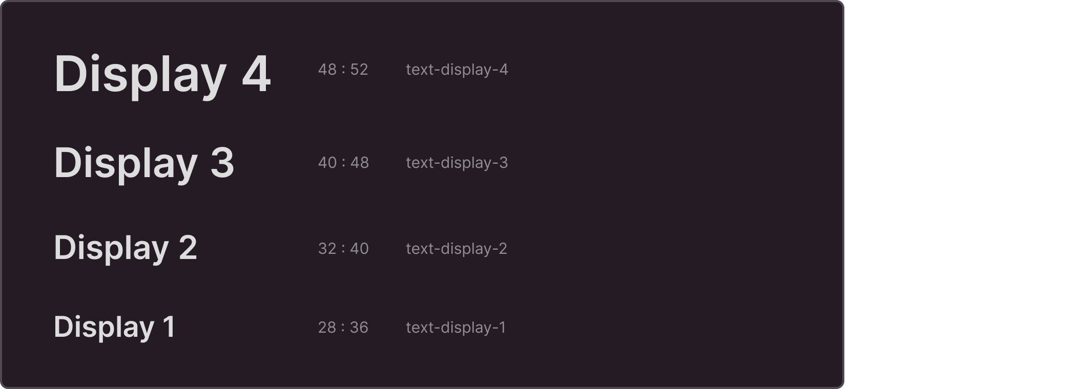
Display
Suitable for situations where display is more important than information density, such as in communication design. Inter is set as the default (600).
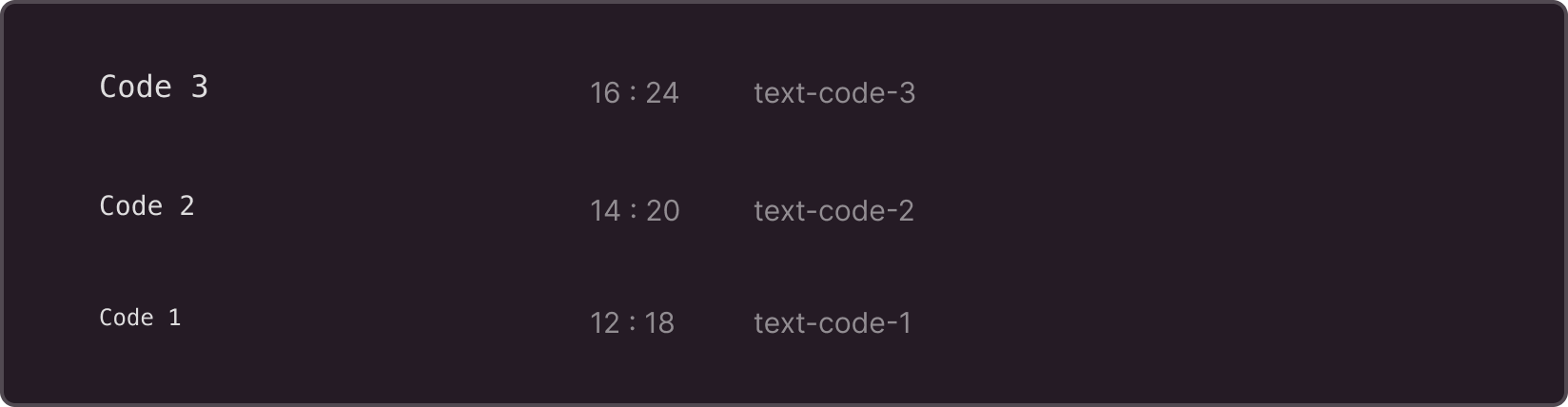
Code
Used to display code in separate blocks. Menlo is set as the default.
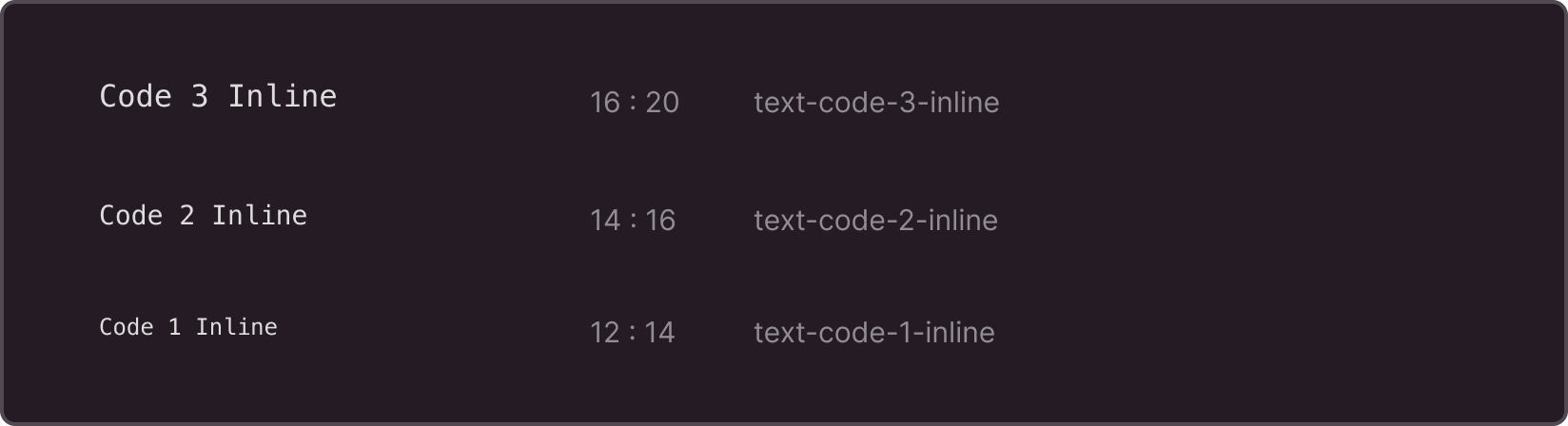
Code Inline
Used to output code that is embedded in plain text. Reduced line spacing is used for optical compensation and alignment with plain text. When changing fonts, make sure that the inline code is displayed correctly. Menlo is set as the default.