Toaster
Toaster is a small notification that appears on the screen to provide important information or a warning. It can be used to notify the user of an event or action, such as when a form is submitted or a file is downloaded.
Main types
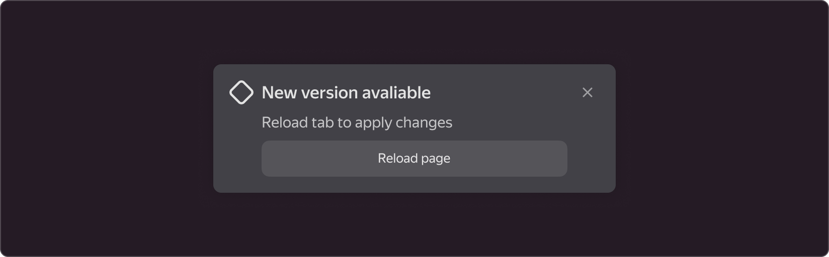
Default
It is used when there is no need for immediate action or when the message is not related to any specific actions or events.
Info
It is used to inform the user about a process, event, or action. For example, in the event of a successful data transfer or page load.

Success
It indicates that an operation or action has been completed successfully. For example, when data is successfully saved or when the user is authorized.

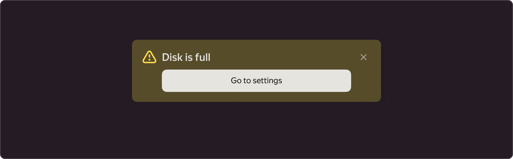
Warning
It informs the user about a potential problem or error. For example, if they need to fill out a required field on a form or if there is no Internet connection.
Error
It is used to indicate an error and that the user's attention is required to fix it. For example, if the data is entered incorrectly or there is a server error. This state is best paired with an action button that allows you to correct an error or get more information.

Modifications
Toast is made up of five main components:
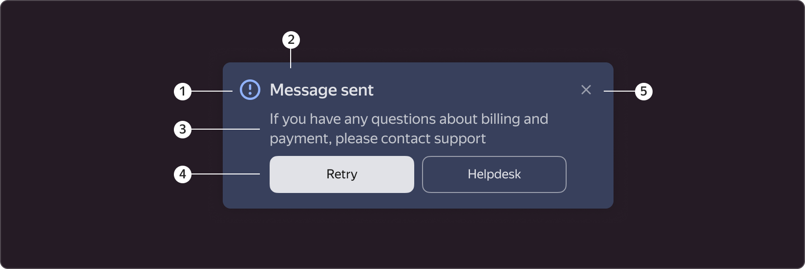
- Toast type icon. A component can be used with or without an icon. An icon is an optional element.
- The header informs the user about the action being performed. If the description is included, the use of the header is optional.
- The description clarifies the title and can be used independently.
- Buttons. Toast may have one or two buttons; it is recommended that the first button be used as the action button. Buttons are optional elements.
- Exit Icon. The exit icon is an optional element. The close button is required, if there is no hide duration set on toast.
When to use
Toasters are recommended for use in the following scenarios:
- When submitting a form or performing an action, if you want the user to see the progress. Such as a message indicating that the data was successfully sent or that there was an error.
- When you do not want to disrupt the user's workflow or block the screen. Toasters are displayed in the corner and do not cover the entire screen, allowing the user to continue using the interface.
- When more information about a specific action is required. Toasts may include links to additional content or information that will help the user understand what happened.
When not to use
Toasters are not recommended for use in the following scenarios:
- When an immediate user response is required.
- When the action being performed at the moment of displaying toaster can cause problems or unwanted consequences.
- When the message requires a large amount of information or a more detailed explanation.
- When the information is already displayed on the screen in another form.
Position on screen
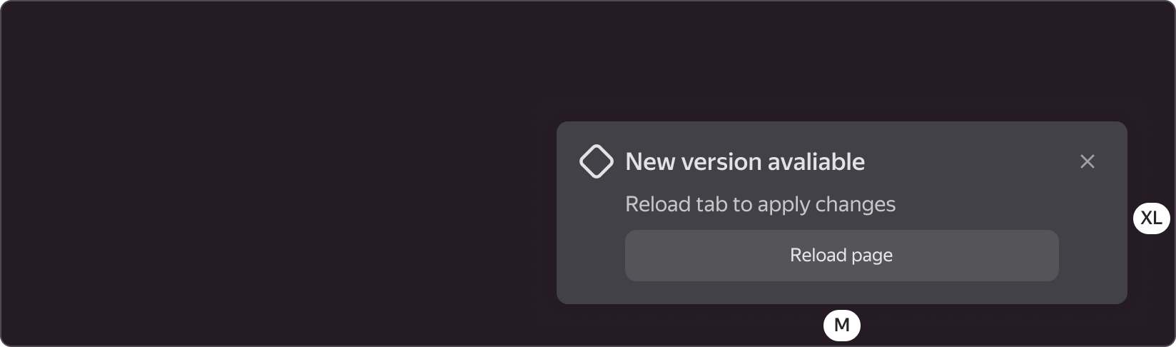
Toaster is displayed in the lower right corner.
Its external margins are: bottom M (8px), right XL (20px).
Customization
Toast's contents may differ from the standard one; it may include any available component from the library, if the use case requires it.