Branding
Quick theme creation
Quick branding allows you to switch between themes quickly and see an immediate result that you can use or optimize further. Simply choose a few colors, and all of the controls will be adjusted accordingly. Repeat for all supported themes, and you are all set.
Before you start
-
We recommend downloading the latest version of the Figma library
-
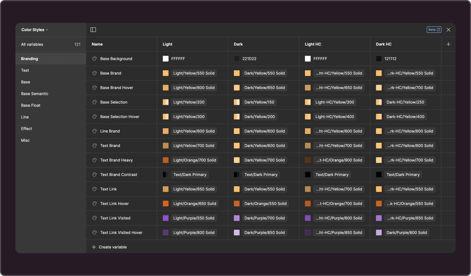
Values are configured in the variable management interface. Open the Color Styles collection and select the Branding group
-
The results can be conveniently viewed on Figma's Branding page. It contains components that use brand variables, which will give you an idea of how everything will look in the end.
-
Remember to use colorstyles in components.
-
The value of each colorstyle is represented by the corresponding variable
1. Base brand colors
--g-color-base-background
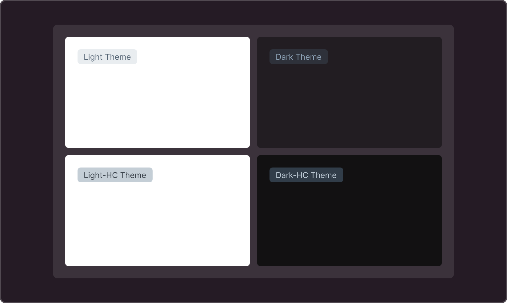
Page background color. The most common color for a light theme is white, but you can use any color you like. Dark themes have more options, from neutral gray shades to warm or cool colors.
--g-color-base-brand
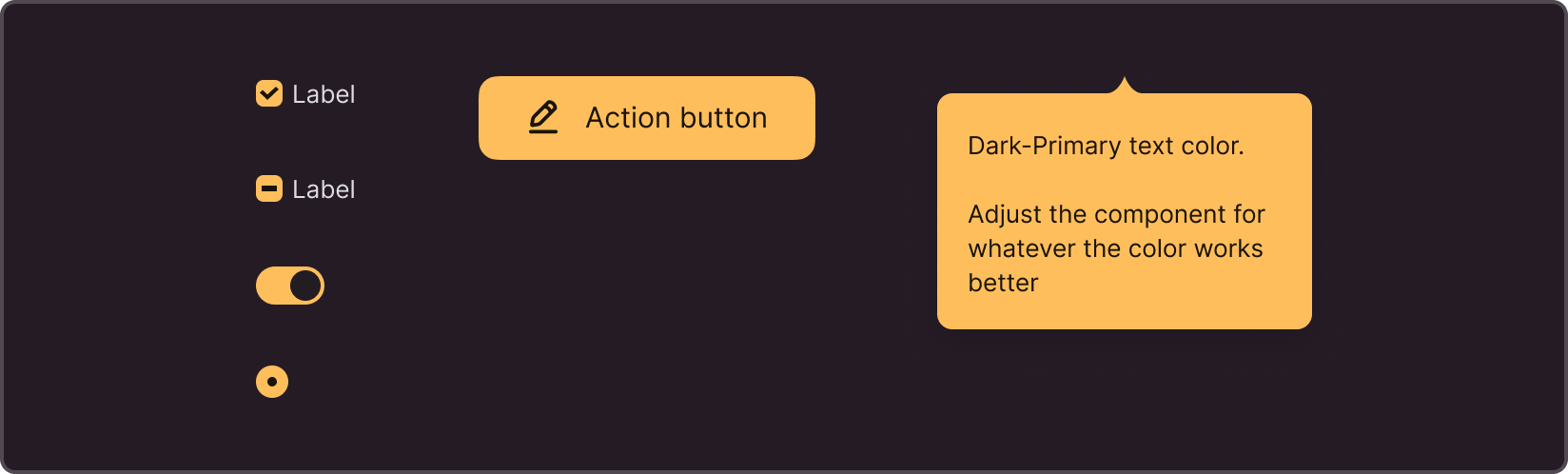
Primary brand color. Background for the main button, checkbox, radio, switch, and special tooltip theme
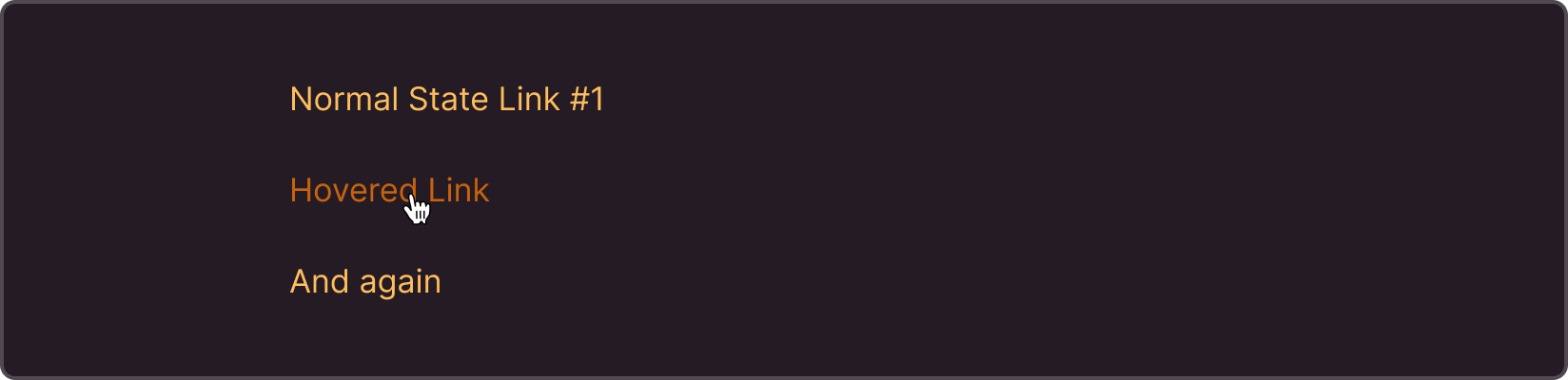
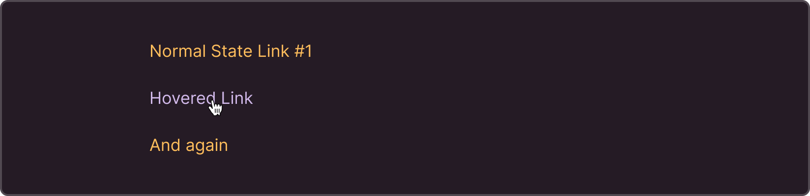
--g-color-base-brand-hover
Hover color for the primary brand color. We are using a darker shade, but a lighter or completely different color is also acceptable.

--g-color-base-brand-selection
Underlays for elements with “selected” semantics
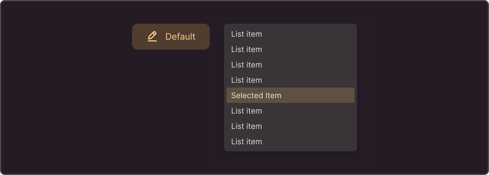
--g-color-base-brand-selection-hover
Hover color of the selected elements. It is used less frequently in typical tasks and more frequently when preparing all states for a new component or prototyping.

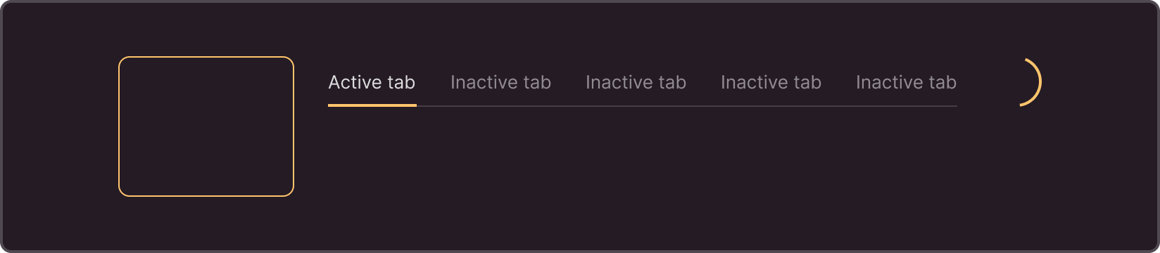
--g-color-line-brand
Brand-colored lines Selected state in cards, tabs; spinner color
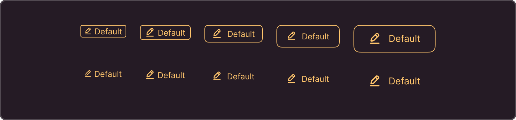
--g-color-text-brand
Brand-colored texts when used without underlays
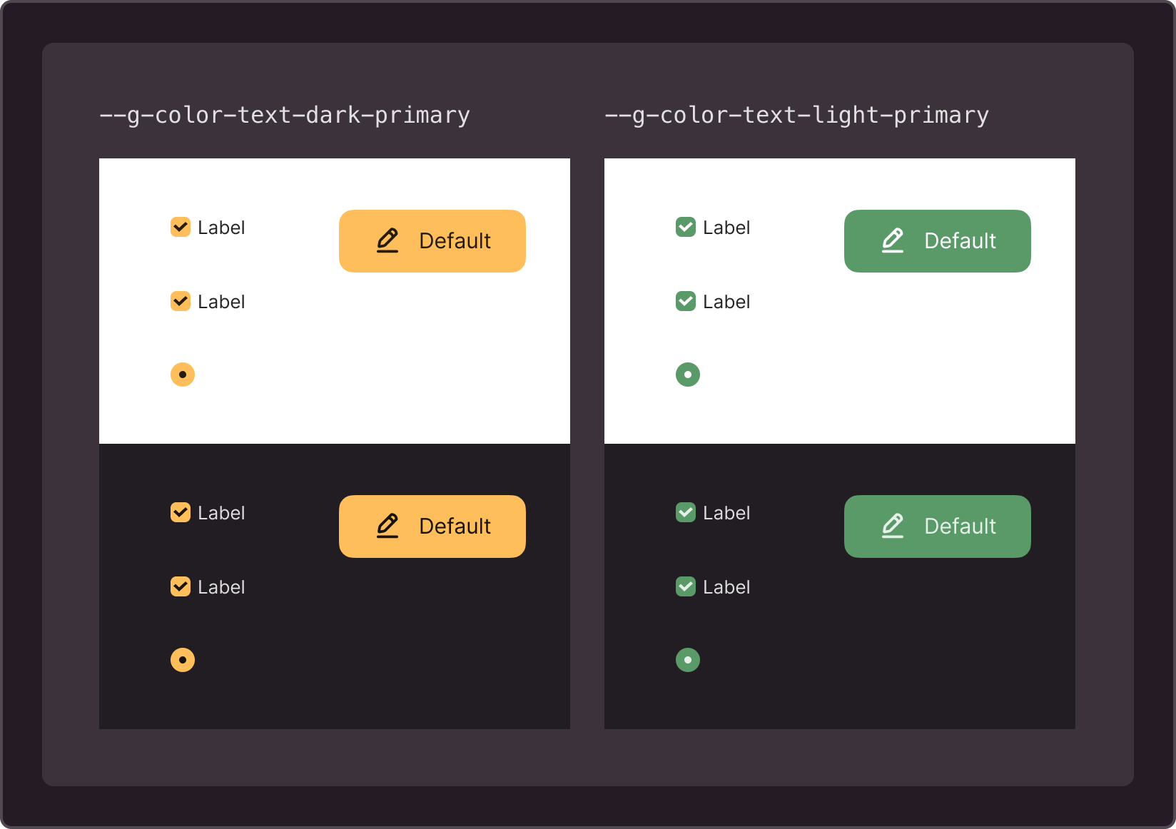
--g-color-text-brand-heavy
Brand-colored texts on top of underlays. Compensate for the loss of contrast caused by the use of an underlay.

--g-color-text-brand-contrast
Once you decide on a color for branding the main controls, choose a contrasting color for them. Contrast must be maintained across all themes.
If the brightness of the brand color does not change significantly when switching themes, you can try colors with constant brightness: --g-color-text-light-primary and --g-color-text-dark-primary. If the brightness of the brand color changes, try --g-color-text-primary or --g-color-text-inverted-primary.
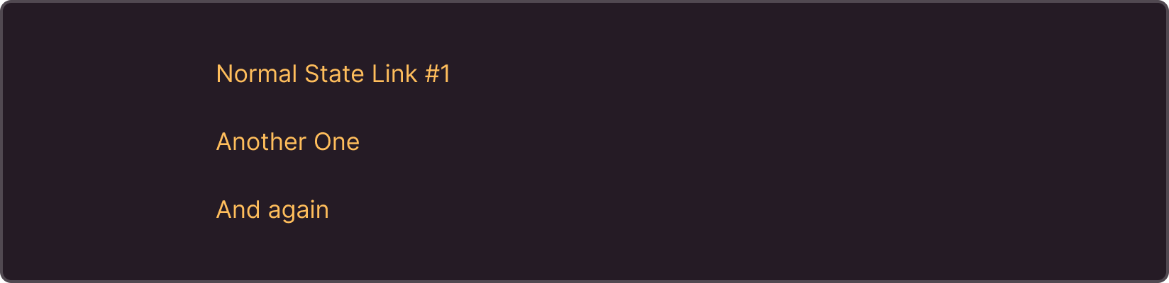
--g-color-text-link
Link color
--g-color-text-link-hover
Hover link color
--g-color-text-link-visited
Visited link color

--g-color-text-link-visited-hover
Visited link hover color
2. Typography
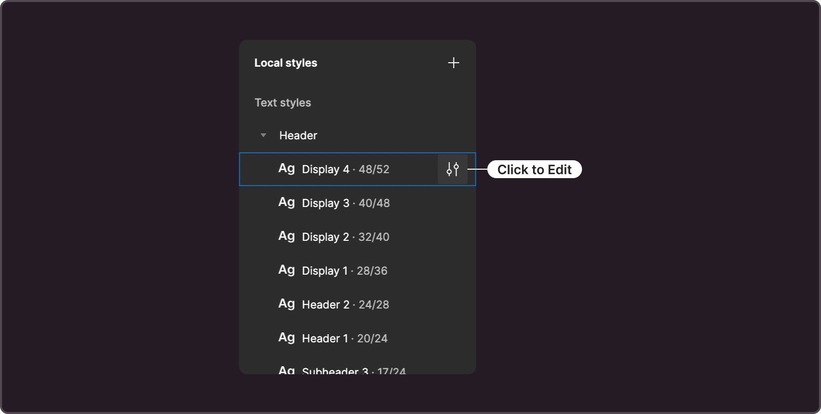
All text styles are listed in the right column of the library, under the section Local Styles. This section is displayed if there are no objects selected. In this case, the attributes of the selected object, not the library, are displayed.
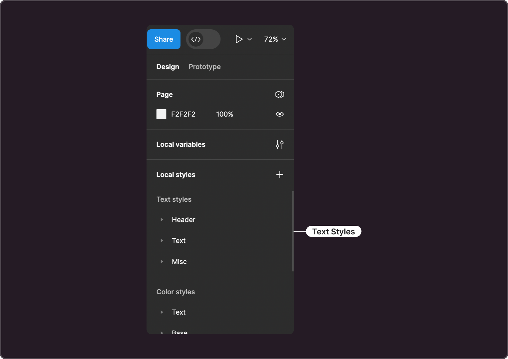
To access the text style editing interface, click the settings icon to the right of the style name.
Styles are divided into three groups.
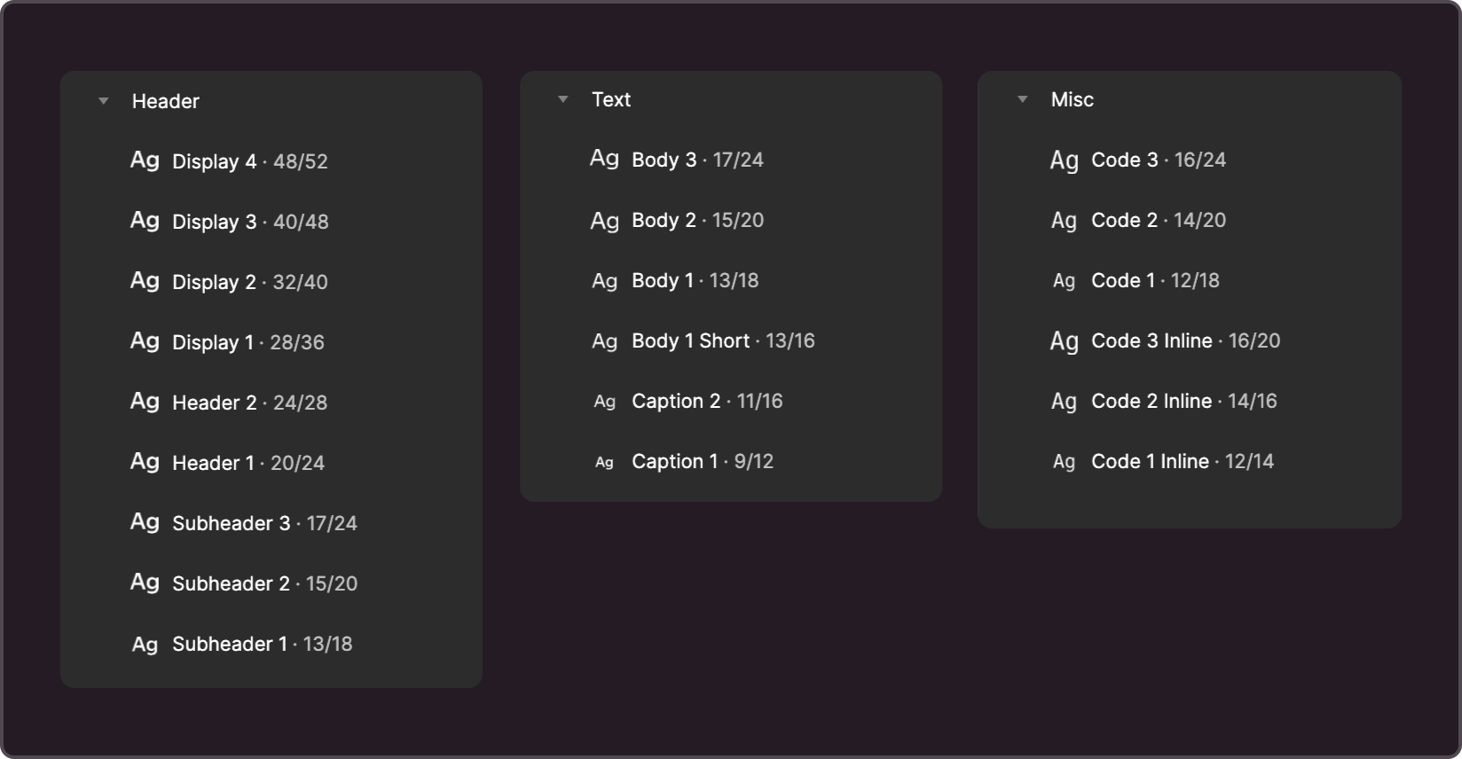
- Header. Contains headings, subheadings, and display styles.
- Text. Styles for typed text and captions
- Misc. Styles for displaying code and code within regular typed text (inline-styles).
For the Header and Text groups, you may use one font with varying weights. Headings usually have higher font weights than typesetting fonts.
For the Misc group, you can set a monospace font. Make sure that the inline styles are displayed correctly when embedded in typed text and that the typesetting's baseline is not shifted. Otherwise, it's recommended to choose a suitable value for the Line Height parameter.
For styles, minor changes to the Font Size and Line Height parameters are allowed. In different typefaces, the height and width of characters can significantly vary, and in some cases, this variation needs to be compensated for. Remember that certain text styles are used within specific component sizes, and significant changes to style parameters may result in components displaying incorrectly. Therefore, when making any changes to Font Size and Line Height, it is important to check how components are displayed in different sizes.
3. Corner radius
This parameter can be configured in the variable management interface. The values can be found in the Border Radius collection. This attribute is set by two groups of variables: primary and technical.
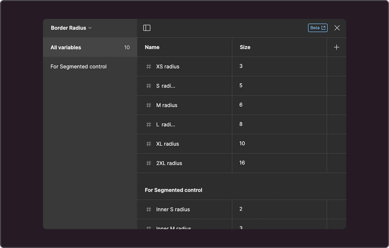
Primary set
This set of variables match the code variables These values are applied to controls of corresponding sizes.
- --g-border-radius-s: 3px
- --g-border-radius-s: 5px
- --g-border-radius-l: 6px
- --g-border-radius-l: 8px
- --g-border-radius-xl: 10px
- --g-border-radius-2xl: 16px
Technical set
Used only in Figma to calculate the corner radius of the internal element in the Check Button component. These are variables labeled as Inner, and their values should be linked to the values of the primary set of variables. To calculate the value of an Inner variable, take the value of the main variable of the same size and subtract 3.
For example, if --g-border-radius-m is set to 6px, then the Inner M radius is calculated as 6 - 3 = 3px.
4. Technical colors
This group contains the colors for scrollbars supported by the design system. To ensure proper display of scrollbars in dark themes across various browsers, it's recommended to configure them accordingly.
Variables in this group:
- --g-color-scroll-track
- --g-color-scroll-handle
- --g-color-scroll-handle-hover
- --g-color-scroll-corner
Advanced theme settings
Private color tuning
If you want to adjust a specific color shade so that it aligns with the brand colors, use a private palette. Private colors are configured in the variable management interface under the Private Colors collection.
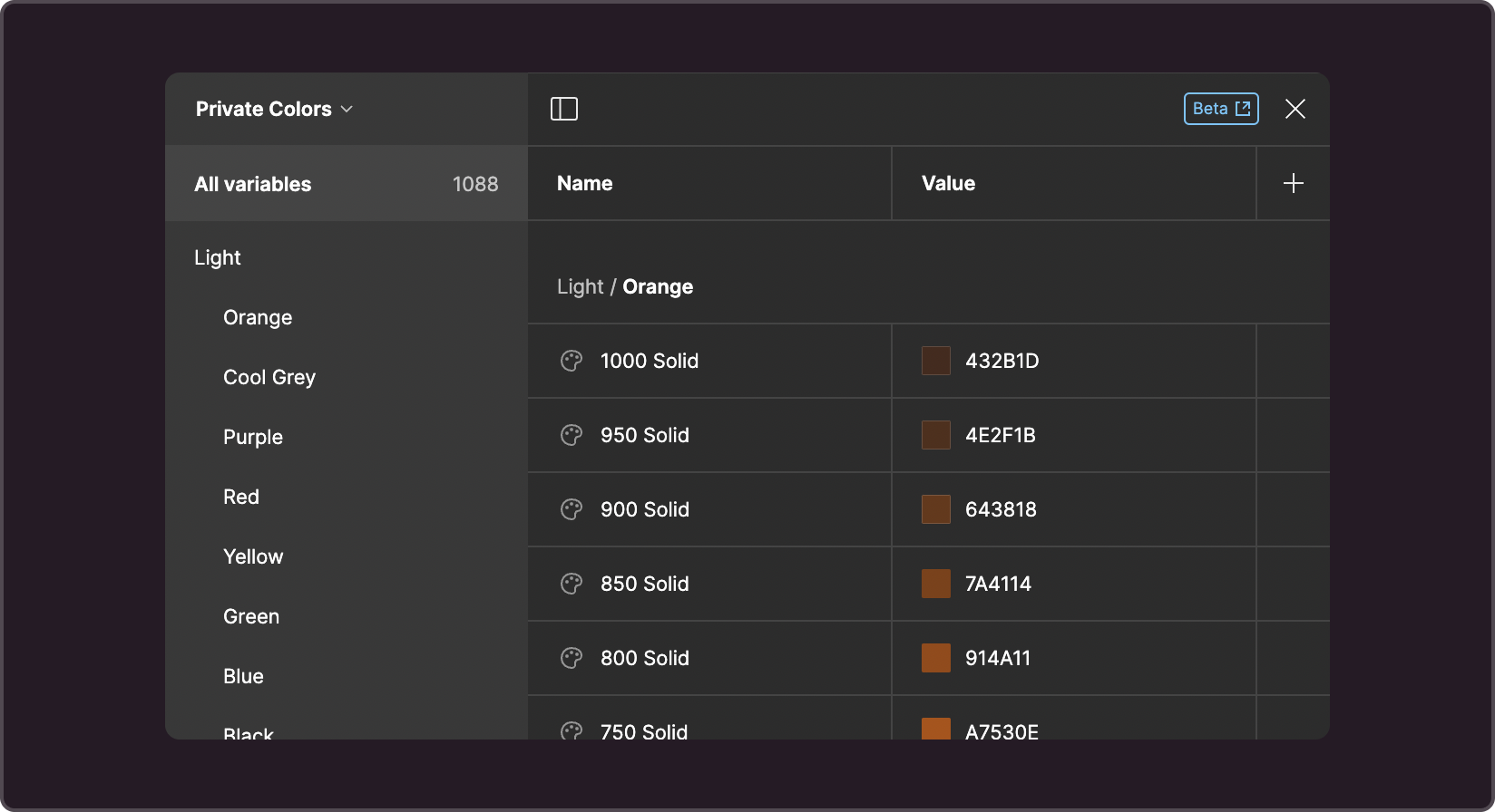
Basic chromatic colors:
- Blue
- Green
- Red
- Yellow
- Orange
- Cold gray
- Purple
Any of them (or all at once) may need to be adjusted to match the brand colors. To prepare a palette ready for handover to development, use a script. You'll need to transfer the script's output into Figma.
If the page background (or the background in the contrasting theme) has been modified, generate new solid shades for black and white.
When changes are made to the private palette, the semantic colors are automatically updated as well.
Semantic color tuning
If the values of private variables don't align with the brand's visual language, you can adjust the values of semantic colors. They are configured in the variables interface in the Color Styles collection.
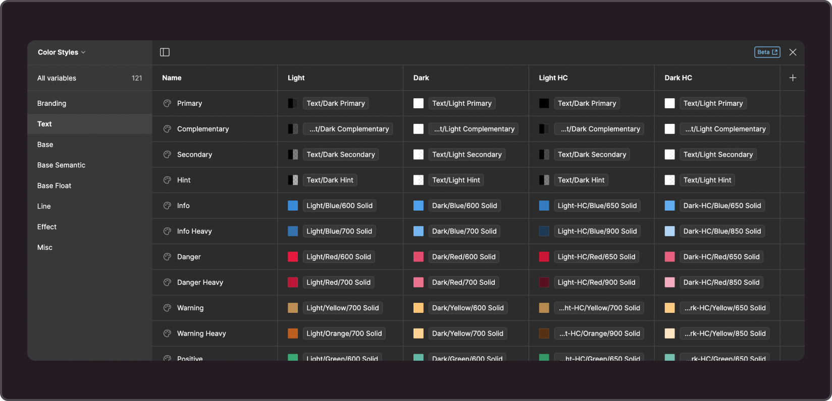
Please note the following:
- Make sure to use private colors that match the corresponding theme.
- Replacing private colors with an alpha channel with solid colors (and vice versa) may cause problems.
- Changes to semantic variables will be applied automatically to colorstyles and components that use them.
Synchronization with development
At the moment, theme synchronization between the Figma library and code is done manually. Prior to development handoff, CSS variables must be prepared according to the instructions.