Radio Group
Used when you have to choose between several mutually exclusive options.
When to use
Similar to checkbox, Radio doesn't trigger action immediately. To do this, you must click the confirmation button (Save / Apply / Send).
The explanatory text on the label should answer the question, "How?" or "Which?"
When to not use
Do not use Radio to switch between page or menu content. This functionality is supported by the radio-button and tab components
Structure
Contains multiple Radio components, with 1 — Radio element, 2 — explanatory label.

Radio is always used with a label that explains its meaning.
The first option is selected by default.
You can also leave the toggle controls unselected (when all options are removed).
Once an item within a group has been selected, the user cannot deselect it to return the group to its original state (without refreshing the page).
When using a component, we recommend that you always select the first option in the list.
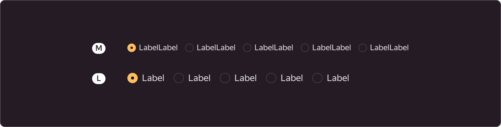
Sizes
The page provides two sizes: M and L. The size of the other page controls determines the choice of this component size. If the page uses size L for inputs, buttons, and other elements, we recommend using the matching size for radio buttons. The size selected for the controls also determines the font size on the page.
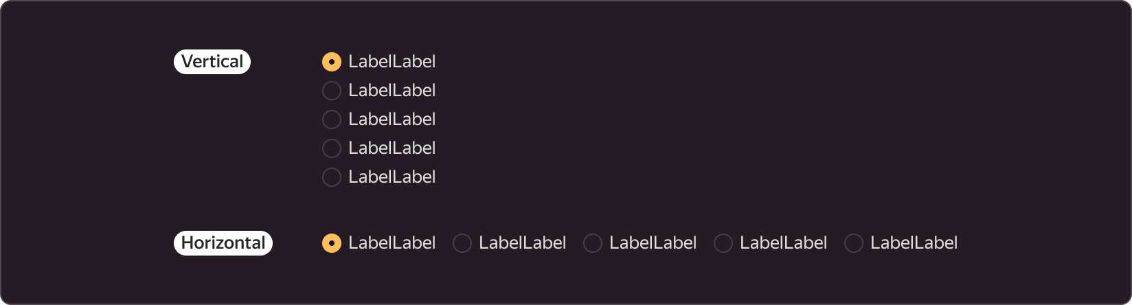
Positioning
You can use this element both in horizontal and vertical layout.