Text Input
A component for entering arbitrary text, numeric, and symbolic values in a single line. Can be used in page forms and dialog boxes, as well as in login, search, and filter forms.
Application
Unlike TextArea, it does not change height during the input and is used for simple free-form data with any combination of letters, numbers, or symbols.

When entering text that exceeds the width of the field, you can scroll through the content to the left and right.

✅ When to use
- When only one line of text is required.
- When selecting an option from a predetermined list is not possible.
- When there is enough space for data entry and there is no need for more complex input interfaces.
🚫 When to not use
- When a parameter can be entered only from a predefined list, as this may result in an error. For this purpose, consider using other components with a specific selection of value options, such as Select, Radio Button, Radio, and Checkbox.
- When a large number of characters must be entered (more than 5 words). For this purpose, we recommend using TextArea, a component for multi-line text input.
Types
TextInput has two types: Normal and Clear, which have the same set of functions but look and are used differently depending on the context.

Normal
- The most commonly used type.
- A distinctive feature of this component is its internal padding and corner radius. These parameters are determined by the element's size and a 1px stroke.
- Used in forms when free space between components is required, such as padding between form elements.
Clear
- This component's defining characteristic is the absence of a border, with elements positioned within the margins of the input field.
- Used when the type Normal creates visual noise.
- When using this type, make sure that the purpose of this component is clear to the user.
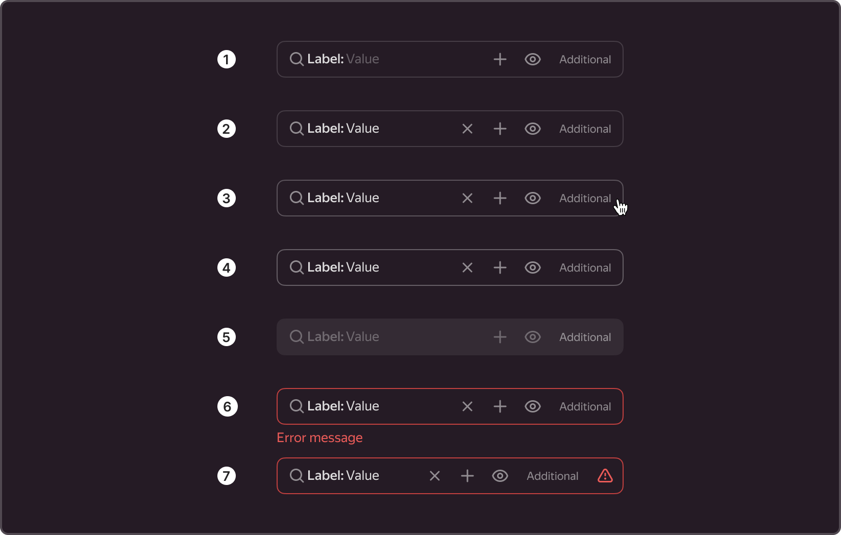
Structure
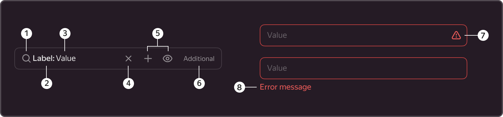
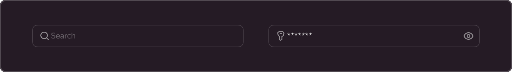
1. Left icon
- Is an optional component.
- The icon can be used for additional field identification.
- If this is a search string, for example, a "magnifying glass" icon can be used. Or a "key" icon, if this is a password entry field.
2. Inline label.

- Is an optional component.
- Amplifies the value of the field name.
- Replaces the external label.
- Used as a field name because, when a value is entered, the hint disappears, leaving the purpose of the field unclear to the user.
3. Value
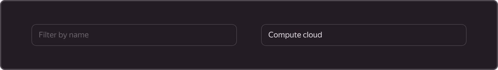
- Is a required element.
- Space used for the text of the hint and the entered text.
- After one character is entered, the entered text replaces the hint.
4. Clear button
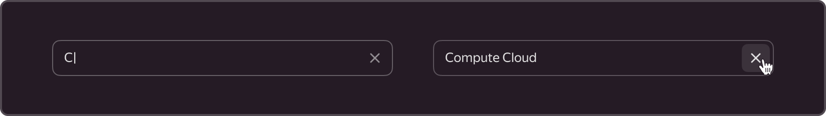
- Is an optional component.
- Used when the field content needs to be erased.
- Displayed when at least one character has been entered in the field.
- Displayed even when the focus is outside the field.
- Is a Button component of type Flat-secondary that inherits all of its properties. For example, the background of the cross is filled on hover.
- When clicking on the clear button, the focus shifts to the field, and the entered value is erased.
5. Inline buttons
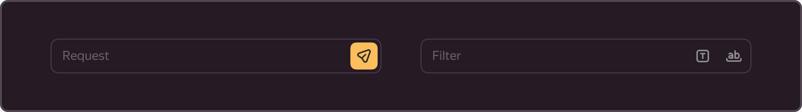
- Is an optional element and is embedded on the right.
- Used to more clearly indicate the relationship between content and actions and can be placed within a component.
- The field allows for a maximum of two Button components.
- The size of embedded buttons should be one size smaller than the component's own size. For example, if a size S is used, the button should be XS; if a size M is used, the button should be S; and so on.
- For example, it can be used to confirm actions, send messages, or add additional filters to a field.
6. Additional content
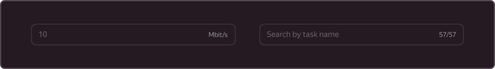
- Is an optional element and is embedded on the right.
- Used when additional text is required inside.
- The text is aligned to the right.
- For example, can be used as a counter (counter of entered characters), for counting the number of values found in a search string, or for units of measurement.
7. Error icon

- Is displayed only in the Inline Error state.
- Works together with Tooltip, offering error descriptions upon hovering over an icon, to achieve a compact layout of the form.
8. Error description

- Is displayed only in the Outline Error state.
- Is embedded at the bottom left.
States
Has the following states: Suggest, Default, Hover, Active, Disabled, Inline Error, and Outline Error.
- Suggest. Inactive state when there is no direct interaction with the component and no data has been entered. In this state, the value may serve as a hint, indicating to the user what kind of information should be entered into the field.
- Default. Inactive state when there is no direct interaction with the component and data has already been entered. In this state, the hint value changes based on the user's input.
- Hover. Active state when the cursor hovers over the component area.
- Active. Active state, triggered by transitioning from the previous component or by clicking on with the cursor. The state resets upon transitioning to a different component or clicking the cursor on an empty area.
- Disabled. Inactive state of a component when it is not possible to interact with it.
- Outline error. Active state of the component when an error occurs during validation and is displayed at the bottom of the field along with an explanation.
- Inline error. Active state of the component when a field validation error occurs, but the error is not displayed. Instead, the error is represented by a special icon that, when hovered over, displays an error Tooltip.
Sizes
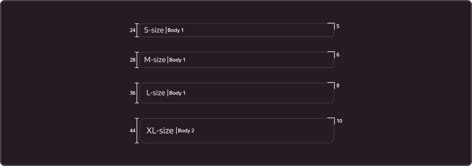
The component comes in four sizes: S, M, L, and XL.
The height and corner radius of the field, as well as the padding inside the field and the size of the text, vary based on the size of the component.
The corner radius depends on the size and is set by variables.
- S (-g-border-radius-s: 5px;) – used when the standard input is too large (e.g., tables, small cards).
- M (-g-border-radius-m: 6px;) – basic size, used in most forms and filters.
- L (-g-border-radius-l: 8px;) – used for search (e.g., service search).
- ХL (-g-border-radius-xl: 10px;) – used in the communication environment (e.g., website and landing pages).
User guide
1. Working with the field
- The field can contain only one line. For this purpose, we recommend using TextArea, a component for multiline text input.
- We don't recommend including a hint within a field, as the field name will not be visible upon entering a value, unless you have limited space or the purpose of the field is clear to the user.
- The width of the field must be the same as the width of the entered value. It informs the user of the expected input.
- Use the same size for all of the complementary components of the form. If you selected size M, all of the other components should be the same size.
2. External field header
- A short field name, preferably limited to one line.
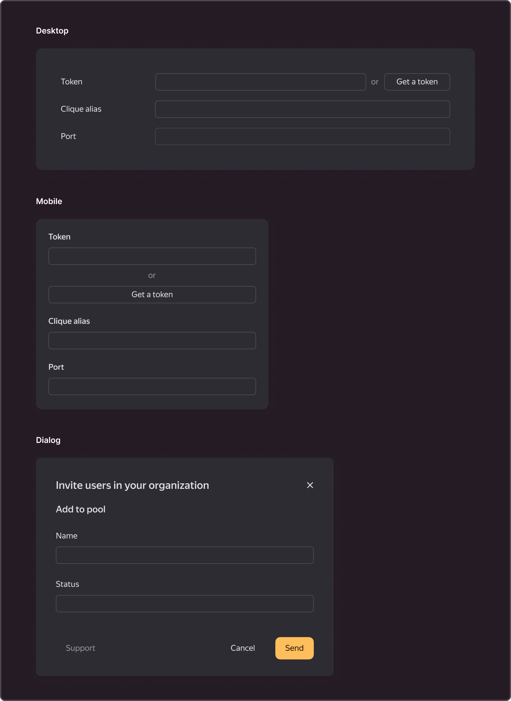
- In desktop forms, the component should be placed in line with the field's value. If the context is mobile or the Dialog size is S, the component's title is displayed on top of the component.
3. Hint with tooltip

- Instructions for filling out the field when hovering over the icon with a question mark.
- Used when the title should be clarified.
- Should not include more than two paragraphs of text.
4. Additional description

- Can be found at the bottom or to the right of the field.
- Used in rare cases when it is unclear how to fill out a field without an additional description or when explanations for previously entered values are required.
5. Units of measurement can be placed as follows:

- In the text description of the field, If there is enough space in the form.
- Within the input field, if the description must be shortened.
- To the right of the field, if space is needed for other elements inside the field, such as buttons or a clear (reset) icon.