User
A component for displaying an avatar along with the user name and contact information, with content that can be easily modified.
Structure
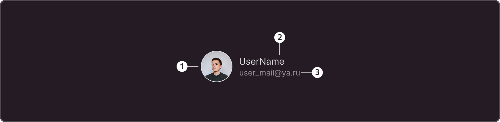
- User avatar (Avatar component)
- Username Block (Optional)
- Contact Block (Optional)
Size
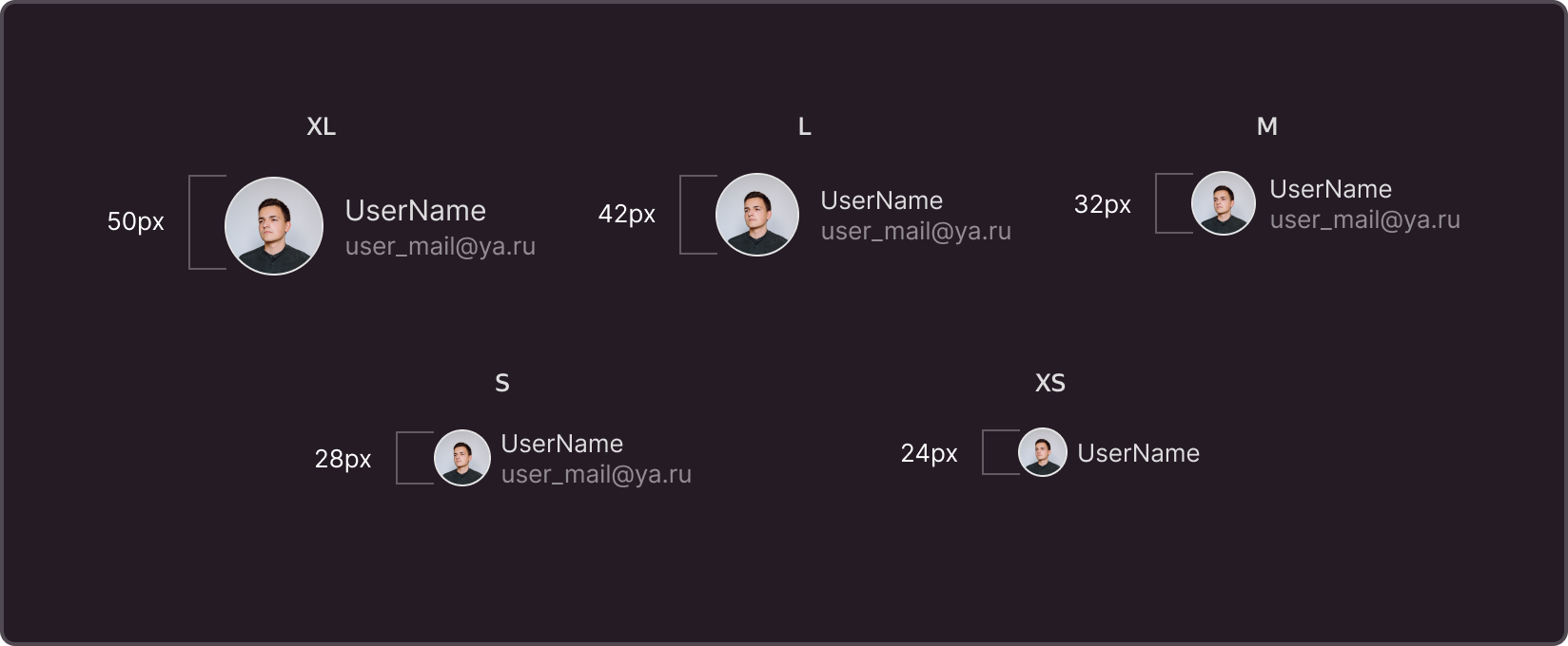
XL - 50x50px avatar + text frame that can be adjusted to the content width
L - 42x42px avatar + text frame that can be adjusted to the content width
M - 32x32px avatar (Default) + text frame that can be adjusted to the content width
S - 28x28px avatar + text frame that can be adjusted to the content width
XS - 24x24px avatar + text frame that can be adjusted to the content width
Types of content
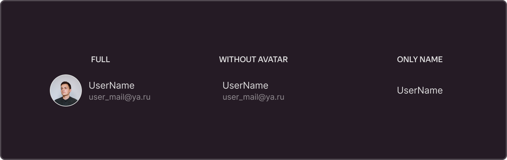
Full Block (Default)
By default, the component is configured to display the maximum amount of content, including an avatar, a name section, and a contact section.
Display without a user avatar
Optionally, the user avatar block can be disabled.
Functionality
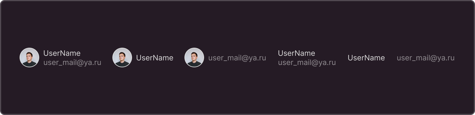
Flexible configuration of an optional display
Any component block can be disabled if necessary.