Tooltip
Tooltip — a basic component on top of which Action Tooltip is built. Is displayed upon hovering over a button and contains an explanation or additional information about the action that will be performed upon clicking the button.
The tooltip is only used when custom content must be included inside a hint. In other cases, it is recommended to use Action Tooltip.
Sizes and styles
The size of the tooltip is adjusted to the content. The color and style of the tooltip cannot be changed.

Content inside
The tooltip can contain any type of content. When designing tooltip content, it is recommended to follow general guidelines and indents.
Timing
You can change the timing of its appearance and disappearance based on its purpose. The tooltip appears with a 250-ms delay by default and disappears when the user moves the cursor away from the button.
If you think that most users will click on a button without reading the tooltip, it is best to use a delay instead of annoying them with too many prompts. If you think that few people will click the button without the tooltip, remove the delay so that the user does not have to wait for a description of the functionality.
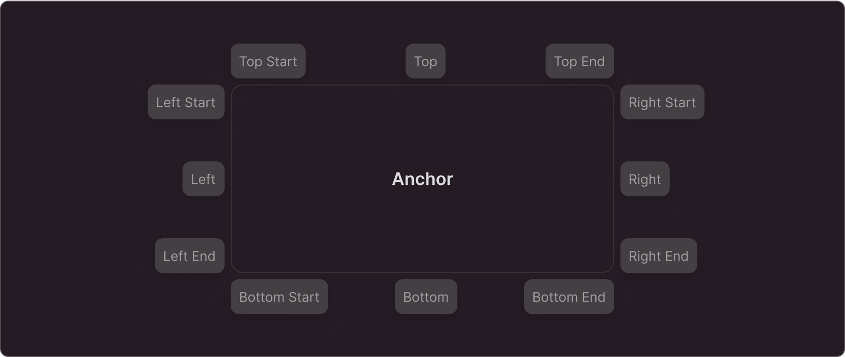
Position
The position of the tooltip is selected with the goal of minimizing the overlap with page content. The optimal placement for the tooltip is where it overlaps the page content the least.