DropdownMenu
The component allows the user to select a parameter or action from a context list. A drop-down list can be accessed by clicking a button with three-dots. The icon is customizable and can be replaced. Users can navigate between items on the list using keyboard controls.
Structure
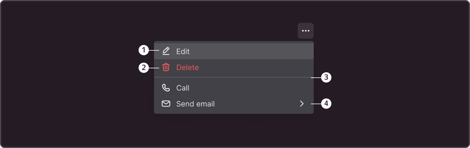
➊ Context menu icon
➋ List item
➌ Separator
➍ Submenu chevron
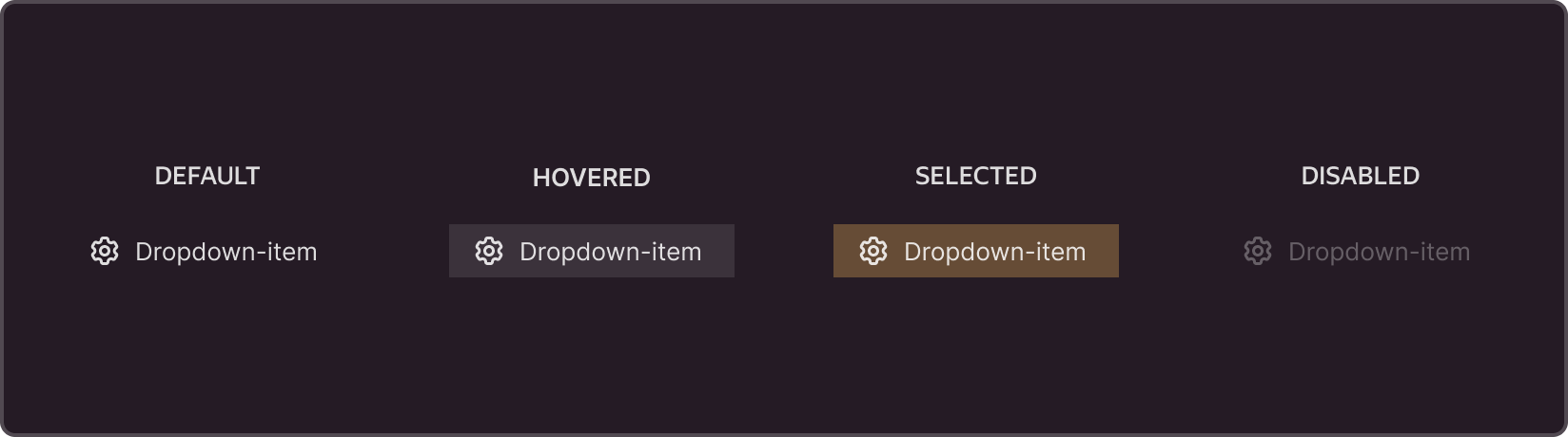
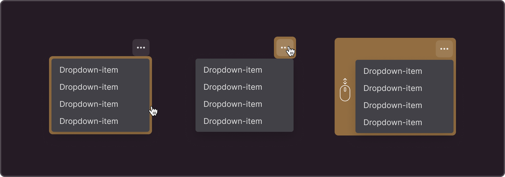
States
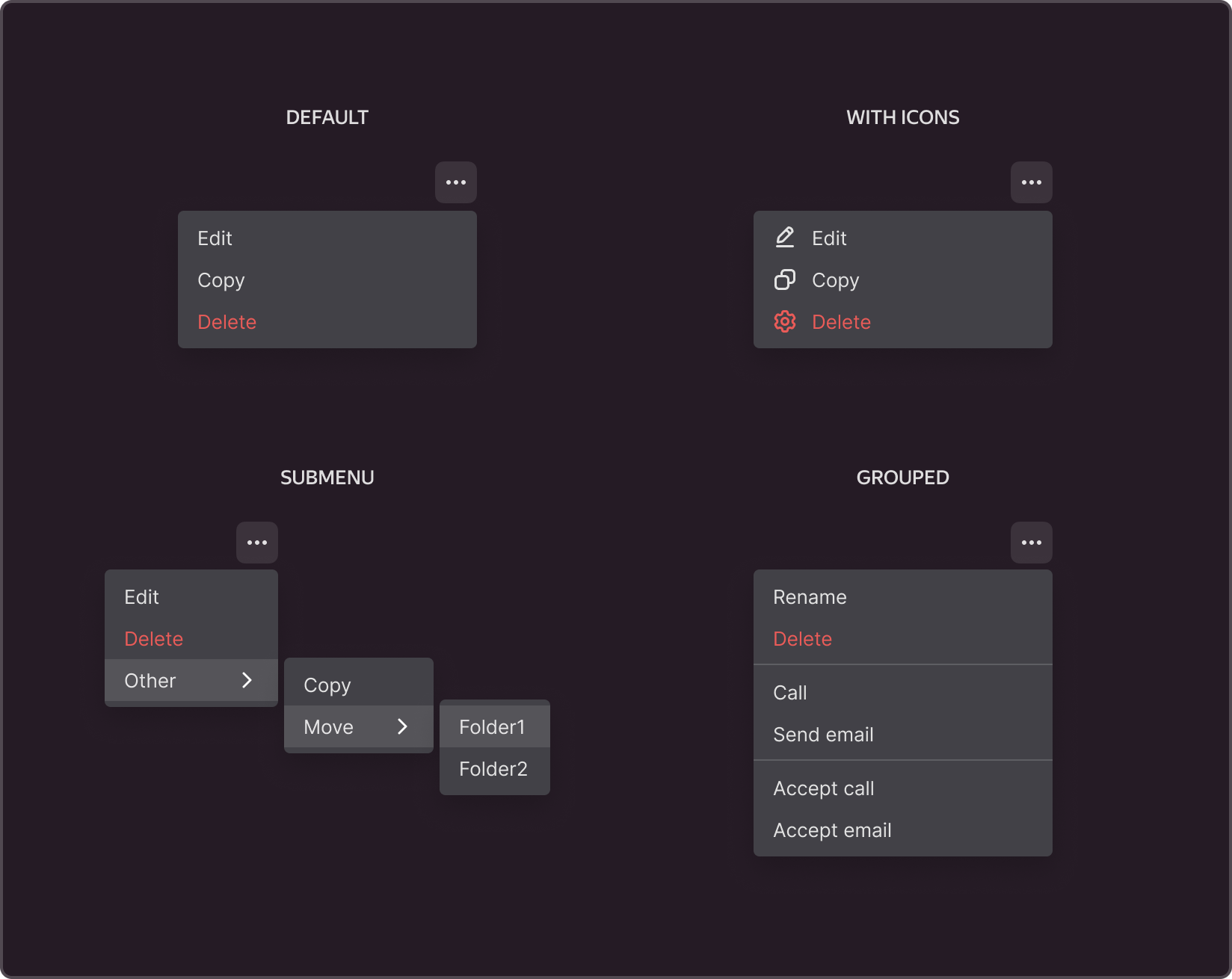
Types of content
Size
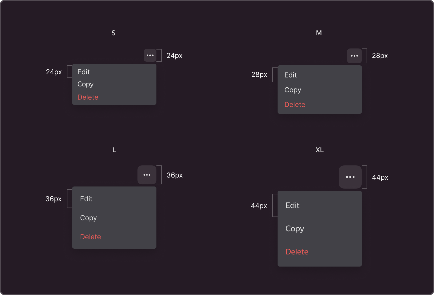
Icon
The context menu icon has four built-in sizes by default.
Size S: 24x24 px, M: 28x28 px, L: 36x36 px, and XL: 44x44 px.
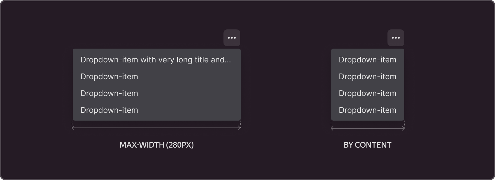
Component width
When a menu item is longer than the object that triggers it, the menu will expand to match the width of the longest item in the list. The maximum component width is 280 px.When the text of a menu item exceeds its maximum width, it will be truncated with an ellipsis.
Scope
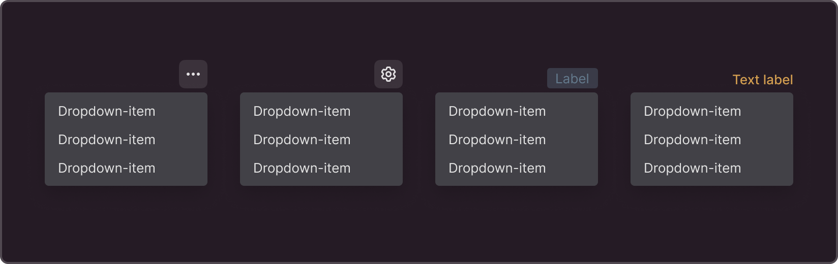
Configurable call icon
The context menu icon can be resized or replaced with a different one. The component uses a three-dot button with a 16px size by default.
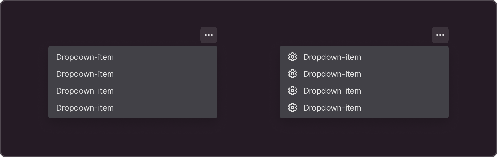
Optional menu item icon
You can add icons next to context menu items to help the user understand their functions. The default size of the icon in the context menu is 16x16px.

Nested dropdown submenus
Elements of the context menu can be nested within each other. The default nesting depth is set to support up to three levels.
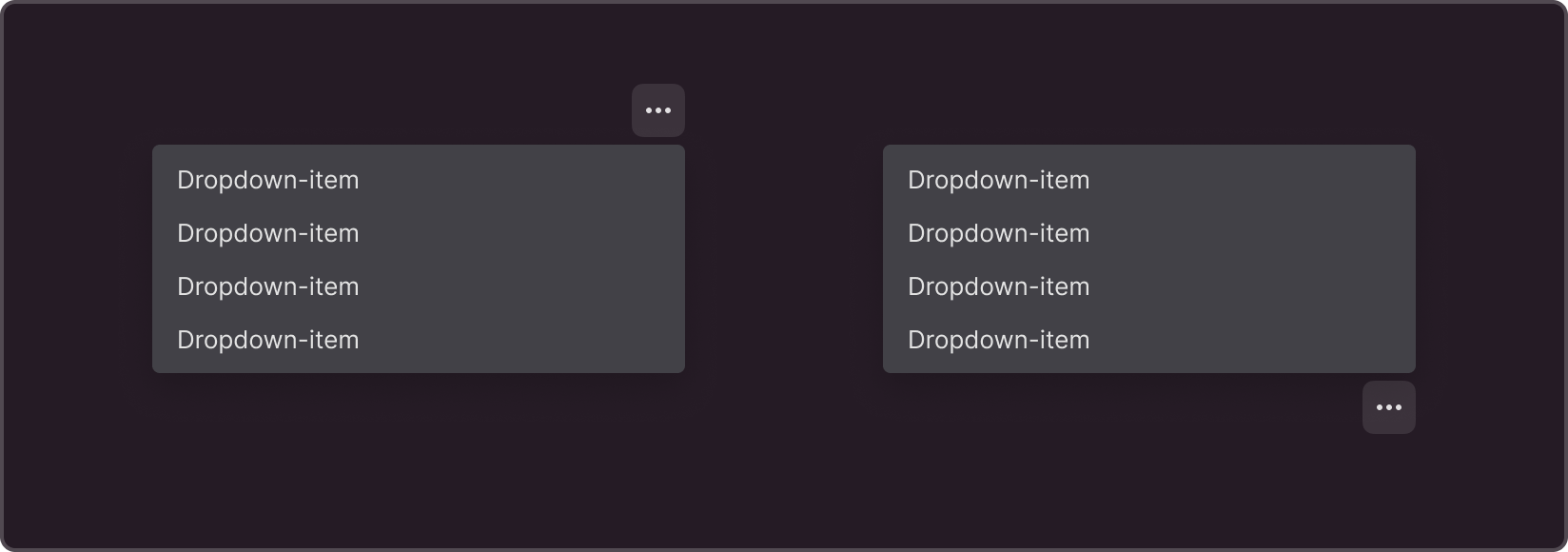
Positioning
By default, the dropdown menu appears beneath the element that invokes it, with the menu icon in the right corner. If the interface does not support a drop-down list beneath the switch icon, the list expands above the icon.
Closing the context menu
You can close the context menu by clicking on the area outside of it or by pressing the ESC key. By default, the menu collapses during page scrolling, but this behavior can be disabled.
Recommendations
Dropdown menus are used when there are at least two options to choose from.The optimal number of options is between 5 and 10.
When arranging menu elements, ensure a logical order by placing the most frequently used and popular options at the top.Try out different menu items and refine them as needed.