Grid and container
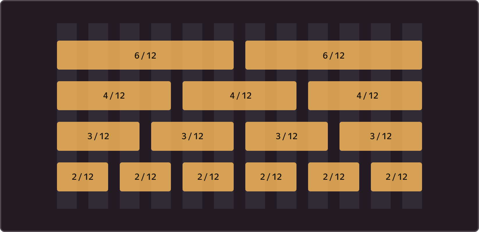
The space module allows us to define strict rules for size and spacing calculations, while the grid helps structure the content into visually organized blocks. We use a 12-, 8-, and 4-column grid that makes it possible to divide the selected area into halves, thirds, and fourths.
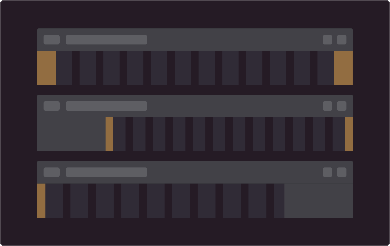
Grid structure
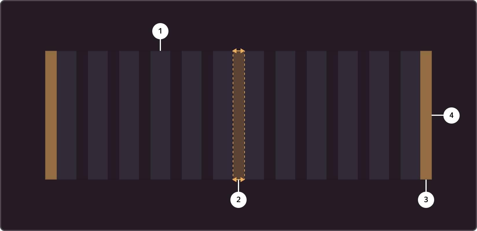
Columns ➊ define the boundaries for horizontal alignment; spaces ➋ provide padding between grid columns; outer margins ➌ ensure padding and center alignment of the container ➍. The grid column width is determined by a percentage value, and the default column spacing is set to 20px.
Container
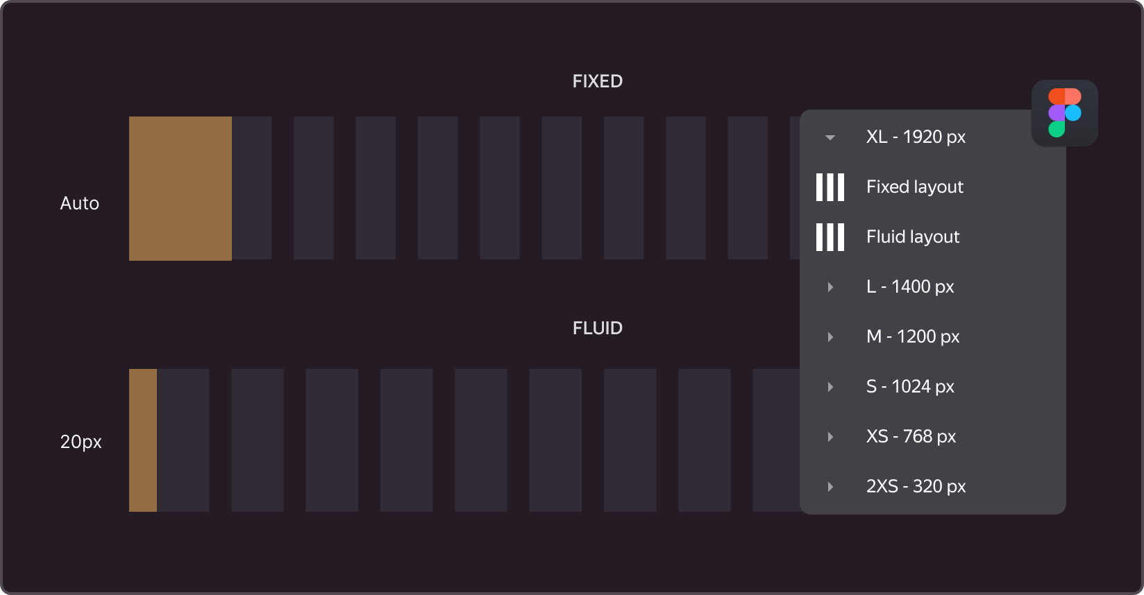
A container is a fundamental component of system design that contains and organizes content within a given viewport. We use two types of containers: Fixed with a fixed width (which means that its fixed max-width can change at each breakpoint) and Fluid with a variable width, which occupies 100% of the available space (except for sizes S, XS, and 2XS).
Breakpoints
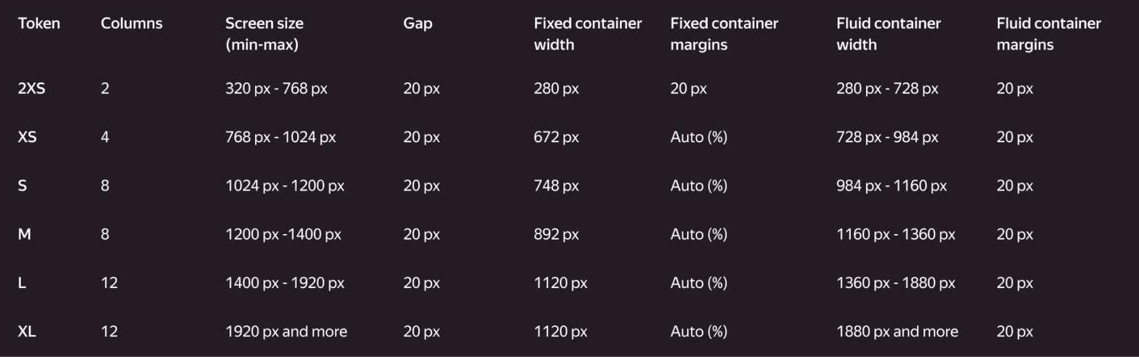
Media query breakpoints, or breakpoints, are predefined viewport widths that allow you to manage various grid settings.
Exclusion zones
In UI design layouts, users expect certain elements to be positioned in specific areas. We refer to these areas as "exclusion zones," and we do not include them in our grid system. When flexible or navigation panels expand, the content and grid are either compressed to fit within the browser or extended beyond it. Overlay panels cover the content without affecting the main container.