
AIReady
A11YReady
TouchReady
i18nReady
RTLReady
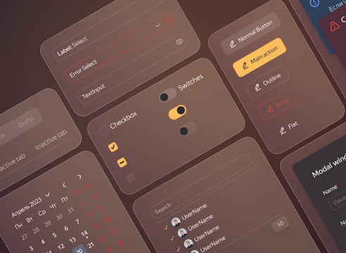
Build modern interfaces with the Gravity design system and libraries
Recent updates
We added illustration theming to the Specific section in Themer — now you can quickly try your theme on illustrations!
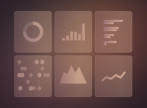
In a new blog post, we introduced Gravity UI Charts!
Configure auto-generation of OpenAPI/Swagger in ExpressKit applications with the new expresskit‑api library!
Examples
Our libraries


Trusted by
