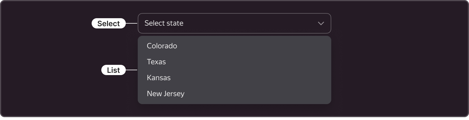
Select
A component for selecting one value or a set of values from a specified list. When the user clicks the control, a drop-down list opens with a set of values for the user to choose from.
Use cases
When to use?
- When you expect the user to select values from a specified list.
When to avoid?
- When you want to show all values to select from. For such use cases, use Radio, Checkbox, or Radio Button.
Options
Single selection
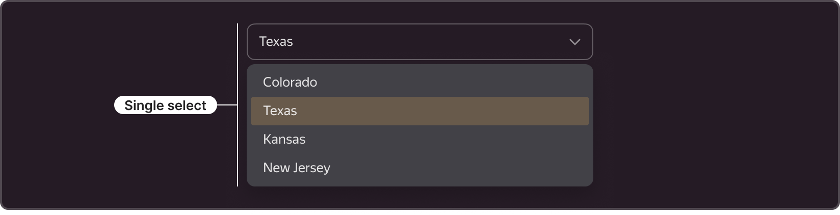
- Use for selecting a single value from a list.
- After the user selects a value, the drop-down list is closed.
- The control shows the selected value.
Multiple selection
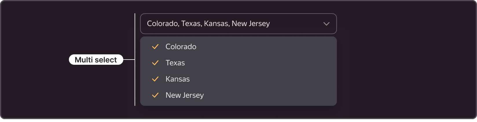
- Use when you expect the user to select more than one value from a list.
- In the list, the selected value is marked with a checkmark on the left.
- The control shows the selected values separated by commas.
- To close the drop-down list and apply the selected values, the user clicks the blank space outside or the confirmation button in the list (if provided).
Types
The control comes in two types: Normal and Clear, both having the same set of functions but looking different and applied depending on the context.

Normal
- The most frequently used type.
- The distinctive feature is that the component has a 1 px border, and elements inside (text and chevron) have margins from the edges.
- Use this component in forms where you need to separate form elements using margins.
Clear
- The distinctive feature is that the component has no border, and elements inside (text and chevron) are flush with the input field edges.
- Use it when the Normal type creates visual noise.
- Using this type, make sure that the component meaning remains clear to the user.
Structure
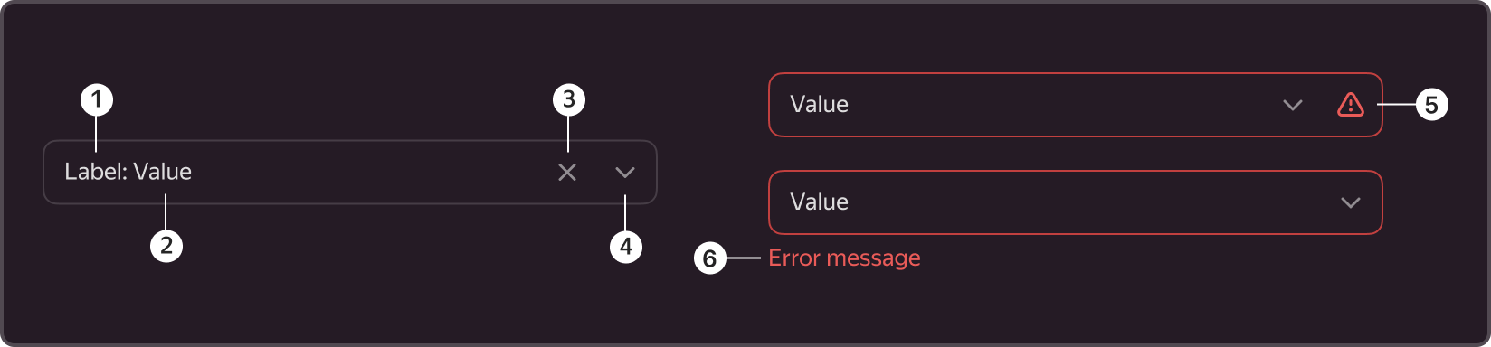
- Inline label
- Value
- Clear icon
- Chevron
- Error icon
- Error description
Inline label

- An optional element.
- Adds an explanation to the select field name.
- It can replace the external label in the form.
Value

- A mandatory element.
- By default, it is a hint to help the user understand what can be selected from the list of values.
- The place where the selected value or values are displayed.
Clear icon

- An optional element.
- Use it to quickly clear the component of selected values or value options without invoking the dropdown list.
- It can show up when at least one value has been selected.
- After clearing, the focus remains in the component.
- It changes color on hover.
Chevron

- A mandatory element.
- Use it to differentiate the component from other visually similar components (for example, TextInput), to identify the component in the form.
- The component can only be with a chevron, for instance, when you need a compact view.
- Despite the presence of a chevron, the entire component area is clickable.
Error icon
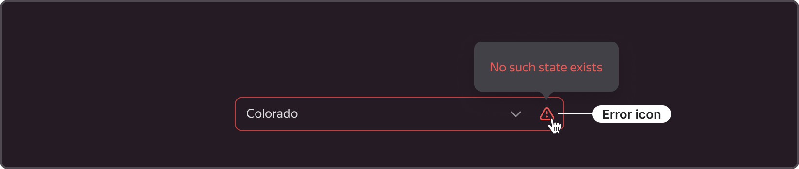
- It is displayed only in the Inline Error state
- It works together with an error description Tooltip shown on icon hover. It helps to keep the user informed but save space.
Error description
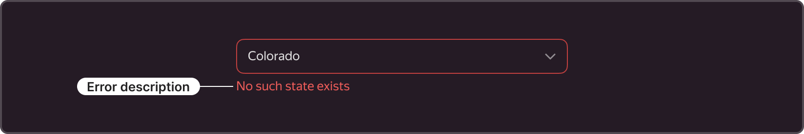
- It shows up only in the Outline Error state.
- The error description is placed at the bottom left of the field when you need to immediately display the error cause.
States
It has several states: Suggest, Default, Hover, Disabled, Active, Inline Error, Outline Error.
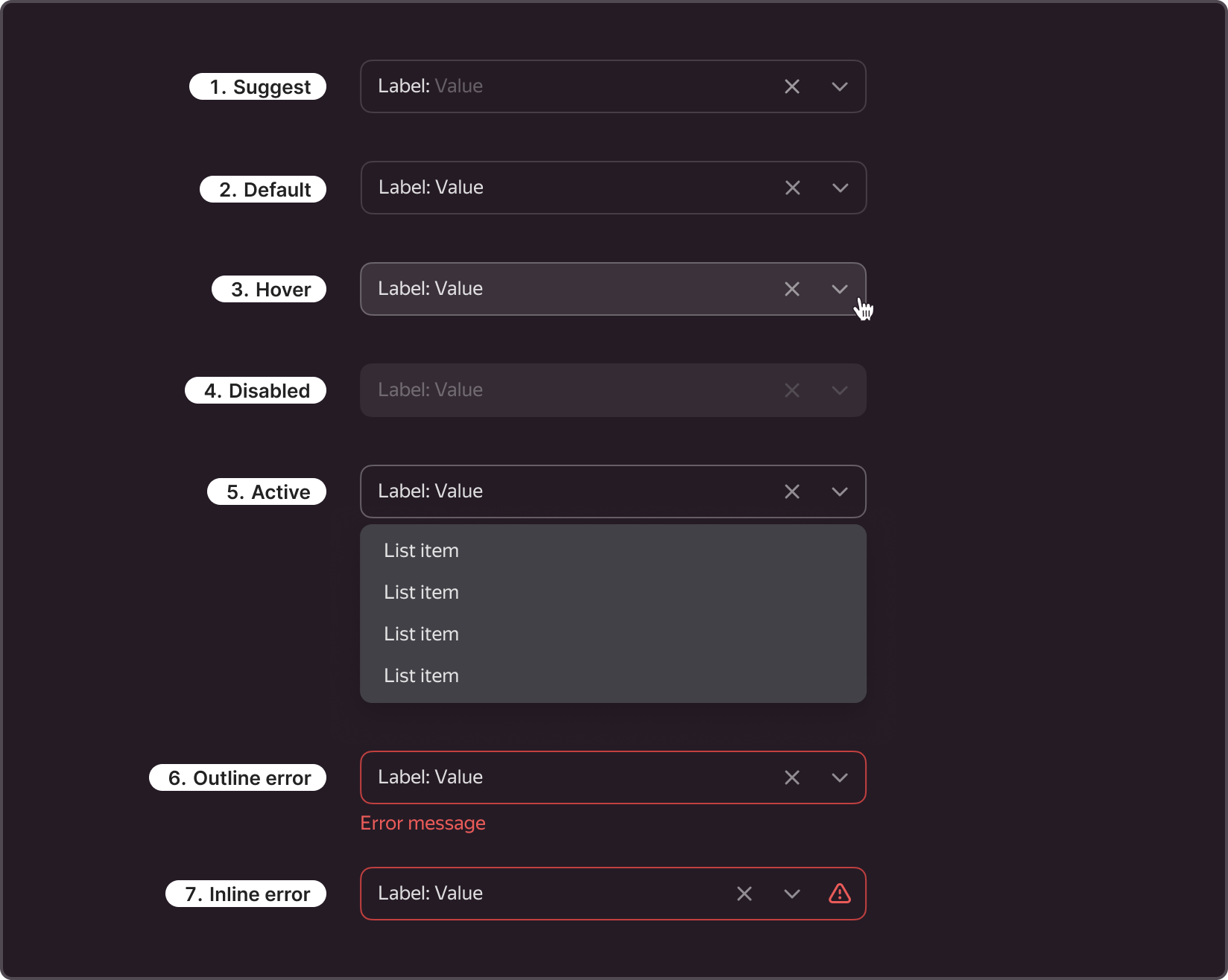
- Suggest. Inactive state, when the user is not interacting with the component directly and has selected nothing in it. In this state, it can hint the user what they can select.
- Default. Inactive state, when the user is not interacting with the component directly and already selected something in it. In this state, the hint value changes to the selection from the dropdown list.
- Hover. Active state when the user moves the cursor over the component area.
- Disabled. Inactive state of the component when the user cannot interact with it.
- Active. Active state enabled when the user has clicked the control. A dropdown list opens on click.
- Outline error. A component state triggered by a validation error, which is displayed at the bottom of the field with an explanation of what has happened.
- Inline error. A component state triggered by a validation error, but the error explanation does not show up, only a special icon. When you hover over the icon, a Tooltip with the error appears.
Sizes
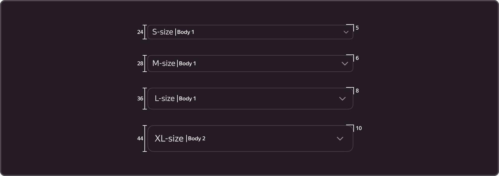
There are four component sizes: S, M, L, XL.
| Size | Height | Text style | Rounding |
|---|---|---|---|
| S | 24 | Body 1 | 5 |
| M | 28 | Body 1 | 6 |
| L | 36 | Body 1 | 8 |
| XL | 44 | Body 2 | 10 |
The size choice determines the height and rounding corners of the control, its paddings, and text size.
The corner radius depends on the size and is set by variables.
- S. Use it where the standard control is too large (tables, small cards).
- M. This is the main size, use it in most forms and filters.
- L. Very rarely used.
- XL. Use it in communication environments, i.e., websites and landing pages.
Usage recommendations
-
Working with the field
- Choose the field width depending on the content size. For instance, you can make the element wider for long values or multiple selection.
- Use one size with other complementary components in the form. If you chose to work with M, the other components should be of the same size.
- Use the cross icon for clearing multiple selection: this is more convenient and fast.
- You cannot change the height of the control. We only provide the fixed field size.
-
Outline label
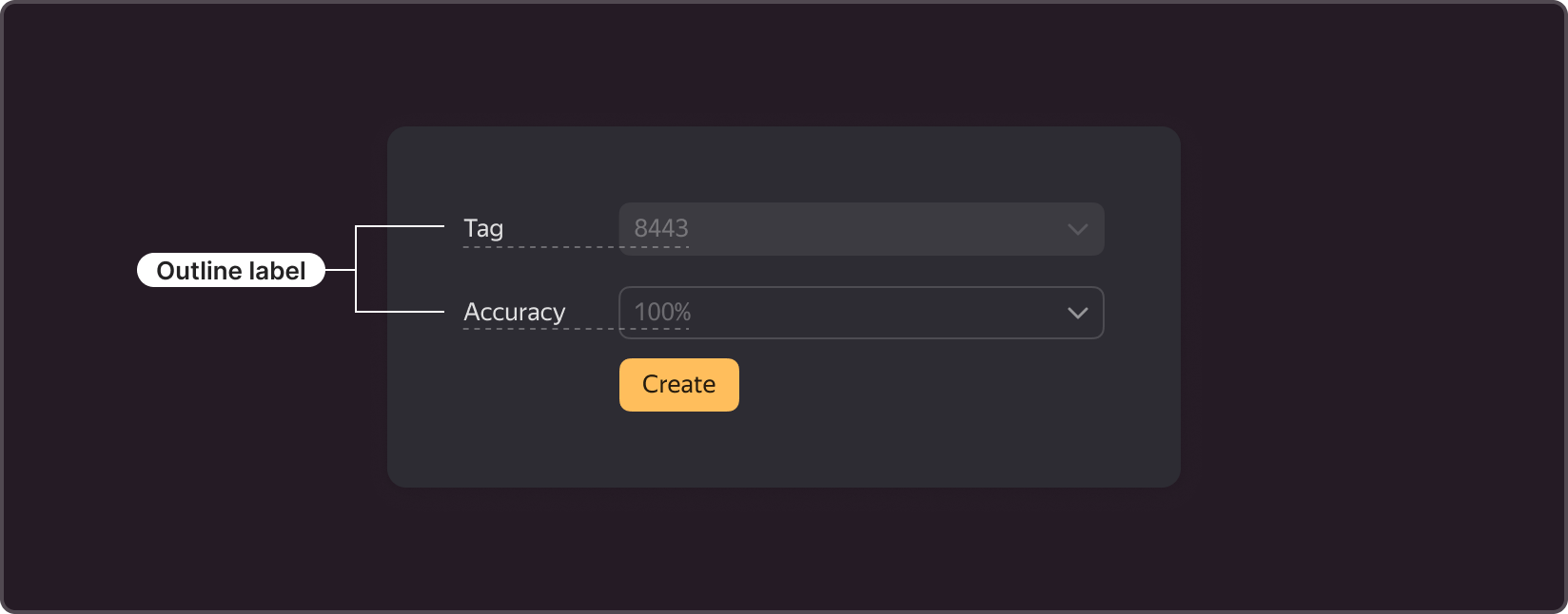
- A brief field name (should not exceed one line).
- When using it in forms, align it with the value inside the field.
-
Hint with a tooltip
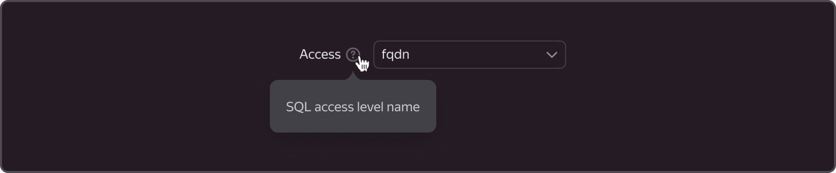
- Additional hint about the choice, shown when hovering over the question mark icon.
- Use it when you need to explain the label.
-
Description
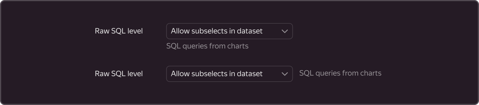
- It can be located below the field or to the right of the field.
- Use it in special cases to make additional clarifications about the choice or give explanations for the chosen values.