Alert
Alert is used to get the user's attention and provide them with useful information without disrupting their workflow.
When to use
It is designed to update the user on the current state of the system, report errors and warnings, and provide the user with instructions, links, or commands to correct those errors as soon as possible.
Types
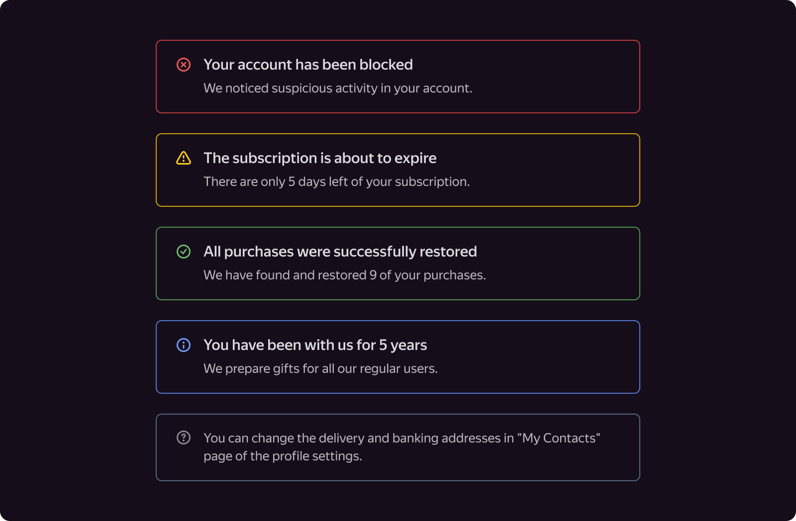
Depending on the situation, the user may see one of the following types of Alert (Type):
- Danger is used to notify the user that the underlying scenario cannot be continued at the moment (e.g., no access to an object) or that further user actions may result in the permanent loss of data or resources.
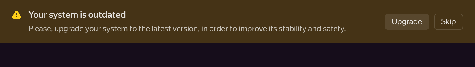
- Warning is used to inform the user that further operations may be difficult or that a fallback scenario may be unavailable.
- Success is used to notify the user of a positive status or any other positive change in the system. For instance, about the successful completion of a lengthy operation.
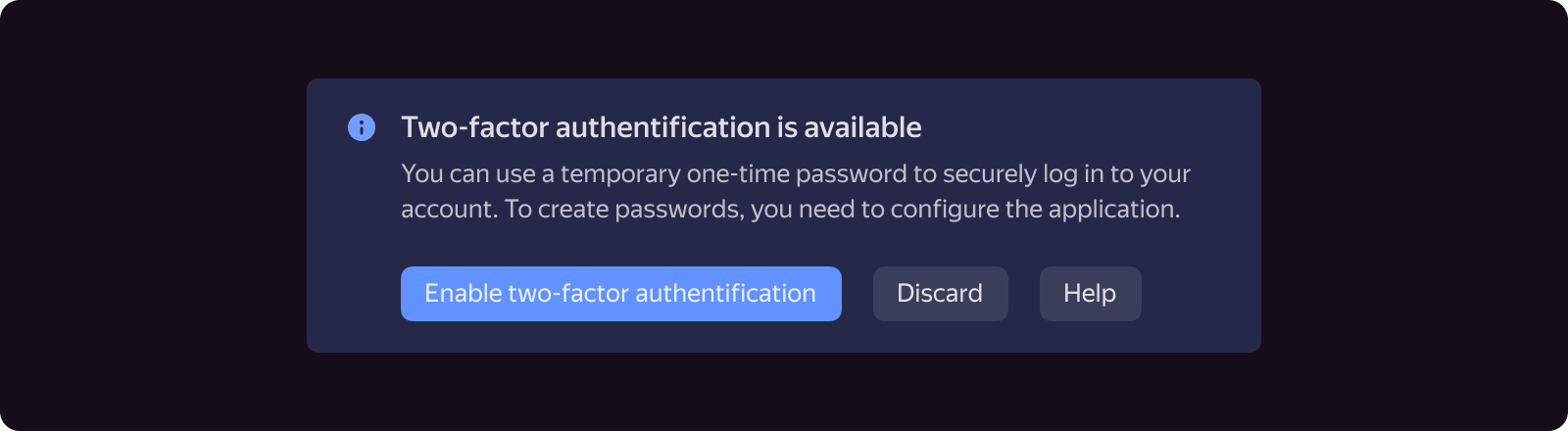
- Info is used to display recommendations on how to organize work with the system (which should be explicitly displayed) or to announce additional system features.
- Normal is mostly used to highlight text, such as short help, example code, calculation results, and so on.
Don't replace types simply to draw the user's attention, such as by displaying reference information in an Alert with a Warning or Error type.
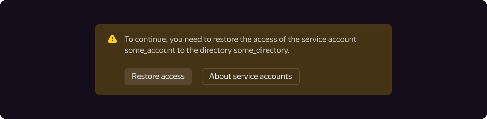
In addition to instructions, Alert offers a number of commands to help the user find a solution and take action.
When not to use
Due to their disruptive nature (especially if the wrong Alert type is selected), alerts should be used sparingly.
- We don't recommend using Alert to display an error, warning, or help message associated with a separate form or dialog field. In this situation, it is better to use the Error state on the field component or to display a plain-text message or text with an icon next to the field.
- We don't recommend placing multiple Alerts, such as Danger and Warning, on the same page (form, dialog), as this makes it difficult to determine the priority of messages.
- Do not use Alert for anything other than its intended purpose, such as visually highlighting any blocks on the page: headers, form fields, and so on.
- Do not use Alert to confirm that operations have been completed. For these kinds of tasks, use Dialog.
- Do not use an Alert to display the status of a user-initiated operation. For this purpose, use Toaster.
Content
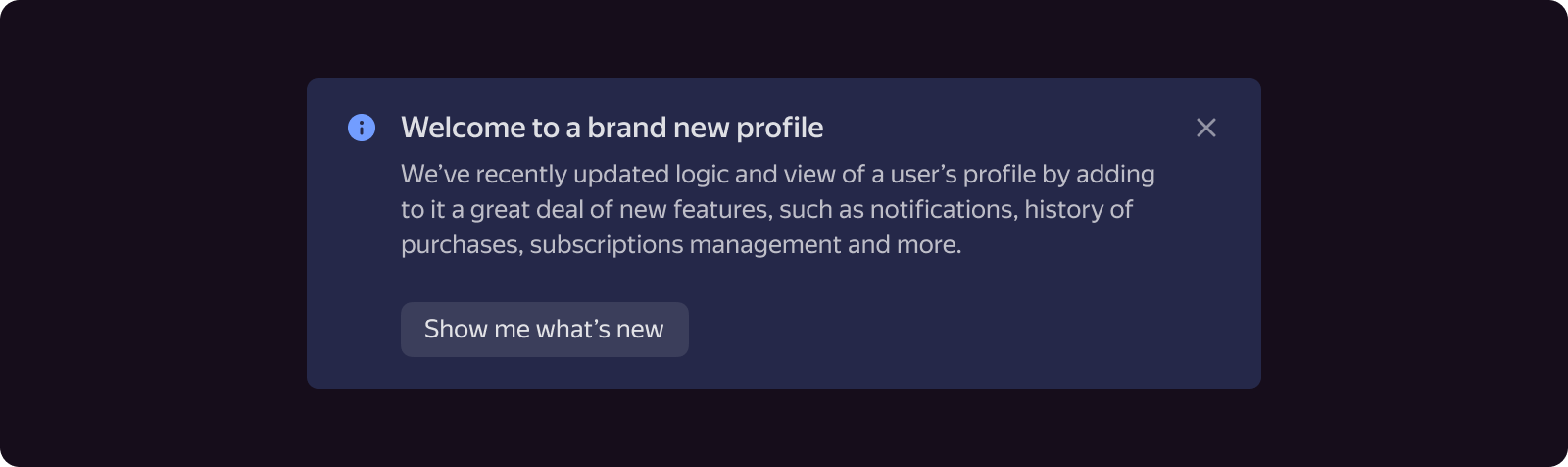
Required Alert elements include a description and an icon. In addition to these, Alert may include a title (Title), a close button (Close), and up to three additional buttons with actions (Actions).
Icon
By default, an Alert displays an icon that corresponds to its type. You can, however, choose your own icon for the component while leaving the background color unchanged. For Alert type Normal, the icon is optional and is not displayed by default.
Text
The title and description text should be as short as possible and start with a capital letter. If you want to give the user more information, it is best to use links or the "Help", "Documentation", and "Learn more" buttons to direct the user to a separate help page or website.
The title should clearly convey the message's thesis. However, it shouldn't repeat the description. If choosing the thesis and turning it into a headline is difficult, use the description without a heading.
The title should not end with a period.
Buttons
Depending on the design requirements and constraints, additional buttons may be displayed to the right of the text (Horizontal Layout) or below it (Vertical Layout).
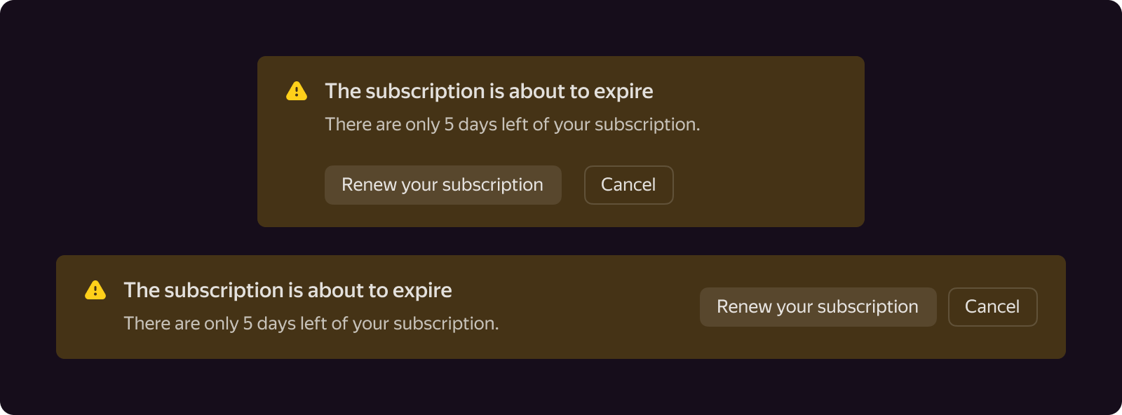
If the buttons and their labels leave enough space for the description and header without creating unnecessary line breaks, then place the buttons on the right. If the width of the Alert is less than 500-600px, opt for the vertical view.
Additional buttons use the Normal style by default. However, depending on the semantics of the message, they can be Action, Contrast-normal, and various types of Outline (Outline-info, Outline-danger, and so on). We recommend keeping the styles of all three buttons consistent. Use only one Action button, and make sure to consider the context of the page, such as whether there are already other Action buttons present.
Alert has a cross button that should be displayed in case the user wants to hide the message due to its irrelevancy.

Options
The width of the Alert is not limited: it can take up the entire available space on the page (form or dialog) or have a fixed width determined by the width of the main content.
If the Alert is designed to be displayed close to the page's borders (form, dialog) and take up the entire width (e.g., a message about updating the browser or the conditions for storing Cookies on the site), rounding the corners of the Alert container is not necessary.
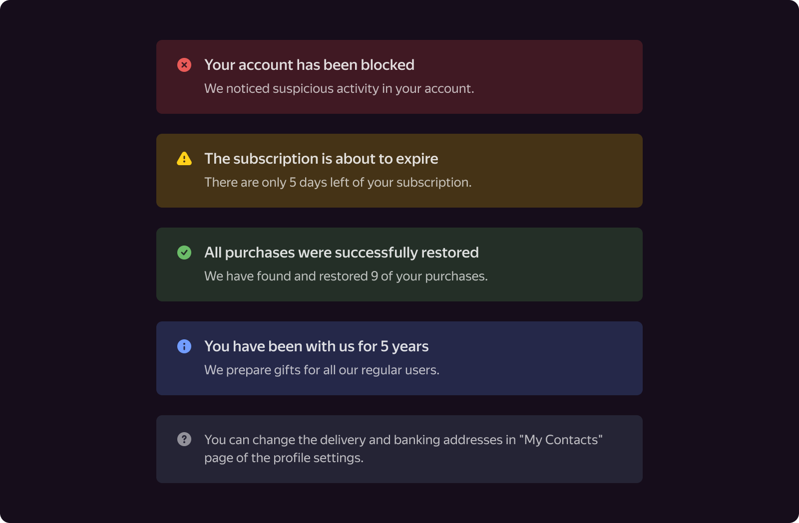
If the design does not require the Alert to actively attract the user's attention, you can use Outlined View, which has the same type of semantics as Filled View.