Color
Two-layer color system
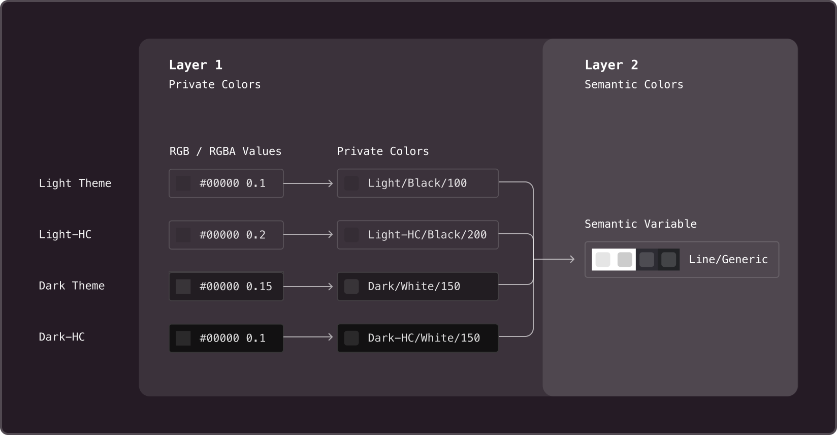
There are two types of color schemes used in the library: private and semantic. These two color schemes, or palettes, vary in structure and purpose. The private palette assigns RGBA values to all shades and tints of colors across all themes, while the semantic palette uses private colors as values and applies them to specific UI elements.
Private colors
Are the base color layers in a design system. They are not designed to be used directly within components. Instead, they serve as values for semantic variables that are already used in components. The values of private variables are RGBA/RGB colors.
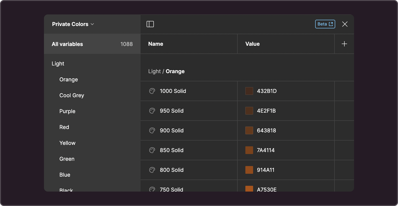
This palette includes all the tones of each color for every theme, both with and without an alpha channel, with the prefix Solid.
Colors with an alpha channel
Alpha colors are only available for indices of 500 and below. They are mixed with the background color, allowing for better readability and contrast. It is suggested that you use them:
- for light colors (from 50 to 300)
- in typography-related projects where text can be displayed on top of backgrounds of any color because using an alpha channel prevents contrast loss.
Solid colors
Use solid colors when two objects may overlap and you want to prevent color blending in the place of an overlap. Solid colors are selected based on the primary background for the theme. Since solid colors can be displayed on top of underlays of any color and their use should be carefully considered.
Shades should be regenerated whenever the primary or secondary background color is changed to maintain visual consistency between solid colors and alpha channel colors.
How to create tones
Tone is created from the middle of the scale, which in our case is a color with an index of 550. It is the primary color that generates less saturated and more saturated tones. The exceptions are black and white, which are at the extreme end of the scale and allow for the creation of more tones and values with an alpha channel.
Colors with an index from 50 to 500 are created by reducing the Opacity of the base color (550). Colors with an alpha channel can only be found in this range, as opposed to solid colors, which can have values across the entire scale.
Colors with an index of 600 to 1000 are created by blending with a background color that contrasts with the primary color for the selected theme. For example, the primary background color of a light theme is white, and the contrasting color is the background of a dark theme. So this contrasting background will be mixed into the color to create darker tones.
In a dark theme, the primary background is dark, and the contrasting background is the background of a light theme, which is white. So white will be mixed into the color to create high-index tones.
A script allows you to quickly generate a color palette for development handoff.
Semantic colors
Variables in this color group are categorized into groups, which are subsequently used within components based on their meanings. Their values are configured for each theme using private variables. Some semantic variables can sometimes be used as values for others, but this must be done carefully to avoid recursion.

Categories based on types
In Figma, variables are organized into groups for easier navigation, as listed below. While, in the code, the structure is more straightforward. Branding isn't placed in a separate category, and there's only one Base variable group. Figma and code are equivalent in terms of variable names, structure, and meaning, except when the name is optimized for readability or understanding.
-
Branding
A collection of brand-specific variables from all categories. These are basic colors that allow you to quickly apply a style and see the result. This group is exclusive to Figma. It is not included in the code, and the colors are categorized into groups of their own.
-
Text
A group of variables for the color of text and icons. Since text and icons are often displayed together, it makes sense to maintain their visual consistency.
-
Base
A color group for underlays, fills, and backgrounds
-
Base Semantic
Underlay colors with Info, Positive, Warning, Danger, and Misc colorings. There are values for both Normal and Hover states. May work for some types of infographics, but not all. This group is exclusive to Figma. In code, it is part of the Base group.
-
Base Float
Underlay colors of elements that float above the page's primary background. This group is exclusive to Figma. In code, it is part of the Base group.
-
Line
Colors of strokes, lines, dividers, frames, and any other thin elements.
-
Effects
Colors used to darken text, apply shadows, etc.
-
Misc
A group of technical colors used for scrollbars, chart axes, and tooltip backgrounds in charts.
More information on each variable can be found in the Figma color style description or in the storybook.
Categories based on meaning
Variables in each group may have their own meanings, which are determined by a group's application principles. For texts, for example, it makes sense to use categories like main and additional. However, they can’t be applied to any other types of content.
The following are examples of meanings shared by different categories:
- success
- dangerous
- warning
- neutral
- etc.
Variables and colorstyles
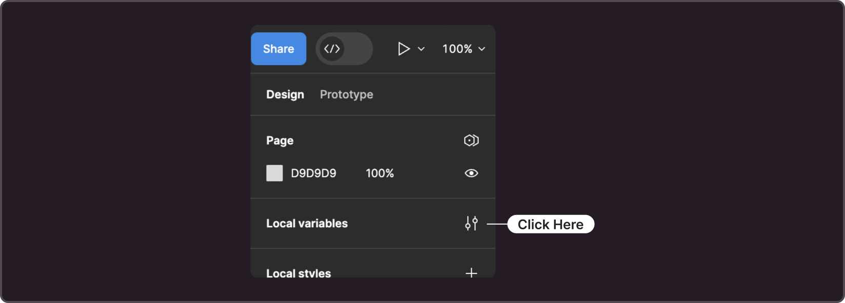
You can work with color values using Figma's Local Variables interface. To go there, open the file with the library, make sure nothing is selected on the page (you can do this by clicking on the canvas's empty background), and select Local Variables in the right panel.
While variables are still not in beta, the design system continues to use color styles to directly define the color of an object. Note that the value within the color style is represented by the corresponding variable. Which means:
-
To change the color of a colorstyle, you need to change the color of the corresponding variable.
-
Colorstyles inherit the properties of variables, particularly support for color themes. As a result, an object with a colorstyle applied can change the theme using only the functionality of Figma.
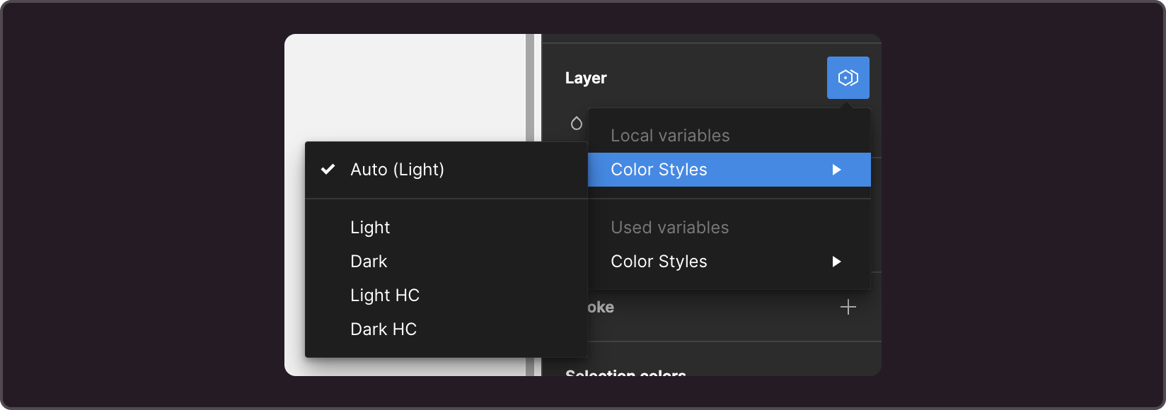
Themes
Gravity-UI supports four themes: light, dark, and contrasting versions of each. The current industry standard requires at least two: light and dark. Given how diverse users' preferences can be, sometimes it is difficult to pick the best one.
Themes with increased contrast were created to address the lack of contrast in regular themes, which can be caused by either equipment features such as monitor calibration, set brightness, matrix type, and color rendering (especially on TV) or room lighting. Currently, these themes do not offer a solution for addressing Accessibility concerns.