Skeleton
Animated placeholder that replaces actual content during content loading until the interface is ready for user interaction. Used if loading time does not exceed 300 ms.
Structure
Depending on the content, can take the shape of a rectangle, a circle, or a combination of the two.

Sizes
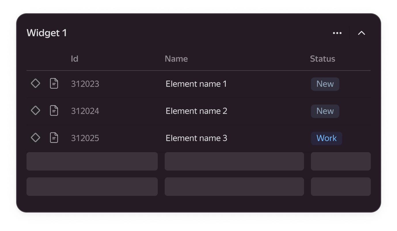
The component adapts to the content container that it replaces during loading.
Use cases
-
Can show the entire page

-
Can replace only a portion of the content, allowing interaction with the rest of the interface
Recommendations
Use
- When the content type can be predicted after loading
- Loading time is less than 300 ms
- If the skeleton is used for asynchronous loading, it should be displayed exactly where the loading happens because loading one block of elements should not block the rest of the interface.

Don't use
- If loading takes more than three seconds, it’s better to use a spin, or a loader,
- If the loading time exceeds 10 seconds and the exact duration is known, a progress bar should be displayed.
- When loading is initiated by a button click, using the state of the button as feedback is sufficient, especially in modal windows.