Tabs
Description
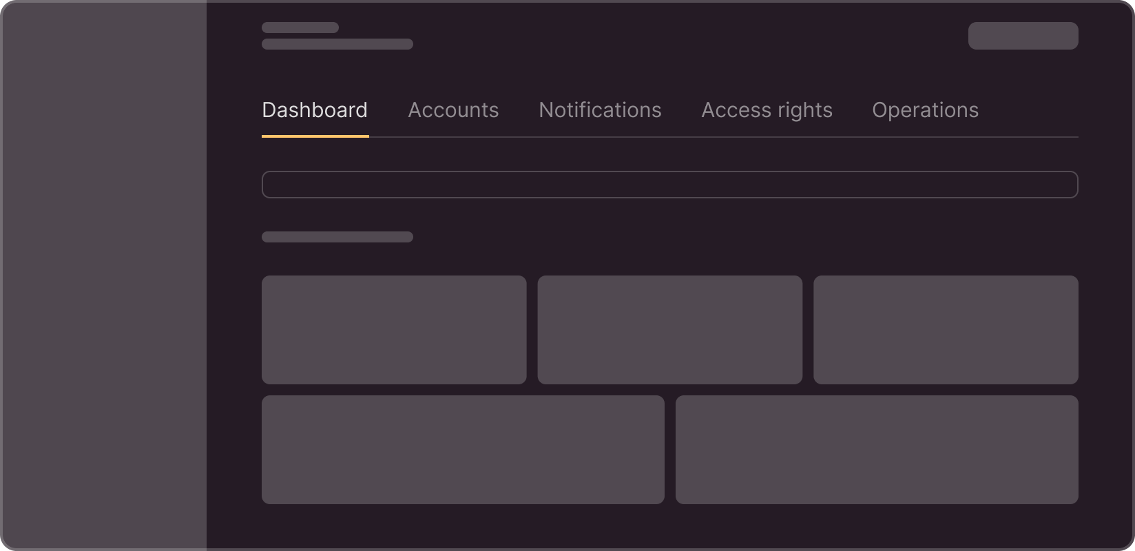
With the Tabs component, you can organize content by dividing it into several sections that the user can switch between for viewing. Use tabs to group related sections and provide quick access to each of them.
Sizes
Tabs can have three sizes:
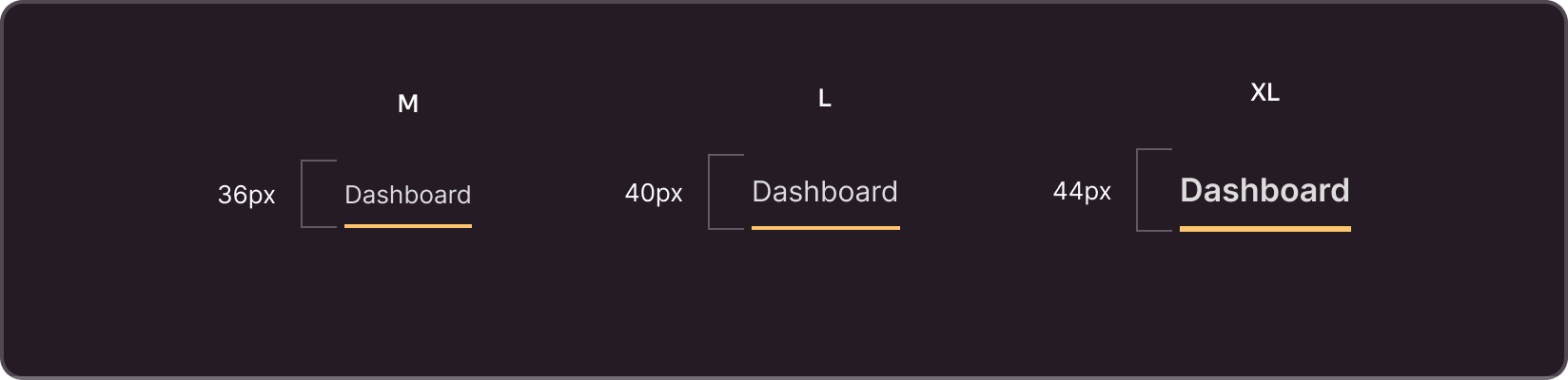
- M (Medium): Use this size for general use on pages, within individual sections.
- L (Large): Use size L if the tabs also serve as page subheadings. In this case, tab content is a separate section on the page, and tabs are subheadings of this section.
- XL (Extra Large): This size is appropriate when tabs also serve as page headings. In this case, when users switch tabs, the content on the entire page changes.
States
Tabs can have the following states:
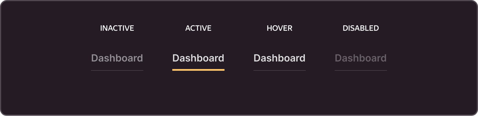
- Inactive: The tab is in an inactive state when it is not selected. In this state, the tab has a more faded color to highlight the active tab.
- Active: This status is assigned to the selected tab which displays the current active section of the content. Active tabs have more saturated colors and are underlined for emphasis.
- Hover: When the user hovers over the tab, the pointer changes its style to indicate the possibility of interaction.
- Disabled: Tabs can be disabled if they are temporarily or permanently unavailable for selection. Such tabs are grayed-out and are inactive for interaction.
Properties
You can enable/disable the following elements for each tab:

- Icon. Used at the designer discretion to visualize the type of content inside the tab.
- Label. The section name in text format.
- Counter. You can use it to indicate the number of entities inside a tab. You can also use it to specify the number of new entities that emerged in the tab.
- Label. You can use it to denote the status of the section that the tab is responsible for.
Usage recommendations
Use tabs to organize large volumes of content or to divide information into logical sections. Ensure a clear and easily readable structure for tab headings.
Select tab style and colors that match the overall design of your project. Always highlight active tabs so that users can easily identify the current section.
Whenever possible, try to make your M and L tab sections fit into a single screen height. This way, you can easily associate the content with the tab name, and see where the tab content ends and the next block begins.