Resources
Component Library in Figma
The component library is available in Figma Community. To use it we recommend publishing in
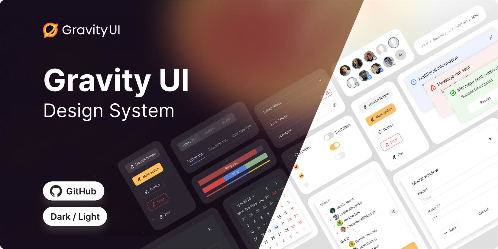
Icon Library in Figma
The default icon set for Gravity UI. We recommend publishing it together with the component library, and adding to the desired files together as well.

Illustration Library in Figma
A set of default illustrations to use with Gravity UI Design System. You can use them on their own or within the PlaceholderContainer component which was added to the Component library.

How to use
- Open the link
- Click
Open in Figma - If you’ve been invited to several organisations, select where you want to have the library copied to
- Move the library from your drafts to your project adjust the styles you want to and publish it
- Add the library to a desired file using the
Team Libraryinterface or make it a default library for all the Team Files in the Admin Pane. The first time you publish it, Figma might think for a while assembling all the styles and components.