Dialog
A dialog box is used to display additional content as well as to draw the user's attention to a specific action or scenario. The dialog box blocks the user from interacting with the parent page until it is either closed or the action specified in this window is executed.
Entry point
The entry point to the dialog box can be a click on a specific trigger (e.g., a button in the interface) or certain actions or conditions in the interface (e.g., an attempt to leave a page without saving data, or changing an account in another tab).
Sizes
The size of the dialog box is determined by its content.
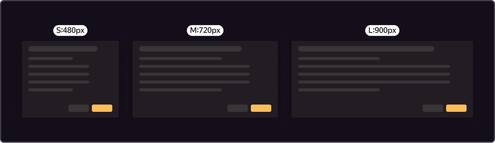
Size S - 480 px: Used for small notifications/confirmations and forms.
Size M – 720 px: Used for small and medium forms
Size L – 900 px: Used for large amounts of data and flow within a modal window.
Custom size: Used when none of the three options (S, M, or L) are suitable.
Content area
The dialog window can contain any type of content. The layout is chosen depending on the requirements of the user.
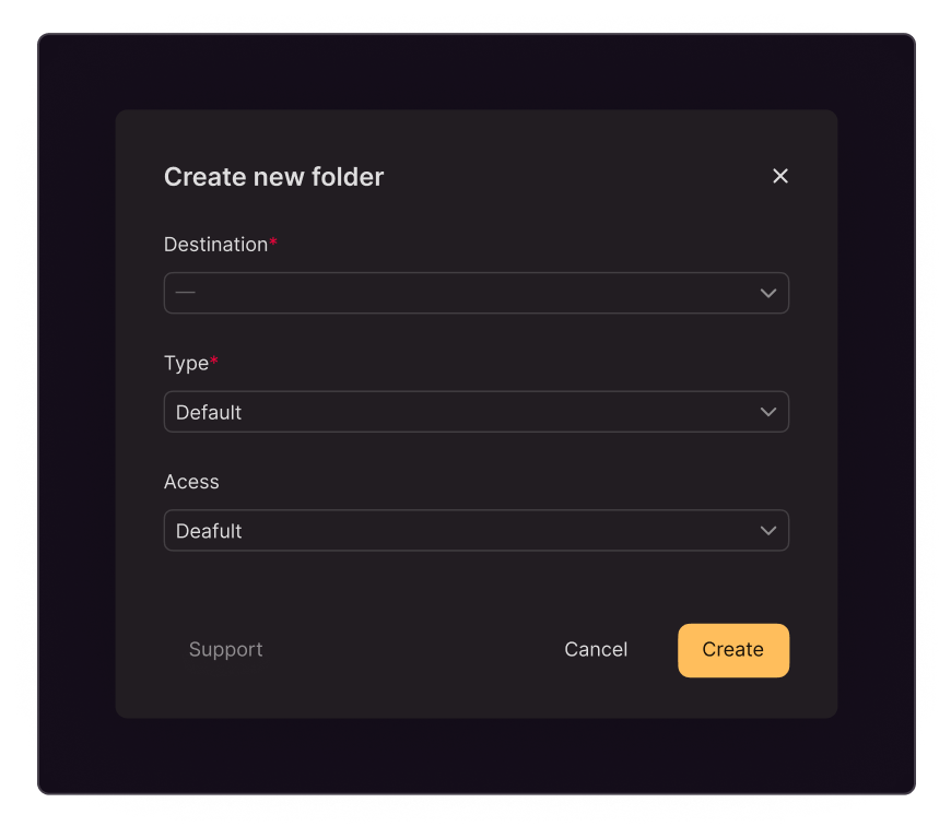
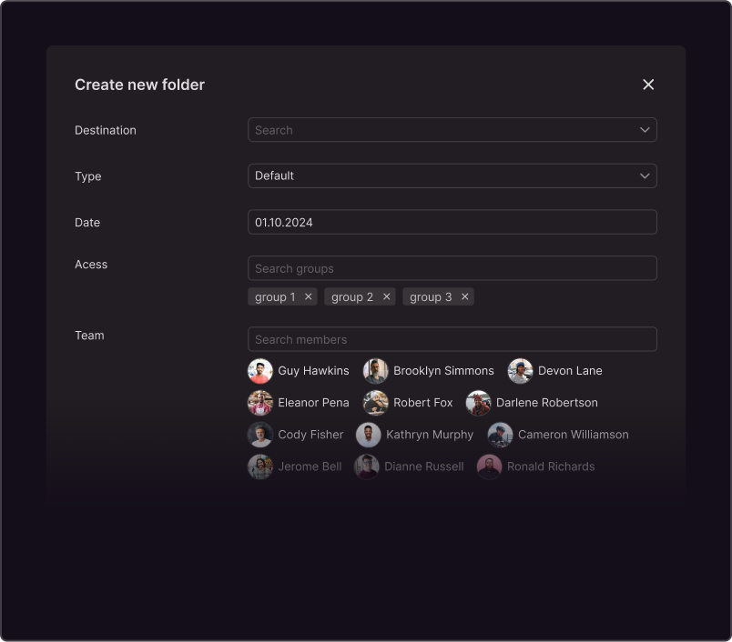
If the dialog box contains a form, one of two element layouts is recommended:
Vertical.
Best suited for simple text boxes and size S
Horizontal.
Suitable for more complex forms
Buttons
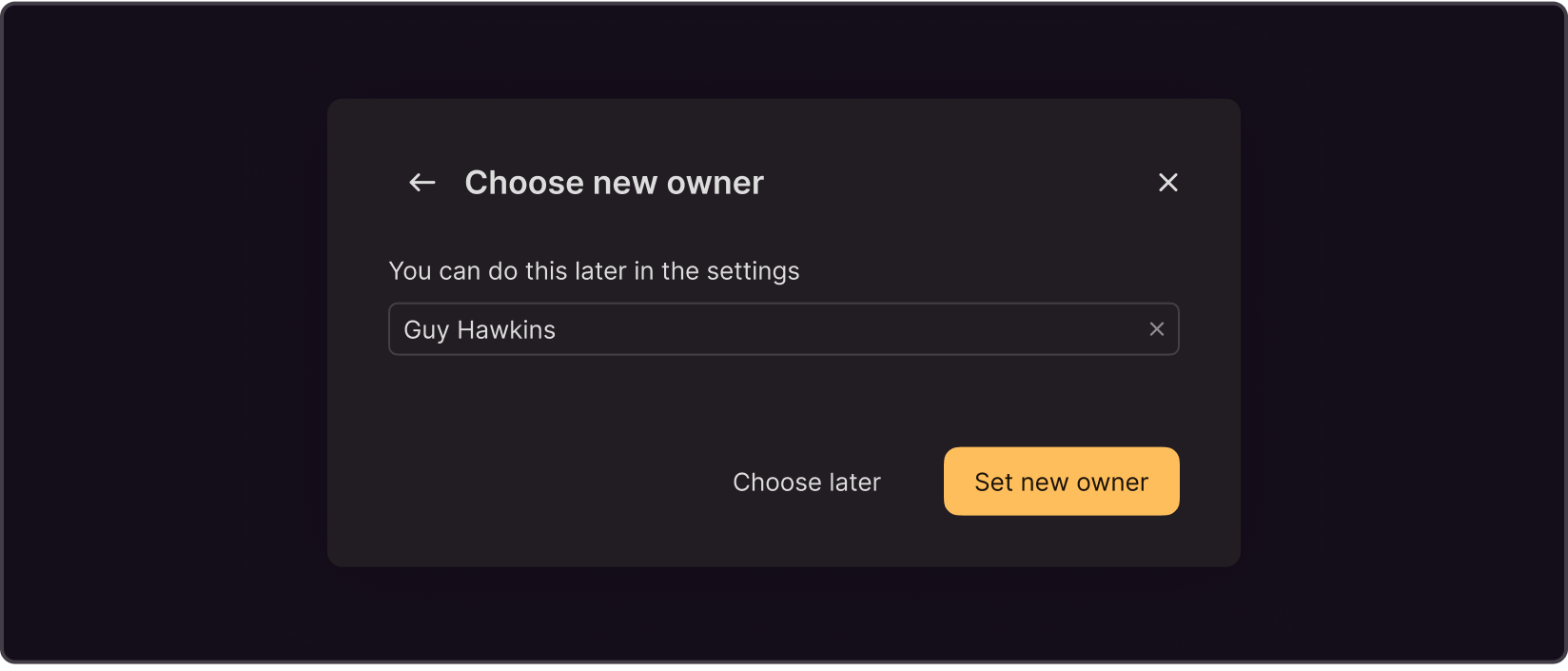
Action button is required in most cases. If the user does not complete the actions specified in the dialog box, the button is Disabled. On the left side, there's a section for custom controls, where you can place secondary buttons and links. For example, references.

In some cases, a Danger button can be used instead of an Action button (e.g., in a dialog box for deleting an entity).

Action button is not needed if there is no target action, and the dialog box is for informational purposes only. In this case, you can use the Normal style Close button.
Secondary button is always used as a cancel button. Can be used to perform additional actions (e.g., continue without changes).
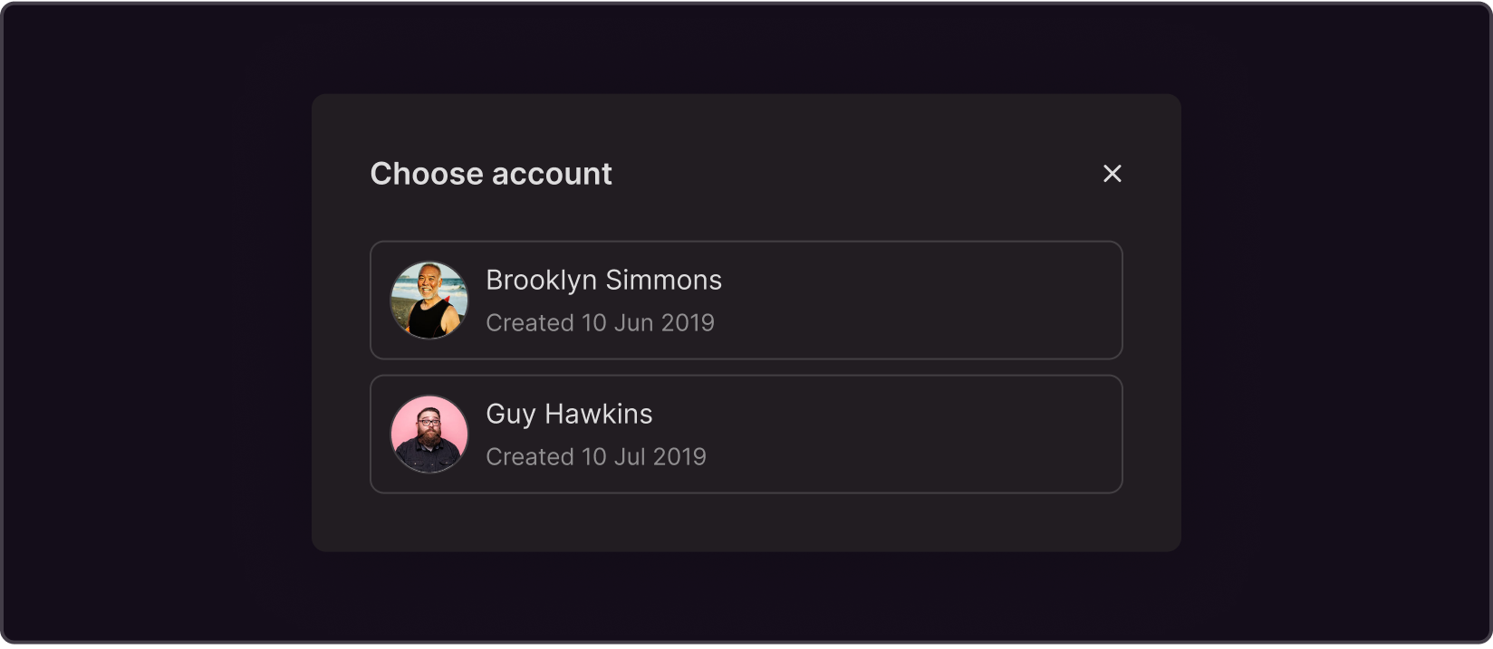
There may be no buttons at all. Typically, a selection must be made within the content area itself; otherwise, the parent interface won’t be available.
In-dialog Navigation
If the dialog box includes multiple steps, use the back button to return to the previous step.

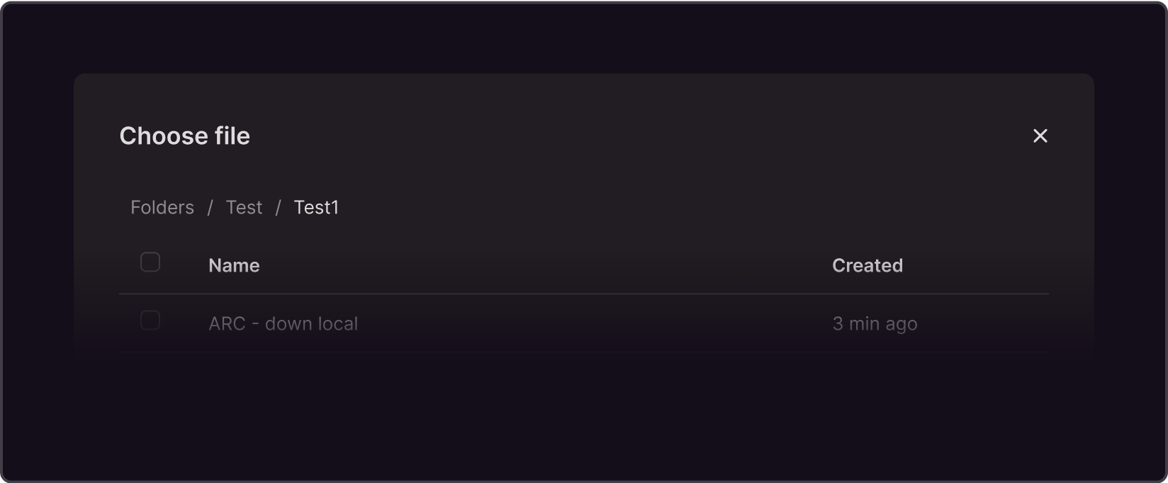
If the dialog box is nested but the steps are not linear, you can use breadcrumbs in the content area of the window.
Positioning the dialog box on the page
The dialog box is aligned with the center of the screen both vertically and horizontally.
While scaling the viewport, its positioning remains unchanged, and the size of the dialog window can be reduced as long as it does not affect the content.
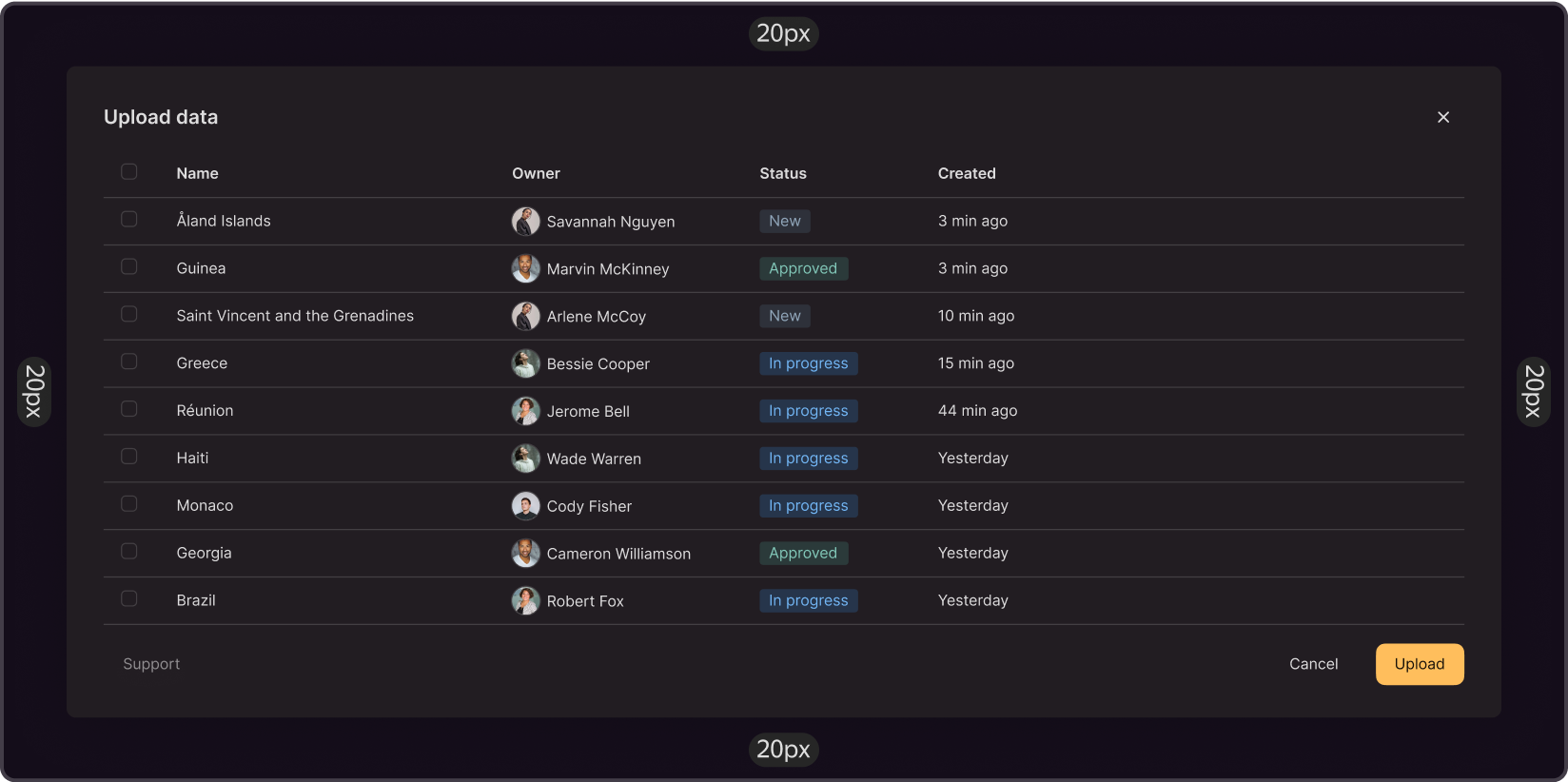
The minimum allowed spacing from the top and left screen edges is 20px.
In cases where the window cannot fit within the viewport, the top and left spacing remains unchanged, while the right and bottom edges of the dialog window extend beyond the screen's edges. However, this is not recommended. That's why the dialog box should be designed so that it fits within the viewport and that the spacing on all sides is at least 20px from the screen's edge.
Closing a window
In addition to the target action, the modal window can be closed in the following ways::
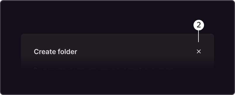
- Cancel button
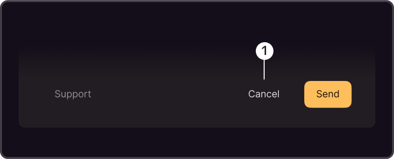
- 'X' button
If the window is not modal, it can be closed using one of the following methods:
- By clicking outside the modal window
- By pressing the Esc button
The ‘cancel’ and ‘X’ buttons are familiar elements, as they are widely used in dialog boxes. Clicking outside the modal window makes it easier for the user to close it, as they don't have to aim their mouse cursor at a specific element. Pressing the Esc key allows to close the window without a mouse.
Since only the dialog box is expected to be interacted with, the parent page's content should not scroll.
Preventing User Data Loss
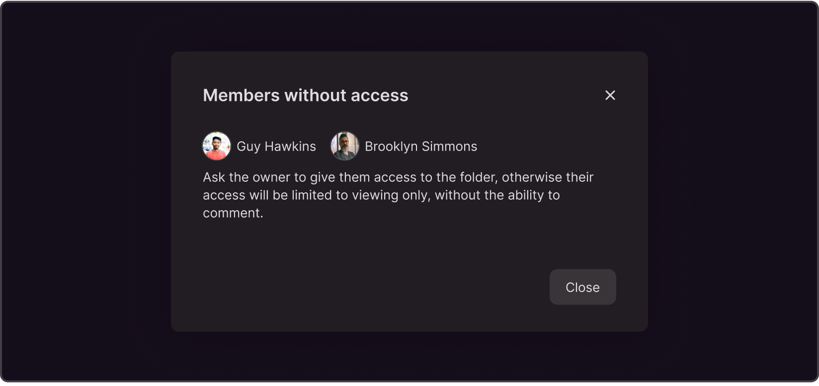
Since it is easy to close a modal window, there is always a chance to do it by accident. If the user selected only check boxes in the modal window, it is easier to recover lost data than if the user spent considerable time writing code or retyping the 12-digit VIN code of the vehicle. So it’s better to avoid such situations. However, we should not prevent the user from closing the modal window in the usual way.
To avoid the risk of data loss, we recommend using an additional confirmation window for data deletion. In this case, the action must be confirmed by the user.
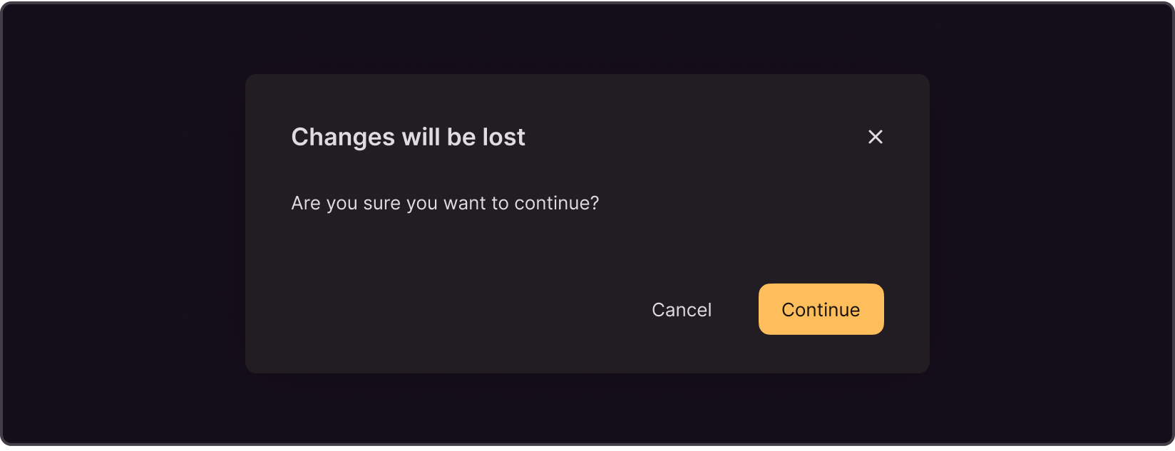
When closing the modal window, use common sense to determine whether another confirmation window is required. It is important to strike a balance between safety and asking too many questions that may annoy the user. The purpose of confirmation is to prevent losing the user's input while still allowing them to execute the script.