Progress
This is a component for embedding a horizontal bar chart into various interfaces. It can show data distribution, share, or progress.
Use cases
✅ When to use Use it when you need to show the level of completion or filling of an entity such as free space on the disk, the number of completed tasks, etc.
🚫When not to use When you need to show a single value without comparison. For example, you can use Progress to show 15/60, but not 15 alone.
Structure
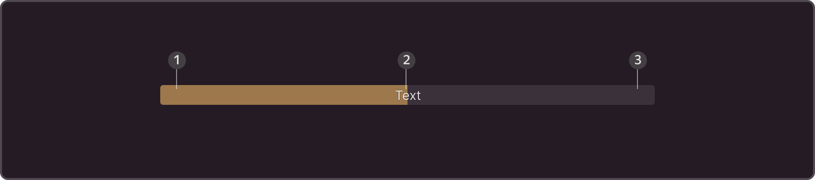
- Color of the indicator. Required part
- Text. Use only with size M, optional part.
- Background. Required part
Sizes
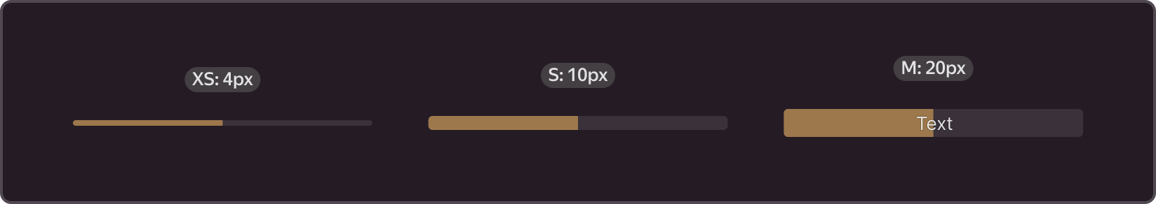
- M is the only size that has text. Use in sections with a large amount of space, on pages where the progress indicator is the key element.
- S is used in tables, cards, and separately where progress is not the only key component on the page
- XS is used in narrow places, where you need to keep your content compact.
Themes
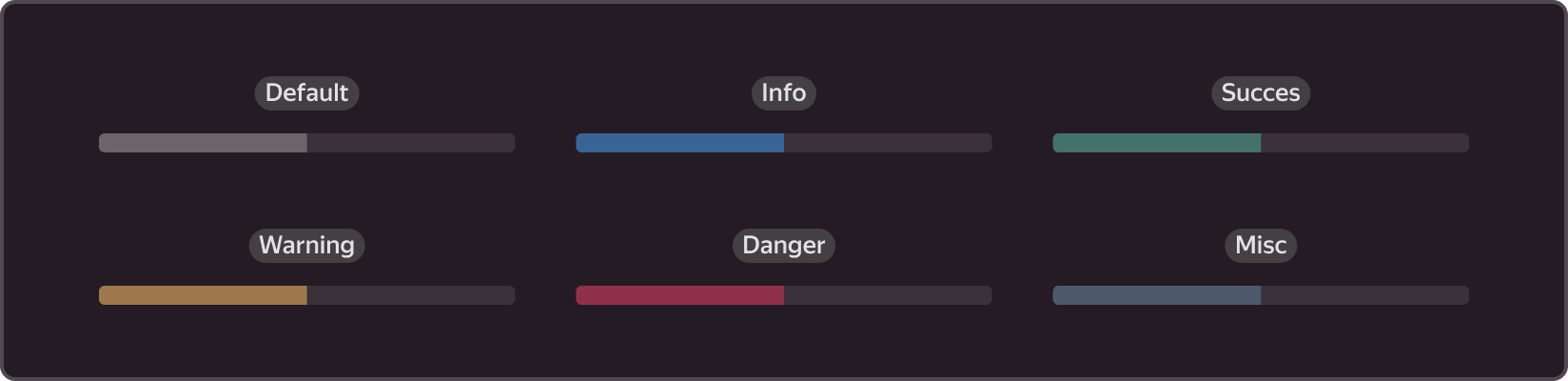
Default is most often used for neutral cases, when you do not need to draw extra attention to progress, for instance, when the page includes more important elements
Info is also used for neutral cases, where you need to put more emphasis on progress, or to show that the operation is in progress
Success is used for successfully completed processes or to indicate that the system is running without issues
Warning is used in unusual situations to warn the user about something, for example, to draw user attention to an impending issue.
Dangeris used to attract maximum attention, when an error has occurred, and the user needs to take actions to resolve the problem: disk space has run out, system has failed, etc.
Misc is used in neutral cases, when you do not want to use Default.
Scope
-
Changing the color depending on the progress value. You can configure this component to change color depending on the progress value, for example, the standard indication is blue (info), and 100% is green (success).

-
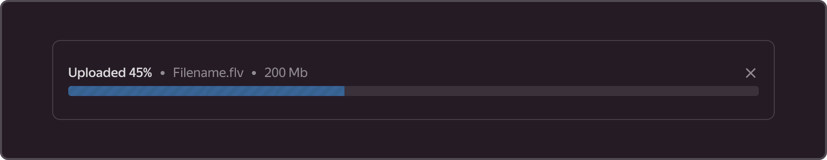
Loading animation. Use it to show real-time progress to the user, for example, when uploading files from a computer.
-
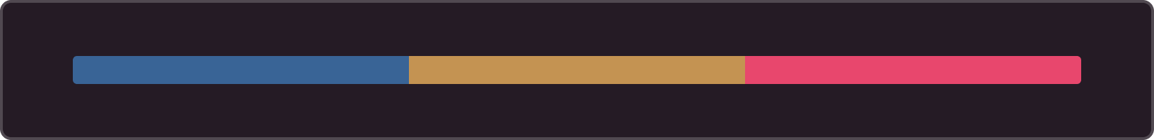
Custom colors. You can use your set of Progress colors when all other options do not fit: use a custom color and combine multiple colors.
Use cases
You can combine this component with text, embed it into other components, for example, wrap Progress in a card or table, combine it with explanatory text, action, etc.
-
In sections with file upload/download
-
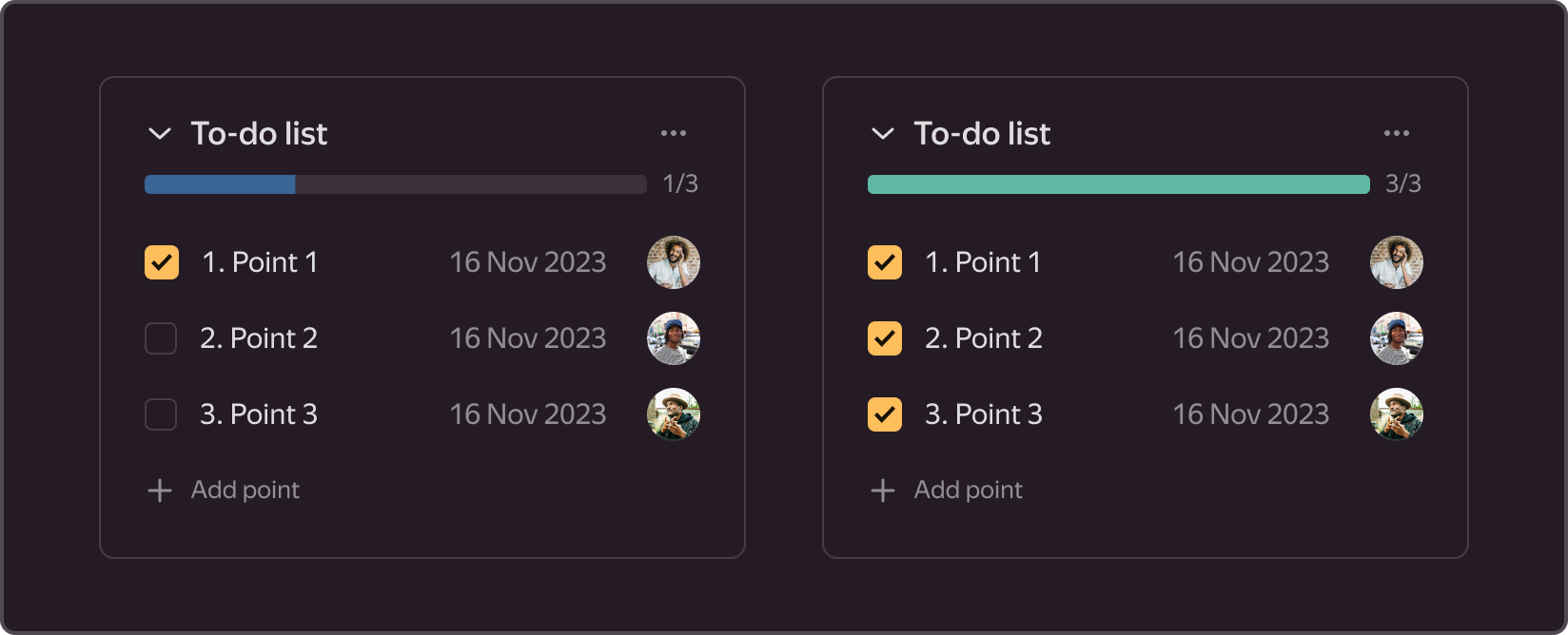
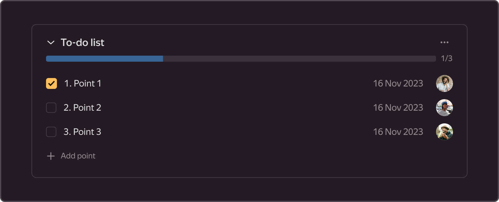
In cards, for example, in a checklist with issues
-
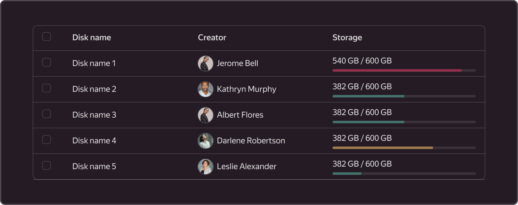
In tables, e.g., to show disk usage.