Links
A clickable element with navigation functionality. When clicked, takes the user to another page of an external or internal service. Less often, navigates the user to a different section of the page.
Has three types: normal (accent), primary (black), and secondary (gray).
Normal
Is the most common and well-known user pattern. Used to visually distinguish elements within text, tables, and as part of navigation. Also used on error pages and null states.
Primary
Used when it is obvious to the user that an element is interactive, but accent-colored links will visually overload the interface and disrupt the balance of page elements.
Secondary
Similar to primary links, this type is used when it is obvious to the user that the element is interactive and the goal is not to distract the user from the page's emphasis elements. Usually used in breadcrumbs or when displaying secondary attributes.
States
Links always have two states: default and hovered.
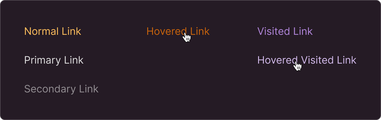
You can enable tagging for visited links, if needed.
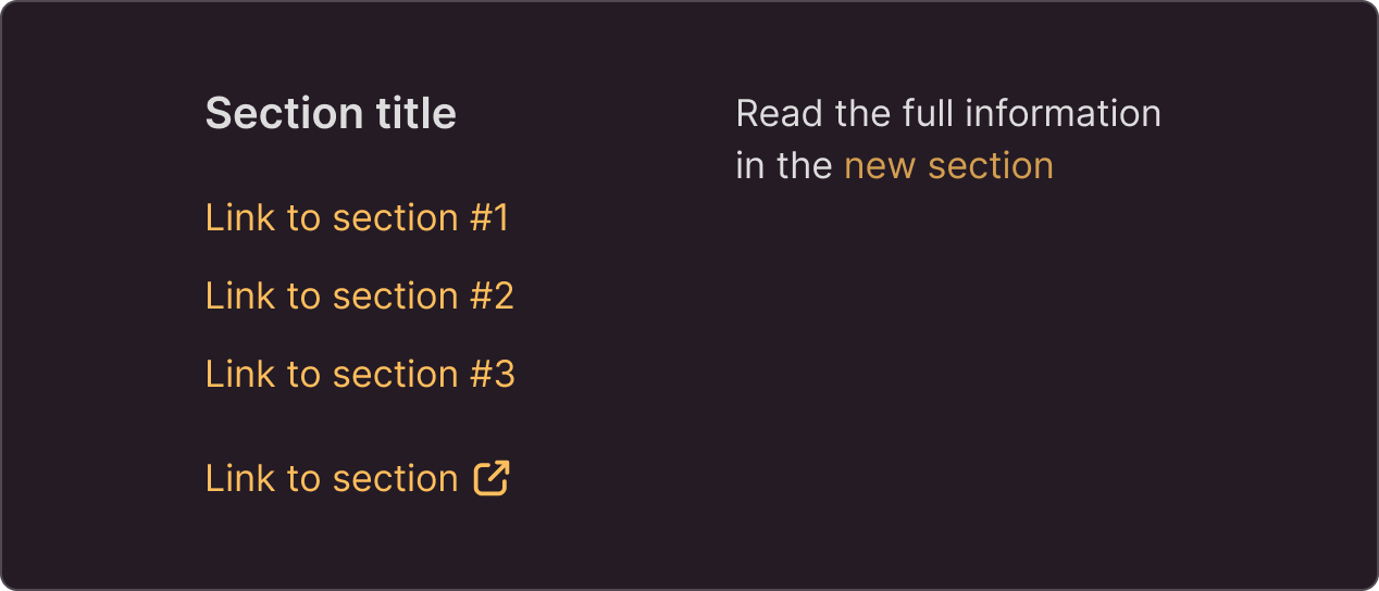
Can be used as:
- stand-alone elements
- part of the text
Can include an icon to indicate an external link
Size
The font used for links should be proportional to the surrounding text and align with the overall hierarchy of the page.
Recommendations
The text of the link should be self-explanatory even when used without the rest of the text and tell the user what the link leads to (service name, title, or description of the section)