Segmented Radio Group
SegmentedRadioGroup is a set of two or more buttons arranged in a row and combined into a group, working on the principle of band switches in radio receivers. In order to avoid confusion with Radio switches, they are also referred to as Segmented-control.
When to use
SegmentedRadioGroup is used to choose from two or more options when filling out a form, filtering a list or table, changing a page's layout, or adjusting a tool's operating mode. It is more user-friendly than a drop-down menu because all options are displayed at once.
SegmentedRadioGroup options must be contextually related and mutually exclusive.
The number of options should be limited to 2-5, and their names should be brief (up to 3 words).
When initializing a SegmentedRadioGroup, at least one option should be selected by default.
When not to use
If multiple options are available, use a checkbox or a drop-down list (Select).
For options like “Yes / No” or “On / Off”, use a checkbox or switch (Switch).
If there are more than 5-6 options or the option names are long, use a group of radio switches (Radio) or a drop-down list.
It is not acceptable to use a SegmentedRadioGroup for page navigation or a progress bar (e.g., in a wizard). To navigate on the page, use a group of tabs (Tabs).
Sizes
M is the standard size for desktop interfaces, and XL is the standard size for mobile interfaces. Other sizes may be used as well, for example, to maintain visual consistency with other elements on the page or in the dialogue box.
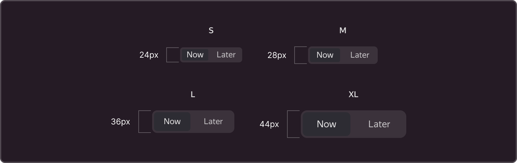
Besides adjusting button heights, you can also customize the sizes of the internal padding, the button corners' rounding, and the font
Buttons with options can have varying widths and can be automatically adjusted to fit the content (Auto width). Alternatively, they can be the same width, with the width of the container split in half (Max width).
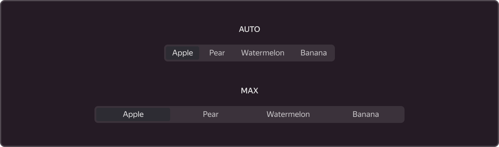
The last option is used when the names differ by only a few characters; otherwise, the names may extend beyond the button edges.
Try to keep the buttons within SegmentedRadioGroup the same size, even in Auto mode, so that the element as a whole is well-balanced.
Content
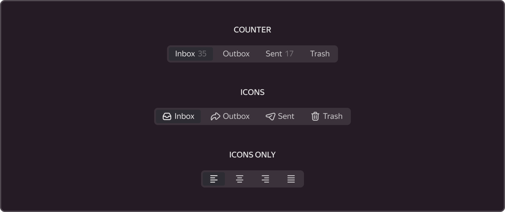
In addition to the text (Label), the buttons may include an icon and a counter. As in the Button element, the icon can be displayed with text (Icon and Label) or without text (Icon only). Do not combine buttons with different types of content within the same SegmentedRadioGroup.
The Counter informs the user of the number of objects contained within the option.
The button text within a SegmentedRadioGroup should start with an uppercase letter. The text should not be cut off with an ellipsis or have repeated parts.
In the icon-only version, when hovering over the icons, tooltips (Tooltip) containing the icon names must be displayed .
In forms, it is recommended to use the text-only or text-and-icon option. The icon-only mode is typically used to switch between layouts or choose options that are already familiar to the user, such as switching between a list and thumbnails of objects or choosing the type of formatting in the editor.
States
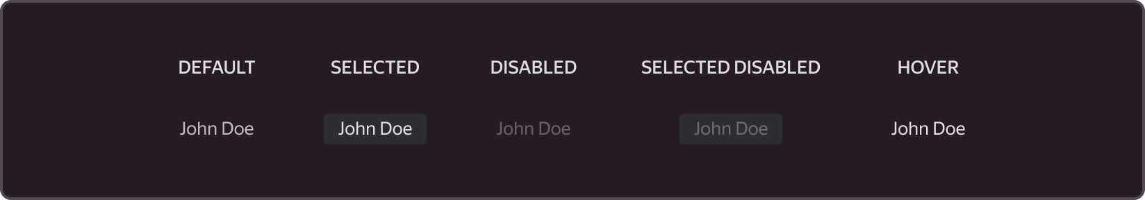
In addition to the default state (Default), buttons can also be in the (Selected) and/or disabled (Disabled) states. When hovered over (Hover), buttons also display states. Only one button can be selected.