Checkbox
A checkbox is a user interface element that allows users to select one or more options from those provided.
Use cases

When activated, the checkbox does not trigger an action instantly. Users must click a confirmation button (for example, Save, Apply, Submit) to apply it. In most cases, the checkbox is used together with an explanatory label. However, in some scenarios, checkboxes may be used without labels, such as in tables or where including an "enable" label next to each checkbox is redundant. Begin your text with positive wording, for example, use "Enable" instead of "Disable," to prevent the user from solving a logic puzzle.
Anatomy
The checkbox consists of:

- Container: Visual rectangular area that surrounds the checkbox. The container indicates boundaries and activates the checkbox.
- Checkmark: Symbol which appears within the container when the user enables the checkbox. This symbol visually confirms that the user selected the checkbox.
- Text label (optional): Text placed to the right of the checkbox. The text label explains the meaning or purpose of the checkbox.
Sizes
The checkbox component has two main sizes:
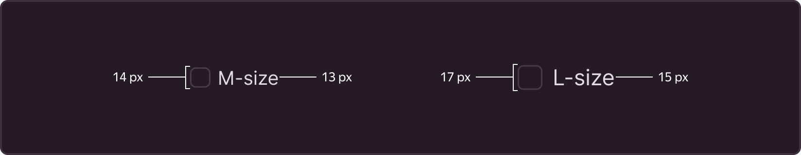
M is the default size, with standard dimensions suitable in most cases. In this size, the container is 14x14 px and the text label uses a 13 px font.
L is used when the checkbox needs to stand out among other interface elements or if the interface requires larger elements for easier use. In this size, the container is 17x17 px, and the text label uses a 15 px font.
States
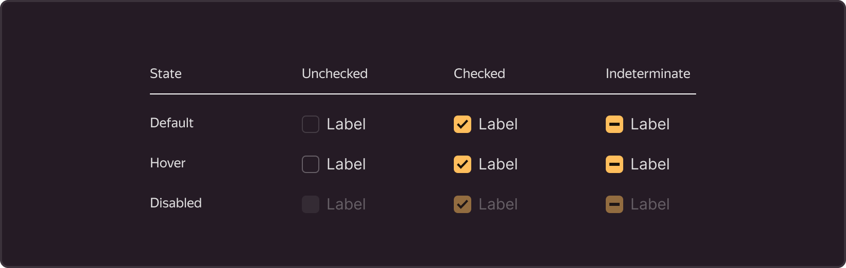
Default is the main checkbox state that the user can enable or disable by a click.
Hover is the state when the user moves the cursor over the checkbox area (checkbox + label).
Disable is the state when the user cannot interact with the checkbox for some reason.
Indeterminate is the state of the header in a checkbox group when one out of several items is selected (usually occurs in tables with multiple row selection).
Recommendations
Use
-
Option selection if you want the user to select one or more options from a list.
-
Enabling/disabling features if you want the user to enable or disable certain features in the interface. For example, users can enable or disable notifications or automatic playback and other features. In such cases, checkboxes provide clear and intuitive interaction.
-
Multiple selection in tables or lists if you want the user to select several items for bulk operations, such as deletion or export. This simplifies data operations and facilitates bulk actions.
-
Content or result filtering if you want the user to select parameters for filtering content or search results.
Avoid
-
Single option selection. If you expect the user to select one option from a mutually exclusive set, use radio buttons.
-
Two-position enabling/disabling (instant action). If the option has only two states, enabled and disabled, and changes take effect instantly, without an "Apply" button, use switches. Switches present such options more clearly and compactly, and changes apply immediately after switching.
-
Segmented selection. If you offer several mutually exclusive options that users can select simultaneously in different categories, use segment controls. They allow the user to select options in different segments or categories.
-
Selection from numerous options. If you provide a long list of options from which to choose a single one, use a dropdown list (select). This saves screen space and facilitates choice from a large set of options.
Writing texts
- Strive for brevity in text descriptions. Avoid long phrases or complex sentences.
- Use active verbs that clearly indicate the action associated with the choice. For example, "Subscribe to newsletter" instead of "Newsletter subscription".
- Give users a full understanding of what will happen when they select the checkbox. For example, "Receive notifications about new articles" instead of "Notifications".