
How We Made Yandex Cloud More Accessible with the Gravity UI Design System
How We Made Yandex Cloud More Accessible with the Gravity UI Design System
Hi, my name is Vova Timofeev, and I’m a Technical Project Manager at Yandex Cloud. In this article, I’ll share how we made the Yandex Cloud platform website more accessible, how many iterations we went through, and what role Gravity UI played in it.
At the core of accessibility for any service is how well it supports screen readers. Through these programs, users with disabilities perceive the interface and interact with it.
Websites are no exception. And we had to find out how accessible Yandex Cloud is for all users.
At Yandex, by accessibility we mean that our services should be comfortable for everyone to use, regardless of temporary or permanent physical limitations. For example, 16 Yandex services are currently adapted for blind users: Lavka, Go, Search, Browser, Mail, and others. A non-visual testing team helps with accessibility work on each service — and in the case I’m describing in this article, we couldn’t have done it without their help either.
Spoiler: the testing revealed several controversial points in how screen readers work with the site, and those turned into actionable tasks.
But let’s start from the beginning.
It all started with Gravity UI
Gravity UI is a design system and component library that powers the Yandex Cloud website and dozens of other cloud products. It is open-sourced and available to everyone (we’re happy to see that activity in the community chat has noticeably increased over the last six months).
What we have:
- a set of basic React components;
- a landing page builder library;
- detailed guides from designers on how to use the components;
- a library in Figma;
- a set of nearly 600 ready-made icons;
- ChartKit — a data visualization package;
- Yagr — high-performance chart rendering based on uPlot;
- i18n — a UI localization package;
- other useful libraries.
In March 2024, the key library was updated — UIKit v6. It introduced an updated List component, RTL support across all components, and a set of a11y improvements that enhance accessibility.
What’s new in UIKit v6
-
List 2.0 component. UIKit originally had a List component, but there were things we wanted to improve. After gathering requests, we compiled the following list:
- support for different sizes and widths;
- an icon on list items, with different counts and positions of icons;
- support for states;
- different content in list items (single-line, multi-line, or a list of users);
- support for different types of dividers and groupings.
These are significant changes, so we created List 2.0. For now it’s released in a prestable version, but we recommend that users migrate to it and share feedback.
-
RTL. If your applications or websites need to be displayed in Hebrew, Arabic, or other right-to-left languages, you need RTL support. At the same time, in RTL:
- an inserted Latin word is written left to right;
- numbers are written left to right;
- punctuation marks in Arabic are also written left to right, etc.
We added RTL support across all components. To have a complete example at hand, we made an Arabic promo page. You can see how it’s implemented in the source code of landing. There are also examples in storybook.
-
Accessibility (a11y):
- added the eslint plugin to the project;
- added keyboard support for the clickable and closable states of the Persona component;
- removed onClick from 15 non-interactive components;
- added keyboard support to the SelectionTable component.
How we arrived at the a11y improvements
This was helped by the non-visual testing team and its lead, Anatoly Popko. During a meeting, Anatoly tested the sandbox and the Gravity UI website step by step to understand what accessibility issues existed at the time.
We tested component accessibility by navigating the site using the keyboard and special screen reader commands.
Visually, it looked like this:
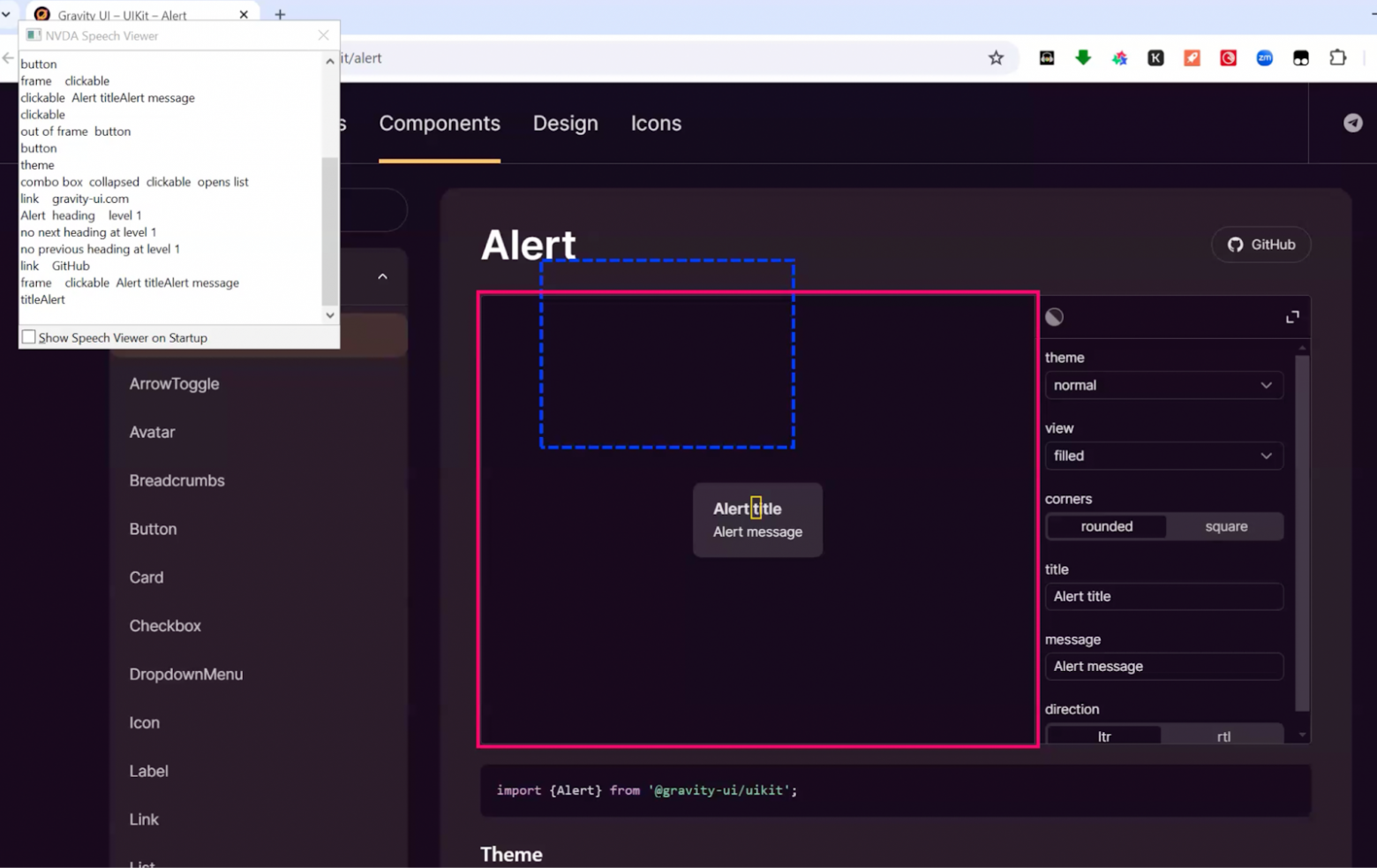
After the meeting, the team got actionable tasks, and GitHub received three new issues for the base components.
Here’s more about them.
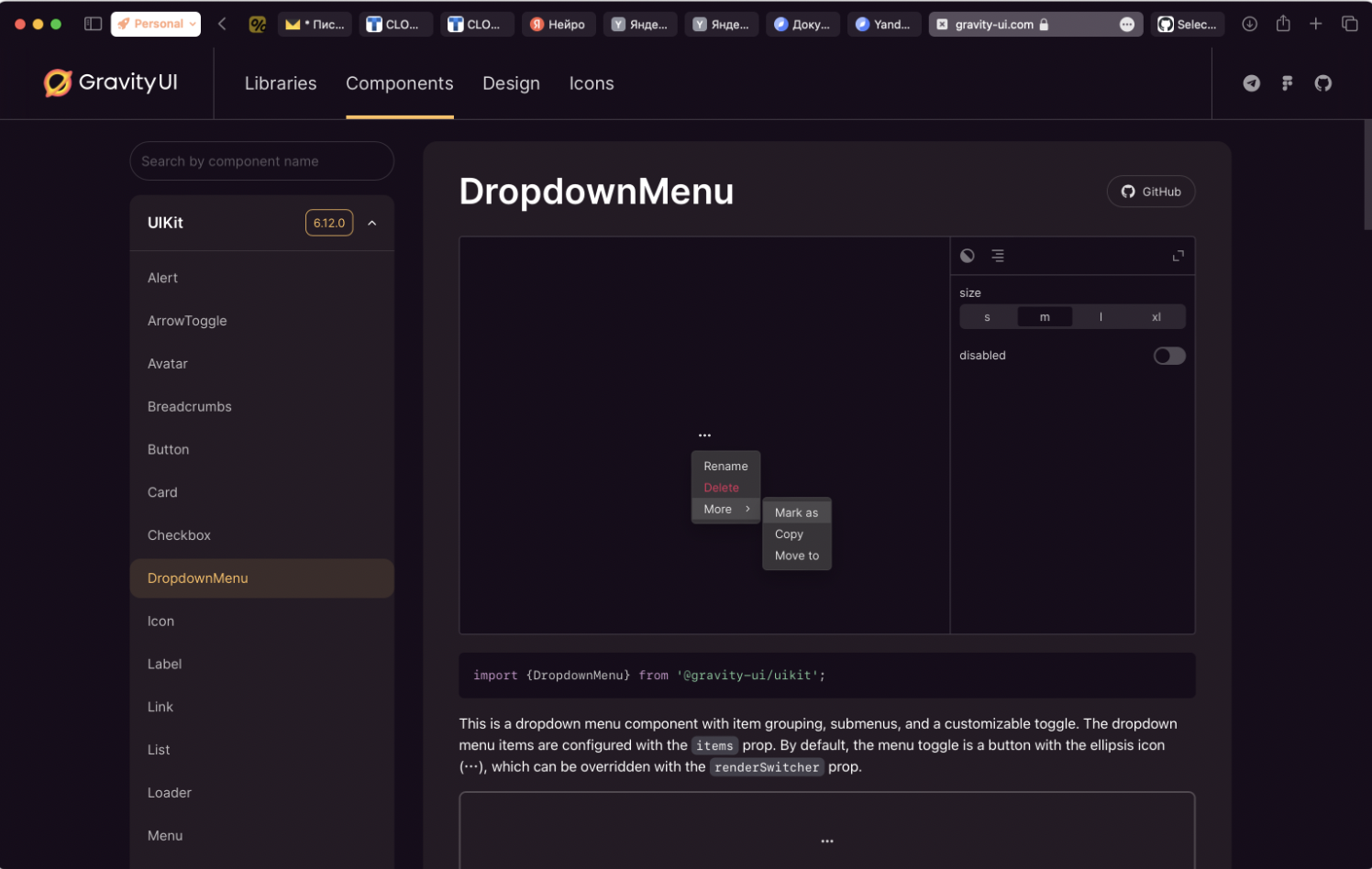
- In the dropdown list, the second level of items doesn’t open using the keyboard — only via a mouse click.
-
It’s unclear which item is selected in a markdown bulleted list inside the Select component.
-
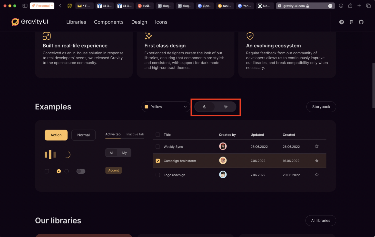
Buttons without text labels, indicated only visually, are read out simply as “button” or “radio button”. This bug occurs only on the landing page; the component itself supports aria-label, but we didn’t use it.
As a result, we realized that since we didn’t find dozens of issues, the library’s accessibility was already at a fairly good level. Testing components outside a real context is very difficult, so we decided to start checking the accessibility of a finished product. This helped us find additional a11y improvements.
Yandex Cloud accessibility
Inspired by the Gravity UI update, we decided to run accessibility testing for our services: starting with the Yandex Cloud website, and then extending this practice to other interfaces.
There are a number of standards that can help achieve accessibility. But to test Yandex Cloud interfaces reliably and better understand how convenient our site is for everyone, we conducted an audit.
Accessibility audit
We again reached out to colleagues from the non-visual testing team and to Anatoly to test the site together, document issues, and take them into work. In total, there were two iterations nearly a month apart — the initial test and a retest.
During testing, we documented a whole set of fixes that we needed to implement.
On the home page
-
The search control needed a redesign. In our interface, the search component is implemented as a search area with a magnifying glass icon. Clicking either of them opens an input field for the query. In the previous implementation, for screen readers these were independent elements, which confused blind users.

-
In the language selector, we used a “collapsed” state attribute even though it was essentially a selection button, not a dropdown list. There was no “language” label, and a space was missing in the “language — region” transition.
-
In the account menu, focus wasn’t trapped: when activated, the user could move outside the menu items.
-
The main tag on the home page was duplicated, so we had to remove one.
-
The examples section: we needed to use a tab instead of a button.

- In the example card, the text was placed into aria-describedby, so the screen reader read it only once, which is inconvenient when reviewing important information. While investigating the bug, we realized we should do a comprehensive refactor of the Card component, so we created an issue where you can learn the details of the changes and take part in the discussion.
Navigation
- Focus issue: when expanding the top-level menu, focus should be moved into the submenu.
- We needed to remove TabIndex from the top-level menu. The current behavior caused all menu items to be announced twice.
- We needed to trap keyboard focus in navigation when it is expanded. Otherwise, you can “fall out” of the menu onto the page itself and then be unable to get back.
Footer
- Yandex Cloud was wrapped in a list. The headings of link lists in the footer were wrapped in a list item, so NVDA treated them as part of the list and read the same list to the user twice.
- Labels were missing for the App Store and Google Play links. At the time of testing, fragments of the URL were read out, which gave the user no meaningful information.
“Blog” section
- The “All topics” and “All services” buttons were not associated with the button. The select buttons did not announce their content.
- Accessibility support was needed in the lists: when opening a dropdown, the screen reader focus should switch to the items of that list. Additionally, it should support simplified navigation between them using the regular arrow keys — without any key combinations.
Blog articles
- Breadcrumbs were missing a “You are here” element.
- Focus needed to be trapped in the dialog.
- The favorites counter had no name. The counter was a button with an icon and a number. Screen readers read the number — without the icon it wasn’t clear what the button does.
We collected all tasks into an epic and started working on them. For some of the tasks, GitHub issues were created.
I’ll describe the most interesting cases in more detail.
Select component
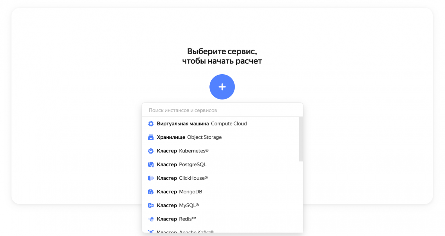
During testing, we found that when navigating with the keyboard, the list item names are not announced by the screen reader. We partially fixed the issue using the aria-activedescendant attribute, but not completely.
Here are the issues that remain
-
In Safari, this approach doesn’t work, and we don’t yet understand how to solve it.
-
Search filtering is not always supported (in fact, it’s never supported — it just hasn’t been implemented). Typically, aria-activedescendant is attached to the main dropdown element and points to the currently selected list item. Right now, it’s attached to the button that opens the dropdown. When pressing the up or down arrows, we change the button’s aria-activedescendant value to the previous or next list item. That way, the screen reader can read from the focused button which item is currently selected.
The issue with search filtering is that the input field doesn’t have aria-activedescendant. If a person focuses the filter input and wants to type something, the screen reader can’t determine which list item is active, and arrow-key navigation in the list doesn’t work.
-
Selected options aren’t marked; we need to add an attribute to them, for example aria-selected.
You can see the issue with the current problems here.
Breadcrumbs

Breadcrumbs are a navigation element that shows the user’s path through the site. In our case, the screen reader read out the entire path, and it was impossible to understand which part of the site the person was on. Also, the entire component was presented simply as a set of links.
We decided to step away from the standard and solve this in a simple and optimal way — by adding a “You are here” label for screen readers. In the end, we combined the standard approach with the label.
During the work, we found that for this label to be read out, it must be attached to an element that screen readers do not ignore. It was easier to attach the label to a conventional structure than to come up with a way to avoid it. Still, the label is useful: it helps the user understand faster that what they are hearing is breadcrumbs.
Images without captions
Some images on the site were placed without captions, and the screen reader read them as “Image”. This provides no useful information to the user and doesn’t convey anything about the interface, so we decided to hide images without captions from the screen reader.
Text order in blocks
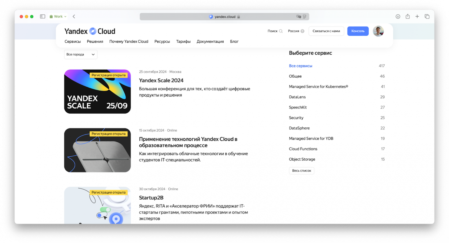
In several places on our site, information is presented as a single block — for example, an event card or a blog article card.
We noticed that screen readers read the information in an order that sighted users don’t follow. For an event card, the screen reader read the data as: registration status, time, location, and only then the title and event description.
Typically, users don’t follow a linear path: they look at the title first, then the subtitle, and the image. The problem is that screen readers read elements in the order they appear in the page’s DOM tree. To fix the order, we had to rebuild it.
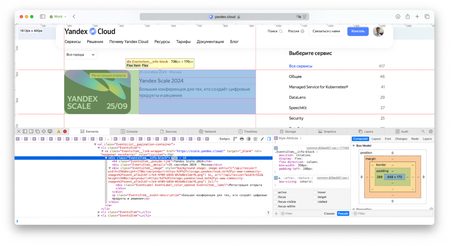
We were surprised, but in some “operating system — browser” combinations this didn’t work. For example, in Mozilla Firefox on macOS the problem persisted despite changing the order in the page tree. Hopefully, Firefox developers will fix this behavior in future browser versions.
Modal windows
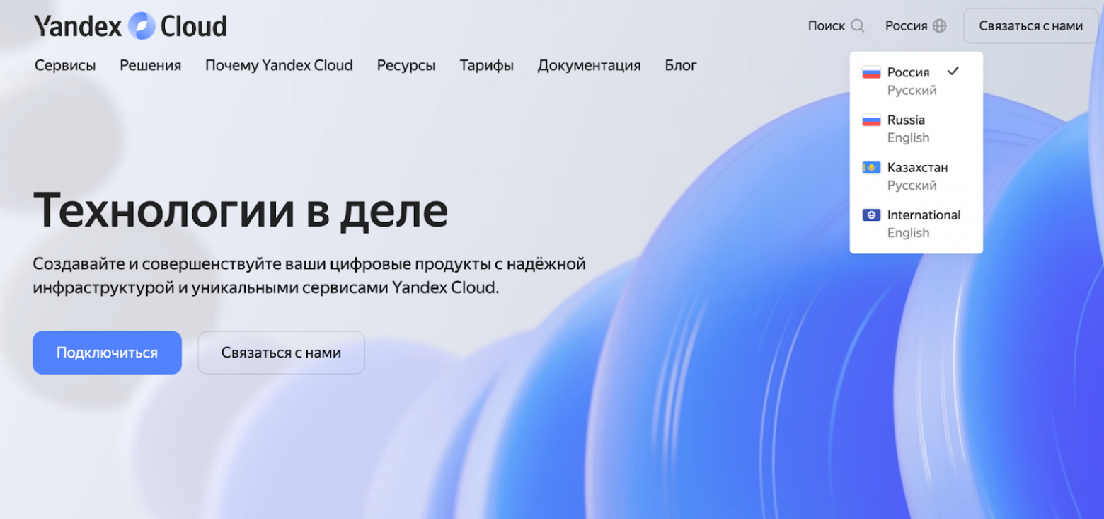
When a sighted user opens a pop-up in the interface, their attention shifts to what’s inside the window. However, the content of the entire site is still available, and they can return their attention to it when needed.
When interacting with a site via a screen reader, the situation changes. If the pop-up isn’t made modal, it has no boundaries. As a result, navigating the site becomes harder: a person can accidentally move out of the pop-up using element navigation.
There is a standard for working with modal windows, and if you follow it, it’s not necessary to make all pop-ups in the interface modal.
But during testing, we concluded that making pop-ups modal is a good practice that simplifies working with the site when using a screen reader.
We decided to make all pop-ups modal. At the same time, we kept the option for the user to configure an alternative interaction scenario with such windows.
You can set up such a scenario by assigning role="dialog", aria-modal="true". In the VoiceOver + Firefox combination, this solution is not supported: details are in a private issue.
Diplodoc
Inspired by our activity, the developers of the technical documentation platform Diplodoc implemented a number of a11y improvements in their product:
- They reviewed all additional YFM (Yandex Flavored Markdown) syntax elements and rewrote them so they are visible to screen readers.
- They improved the keyboard workflow for working with documentation: fixed the order of selecting elements and added the ability to select all interactive elements.
- They added correct labels and indications for UI elements, which will significantly simplify using the service for screen reader users.
Since we use Diplodoc to render our documentation, these improvements also increased the accessibility of documentation on the Yandex Cloud website.
Results and plans
We’ve taken the first steps toward improving the accessibility of Yandex Cloud interfaces for all users. We still need to transfer this experience to other service interfaces and fix the issues we already know about.
Gravity UI made our accessibility work easier, and we continue to address open issues labeled a11y. At the time of writing, we had 14 open and 24 closed issues — you can see them here.
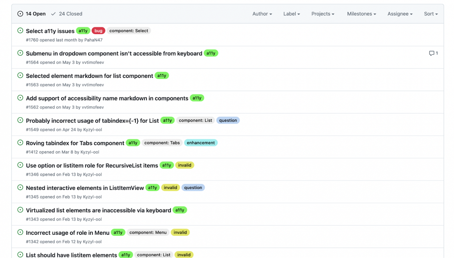
We’re looking forward to your PRs and comments on accessibility and how the services work, as well as examples of using Gravity UI on your websites.

Vladimir Timofeev
Technical Project Manager, Yandex Cloud