Build modern interfaces with the Gravity design system and libraries
Recent updates
Icon Library Update: 742 vector icons available for your projects; 51 changes in the release! Figma Library Update: sample interfaces were added to the Branding and Customization page to fast preview the applied theme.
The number of developers involved in the project has already exceeded 250! Thank you each for your contribution, stay with us to make the product even better!
Now you can import your Themer files into Figma Library using the Gravity Themer Plugin!
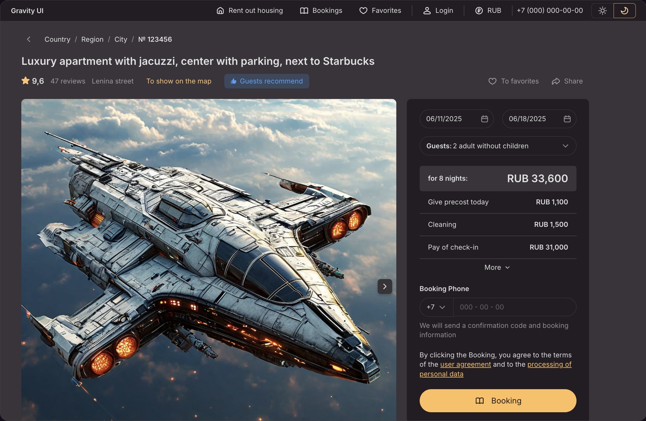
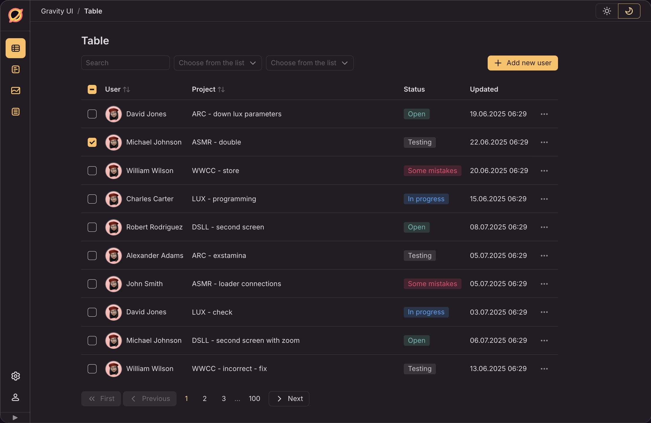
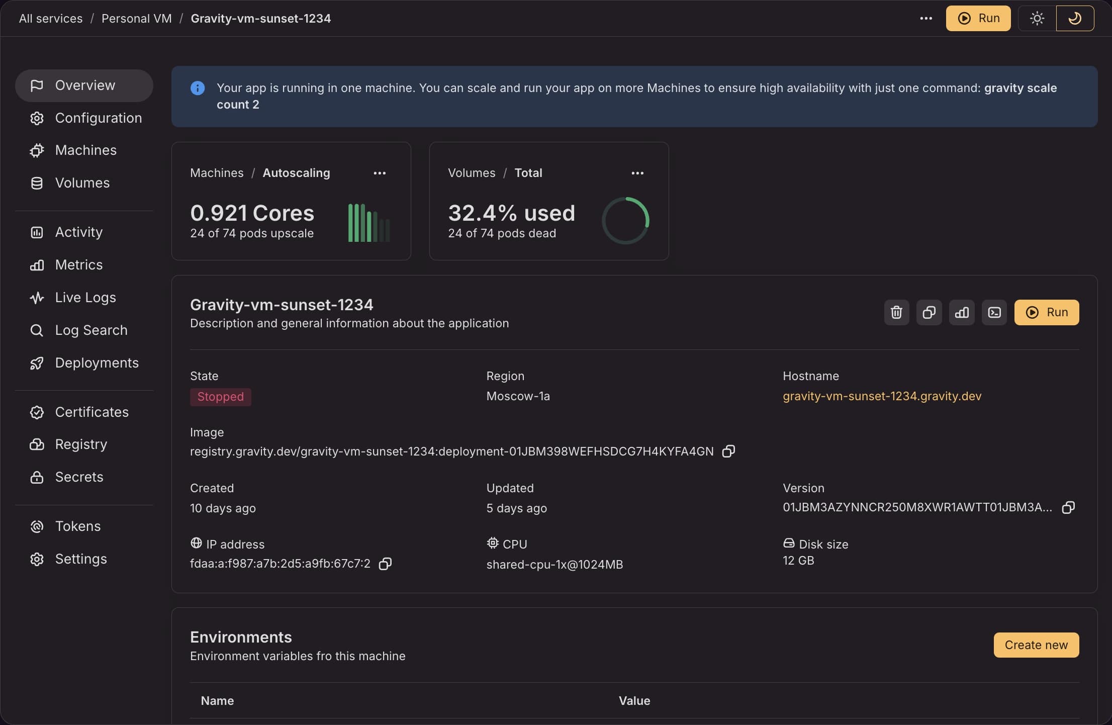
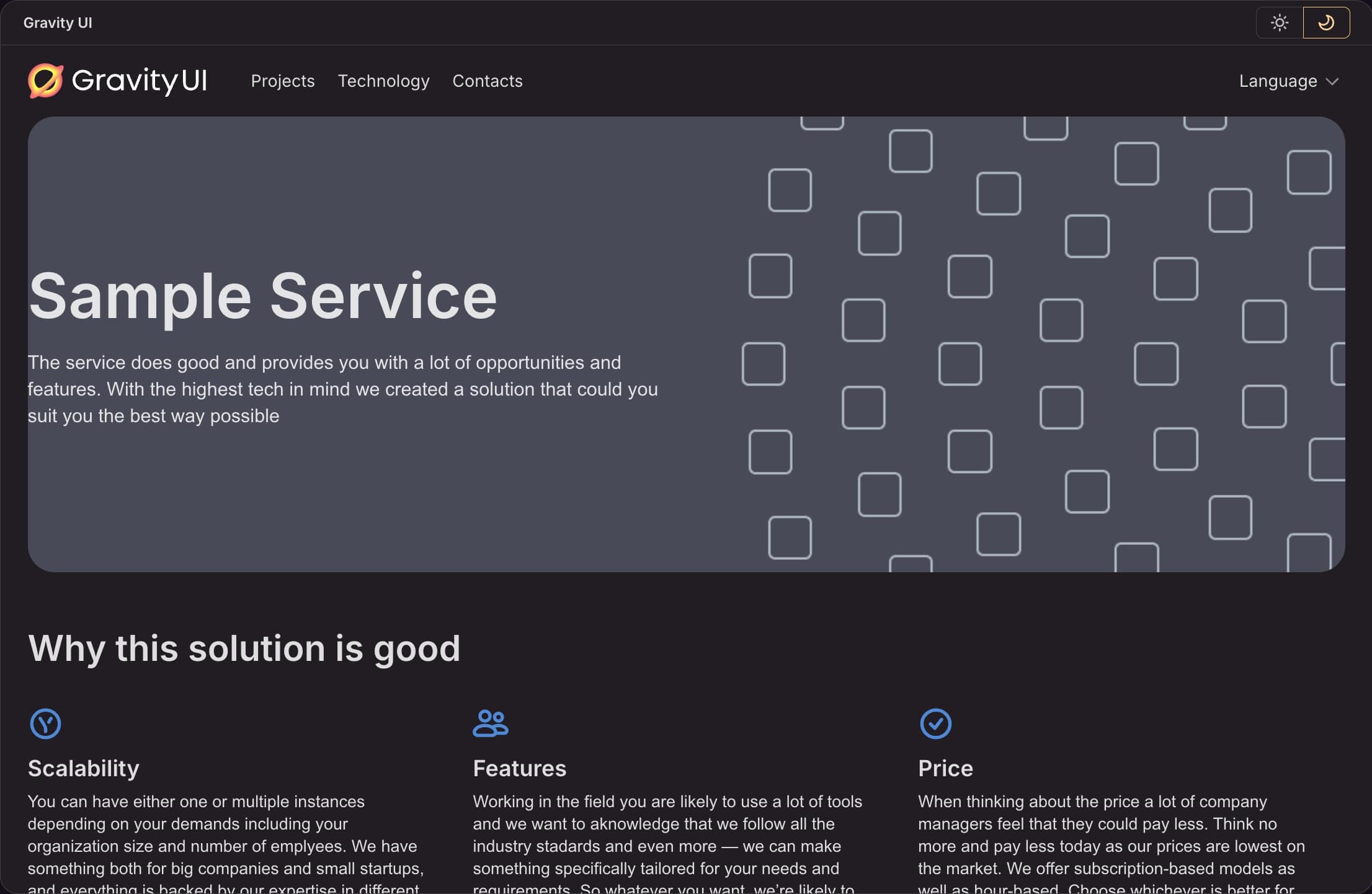
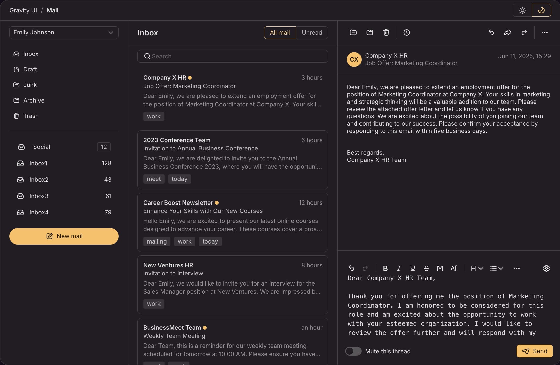
Examples
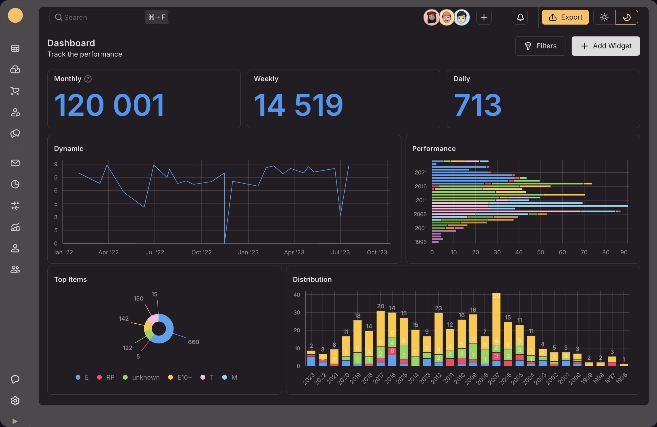
Roadmap 2025
- UIKit migration to Floating UI
- Themer 1.5 Support of theme export to Figma
- Page-constructor PlaygroundIn progress
- Themer 2.0 theme catalog
Trusted by
