Timeline
@gravity-ui/timeline 


A React-based library for building interactive timeline visualizations with canvas rendering.
Documentation
For details see Documentation.
Preview
Basic timeline with events and axes:
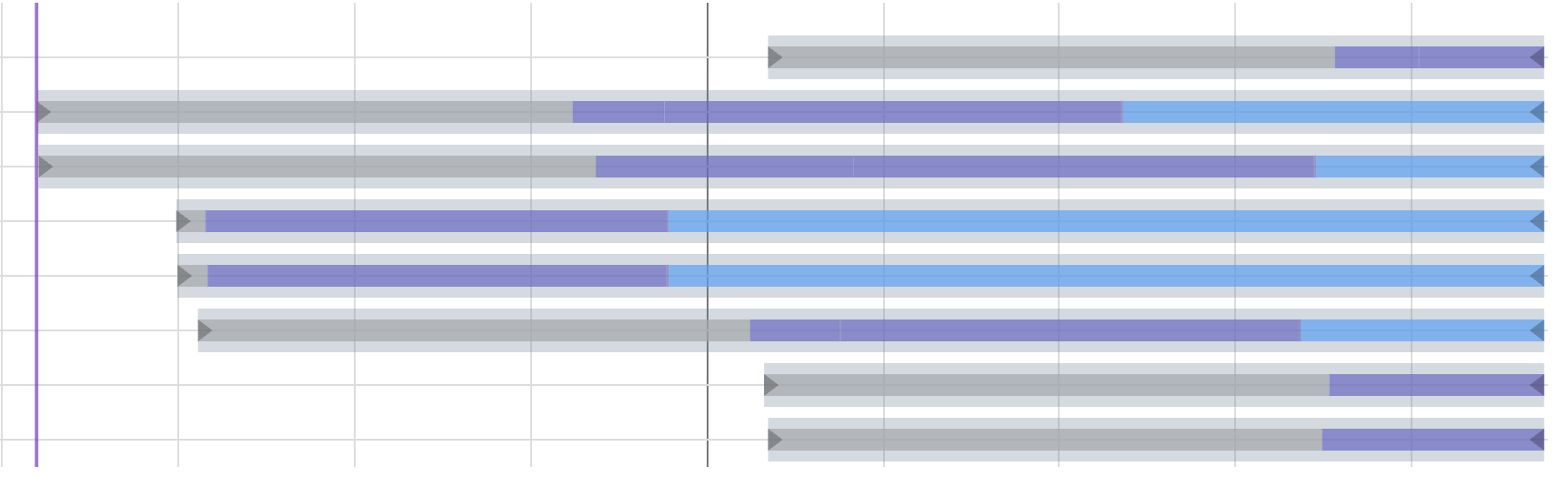
Custom rendering with expandable nested events (NestedEvents example):
Features
- Canvas-based rendering for high performance
- Interactive timeline with zoom and pan capabilities
- Support for events, markers, sections, axes, and grid
- Background sections for visual organization and time period highlighting
- Smart marker grouping with automatic zoom to group - Click on grouped markers to zoom into their individual components
- Virtualized rendering for improved performance with large datasets (only active when timeline content exceeds the viewport)
- Customizable appearance and behavior
- TypeScript support with full type definitions
- React integration with custom hooks
Installation
npm install @gravity-ui/timeline
Usage
The timeline component can be used in React applications with the following basic setup:
import { TimelineCanvas, useTimeline } from '@gravity-ui/timeline/react';

const MyTimelineComponent = () => {
  const { timeline, api, start, stop } = useTimeline({
    settings: {
      start: Date.now(),
      end: Date.now() + 3600000, // 1 hour from now
      axes: [],
      events: [],
      markers: [],
      sections: []
    },
    viewConfiguration: {
      // Optional view configuration
    }
  });

  // timeline - Timeline instance
  // api - CanvasApi instance (same as timeline.api)
  // start - function to initialize timeline with canvas
  // stop - function to destroy timeline

  return (
    <div style={{ width: '100%', height: '100%' }}>
      <TimelineCanvas timeline={timeline} />
    </div>
  );
};
Axis Structure
Each axis has the following structure:
type TimelineAxis = {
  id: string;          // Unique axis identifier
  tracksCount: number; // Number of tracks in the axis
  top: number;         // Vertical position (px)
  height: number;      // Height per track (px)
};
Section Structure
Each section requires the following structure:
type TimelineSection = {
  id: string;               // Unique section identifier
  from: number;             // Start timestamp
  to?: number;              // Optional end timestamp (defaults to timeline end)
  color: string;            // Background color of the section
  hoverColor?: string;      // Optional color when section is hovered
  renderer?: AbstractSectionRenderer; // Optional custom renderer (exported from the package)
};
Sections provide background coloring for time periods and help organize timeline content visually:
const MyTimelineComponent = () => {
  const { timeline } = useTimeline({
    settings: {
      start: Date.now(),
      end: Date.now() + 3600000,
      axes: [],
      events: [],
      markers: [],
      sections: [
        {
          id: 'morning',
          from: Date.now(),
          to: Date.now() + 1800000, // 30 minutes
          color: 'rgba(255, 235, 59, 0.3)', // Semi-transparent yellow
          hoverColor: 'rgba(255, 235, 59, 0.4)'
        },
        {
          id: 'afternoon',
          from: Date.now() + 1800000,
          // No 'to' specified - extends to timeline end
          color: 'rgba(76, 175, 80, 0.2)', // Semi-transparent green
          hoverColor: 'rgba(76, 175, 80, 0.3)'
        }
      ]
    },
    viewConfiguration: {
      sections: {
        hitboxPadding: 2 // Hover detection padding
      }
    }
  });

  return <TimelineCanvas timeline={timeline} />;
};
Marker Structure
Each marker requires the following structure:
type TimelineMarker = {
  time: number;           // Timestamp for the marker position
  color: string;          // Color of the marker line
  activeColor: string;    // Color when marker is selected (required)
  hoverColor: string;     // Color when marker is hovered (required)
  lineWidth?: number;     // Optional width of the marker line
  label?: string;         // Optional label text
  labelColor?: string;    // Optional label color
  renderer?: AbstractMarkerRenderer; // Optional custom renderer
  nonSelectable?: boolean;// Whether marker can be selected
  group?: boolean;        // Whether marker represents a group
};
Marker Grouping and Zoom
The timeline automatically groups markers that are close together and provides zoom functionality:
const MyTimelineComponent = () => {
  const { timeline } = useTimeline({
    settings: {
      start: Date.now(),
      end: Date.now() + 3600000,
      axes: [],
      events: [],
      markers: [
        // These markers will be grouped together
        { time: Date.now(), color: '#ff0000', activeColor: '#ff5252', hoverColor: '#ff1744', label: 'Event 1' },
        { time: Date.now() + 1000, color: '#ff0000', activeColor: '#ff5252', hoverColor: '#ff1744', label: 'Event 2' },
        { time: Date.now() + 2000, color: '#ff0000', activeColor: '#ff5252', hoverColor: '#ff1744', label: 'Event 3' },
      ]
    },
    viewConfiguration: {
      markers: {
        collapseMinDistance: 8,        // Group markers within 8 pixels
        groupZoomEnabled: true,        // Enable zoom on group click
        groupZoomPadding: 0.3,        // 30% padding around group
        groupZoomMaxFactor: 0.3,      // Max zoom factor
      }
    }
  });

  // Listen for group zoom events
  useTimelineEvent(timeline, 'on-group-marker-click', (data) => {
    console.log('Group zoomed:', data);
  });

  return <TimelineCanvas timeline={timeline} />;
};
How It Works
The timeline component is built using React and provides a flexible way to create interactive timeline visualizations. Here's how it works:
Component Architecture
The timeline is implemented as a React component that can be configured through two main objects:
-
TimelineSettings: Controls the core timeline behavior and appearance
start: Start time of the timelineend: End time of the timelineaxes: Array of axis configurations (see structure below)events: Array of event configurationsmarkers: Array of marker configurationssections: Array of section configurations
-
ViewConfiguration: Manages the visual representation and interaction settings
- Controls appearance, zoom levels, and interaction behavior
- Can be customized or use default values
Event Handling
The timeline component supports several interactive events:
on-click: Triggered when clicking on the timelineon-context-click: Triggered on right-click/context menuon-select-change: Fired when the selection changeson-hover: Triggered when hovering over timeline elementson-leave: Fired when the mouse leaves timeline elements
Example of event handling:
import { useTimelineEvent } from '@gravity-ui/timeline/react';

const MyTimelineComponent = () => {
  const { timeline } = useTimeline({ /* ... */ });

  useTimelineEvent(timeline, 'on-click', (data) => {
    console.log('Timeline clicked:', data);
  });

  useTimelineEvent(timeline, 'on-select-change', (data) => {
    console.log('Selection changed:', data);
  });

  return <TimelineCanvas timeline={timeline} />;
};
React Integration
The component uses custom hooks for timeline management:
-
useTimeline: Manages the timeline instance and its lifecycle- Creates and initializes the timeline
- Handles cleanup on component unmount
- Provides access to the timeline instance
-
useTimelineEvent: Handles event subscriptions and cleanup- Manages event listener lifecycle
- Automatically cleans up listeners on unmount
The component automatically handles cleanup and destruction of the timeline instance when unmounted.
Event Structure
Events in the timeline follow this structure:
type TimelineEvent = {
  id: string;             // Unique identifier
  from: number;           // Start timestamp
  to?: number;            // End timestamp (optional for point events)
  axisId: string;         // ID of the axis this event belongs to
  trackIndex: number;     // Index in the axis track
  renderer?: AbstractEventRenderer; // Optional custom renderer
  color?: string;         // Optional event color
  selectedColor?: string; // Optional selected state color
};
Direct TypeScript Usage
The Timeline class can be used directly in TypeScript without React. This is useful for integrating with other frameworks or vanilla JavaScript applications:
import { Timeline } from '@gravity-ui/timeline';

const timestamp = Date.now();

// Create a timeline instance
const timeline = new Timeline({
  settings: {
    start: timestamp,
    end: timestamp + 3600000, // 1 hour from now
    axes: [
      {
        id: 'main',
        tracksCount: 3,
        top: 0,
        height: 100
      }
    ],
    events: [
      {
        id: 'event1',
        from: timestamp + 1800000, // 30 minutes from now
        to: timestamp + 2400000,   // 40 minutes from now
        label: 'Sample Event',
        axisId: 'main'
      }
    ],
    markers: [
      {
        id: 'marker1',
        time: timestamp + 1200000, // 20 minutes from now
        label: 'Important Point',
        color: '#ff0000',
        activeColor: '#ff5252',
        hoverColor: '#ff1744'
      }
    ],
    sections: [
      {
        id: 'section1',
        from: timestamp,
        to: timestamp + 1800000, // First 30 minutes
        color: 'rgba(33, 150, 243, 0.2)', // Light blue background
        hoverColor: 'rgba(33, 150, 243, 0.3)'
      }
    ]
  },
  viewConfiguration: {
    // Optional: customize view settings
    zoomLevels: [1, 2, 4, 8, 16],
    hideRuler: false,
    showGrid: true
  }
});

// Initialize with a canvas element
const canvas = document.querySelector('canvas');
if (canvas instanceof HTMLCanvasElement) {
  timeline.init(canvas);
}

// Add event listeners
timeline.on('on-click', (detail) => {
  console.log('Timeline clicked:', detail);
});

timeline.on('on-select-change', (detail) => {
  console.log('Selection changed:', detail);
});

// Clean up when done
timeline.destroy();
The Timeline class provides a rich API for managing the timeline:
-
Event Management:
// Add event listener timeline.on('eventClick', (detail) => { console.log('Event clicked:', detail); }); // Remove event listener const handler = (detail) => console.log(detail); timeline.on('eventClick', handler); timeline.off('eventClick', handler); // Emit custom events timeline.emit('customEvent', { data: 'custom data' }); -
Timeline Control:
// Update timeline data
timeline.api.setEvents([
  {
    id: 'newEvent',
    from: Date.now(),
    to: Date.now() + 3600000,
    label: 'New Event',
    axisId: 'main',
    trackIndex: 0
  }
]);

// Update axes
timeline.api.setAxes([
  {
    id: 'newAxis',
    tracksCount: 2,
    top: 0,
    height: 80
  }
]);

// Update markers
timeline.api.setMarkers([
  {
    id: 'newMarker',
    time: Date.now(),
    label: 'New Marker',
    color: '#00ff00',
    activeColor: '#4caf50',
    hoverColor: '#2e7d32'
  }
]);

// Update sections
timeline.api.setSections([
  {
    id: 'newSection',
    from: Date.now(),
    to: Date.now() + 1800000,
    color: 'rgba(255, 193, 7, 0.2)', // Light amber background
    hoverColor: 'rgba(255, 193, 7, 0.3)'
  }
]);

// Update view configuration (merges with current config)
timeline.api.setViewConfiguration({ hideRuler: true });
Live Examples
Explore interactive examples in our Storybook:
- Basic Timeline - Simple timeline with events and axes
- Endless Timeline - Endless timeline with events and axes
- Markers - Timeline with vertical markers and labels
- Custom Events - Timeline with custom event rendering
- Integrations - RangeDateSelection, DragHandler, NestedEvents, Popup, List
Development
Storybook
This project includes Storybook for component development and documentation.
To run Storybook:
npm run storybook
This will start the Storybook development server on port 6006. You can access it at http://localhost:6006.
To build a static version of Storybook for deployment:
npm run build-storybook
License
MIT