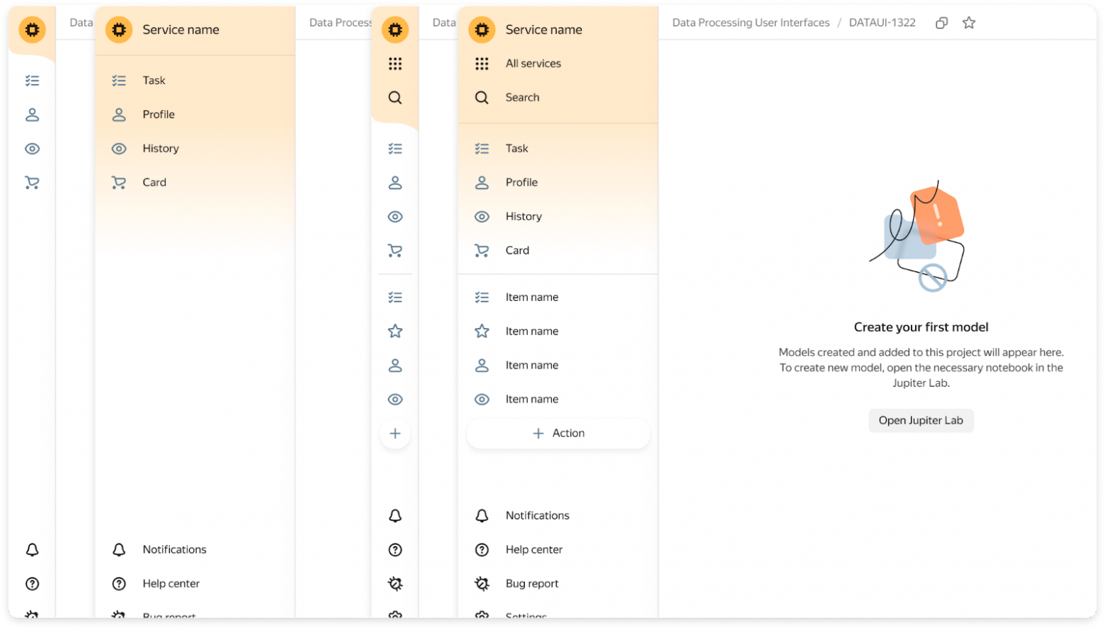
The Navigation component — you can configure it as a simple version or as a fully loaded one
Gravity UI Design System: How to Easily Build Your Interface
Gravity UI Design System: How to Easily Build Your Interface
Hello everyone, I’m Alexey Sizikov, Head of User Experience at Yandex Cloud. In this article, I’d like to share some news: we’ve open-sourced our design system and component library Gravity UI.
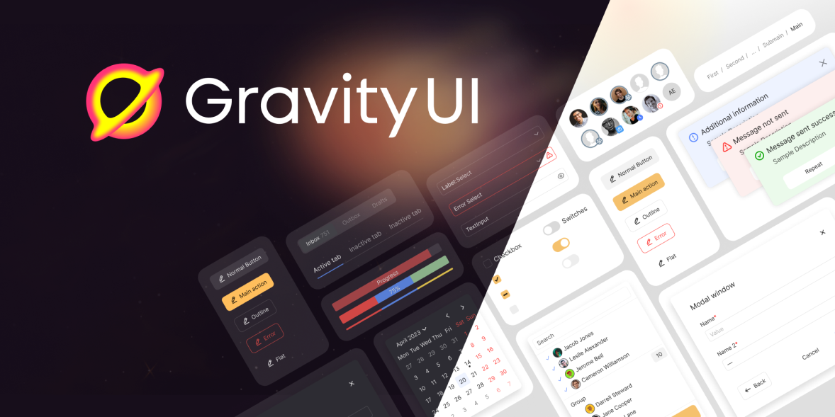
With the Gravity UI component library, you can build modern interfaces. It includes:
- a set of basic React components;
- a landing page builder library;
- detailed guides on using the components;
- a library in Figma;
- a set of ready-made icons with nearly 600 options;
- ChartKit — a data visualization package;
- Yagr — high-performance chart rendering based on uPlot;
- I18n — a UI localization package
- and more than 25 useful libraries.
Below the cut is a story about why we created Gravity UI, how we use it, what the features and advantages of our approach are, and how we plan to evolve it further. Also: how to configure different color schemes in your projects and why we have four themes instead of the usual two.
Why we created Gravity UI
Initially, the UIKit library was an internal product to speed up the team’s work. As the number of new services grew, we set a goal: to build a unified UX across our products. It was important to use the same user behavior patterns across services so that users would perceive the entire platform as a single whole.
An additional goal for the design team was to create tools so that developers could build a new service without involving designers.
Relatively recently, platforms and services using our design system started going open source: YTsaurus, YDB, DataLens, Diplodoc. Many users spoke positively about them and helped improve the code together with the developers. Inspired by their example, we came up with the idea to release Gravity UI to the public as well, because we saw how useful the library could be for many services — not only inside Yandex.
What are the features of Gravity UI
Based on real-world experience
One of the distinguishing features of our design system is that it evolves based on the needs of our users — most of whom are developers. Moreover, our designers are closely tied to the products they work on. Each designer has several services with their own usage scenarios. After a solution has been tested in their services, the product designer rolls it out to other services to make sure it works and helps developers.
For example, the side navigation component initially evolved with only a logo and menu items. Later, for convenience, we added an item with all services and a search feature. And when we got a service where there was a need to create a new entity right from the side menu, we added a separate plus button. Next came menu sections with dividers for complex services with lots of menu items, as well as an “Other items” button.
Flexible variability
Many Gravity UI components can be configured for different scenarios. For example, the pagination component has several display options: with a total page count, full button labels, the ability to jump to a specific page, and changing the number of results per page — this option is designed for a large number of pages. But if your case has only a few results, you can use a compact mode or even hide the numbers and show only arrows.
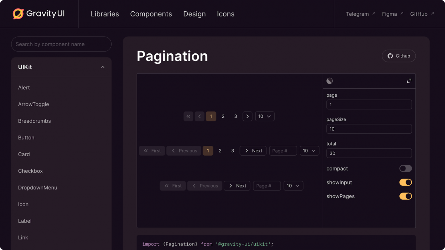
Example of displaying different pagination variants
Broad range of applications
With Gravity UI, you can build both a simple admin interface and a complex dashboard with charts. Here are a few examples of what you can put together with our design system:
- landing pages,
- admin panels,
- dashboards,
- charts,
- CRM,
- an analytics service.
For example, our colleagues built this dashboard:
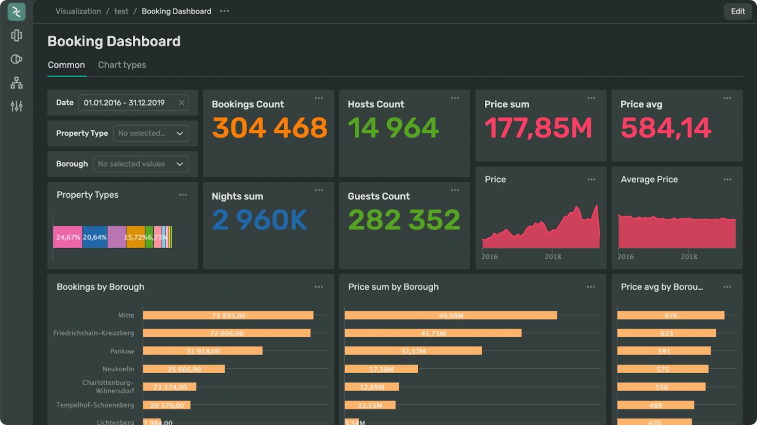
An example dashboard you can build with Gravity UI
You can also build a simple landing page. For example, the website with our open-source projects is built using Gravity UI components.
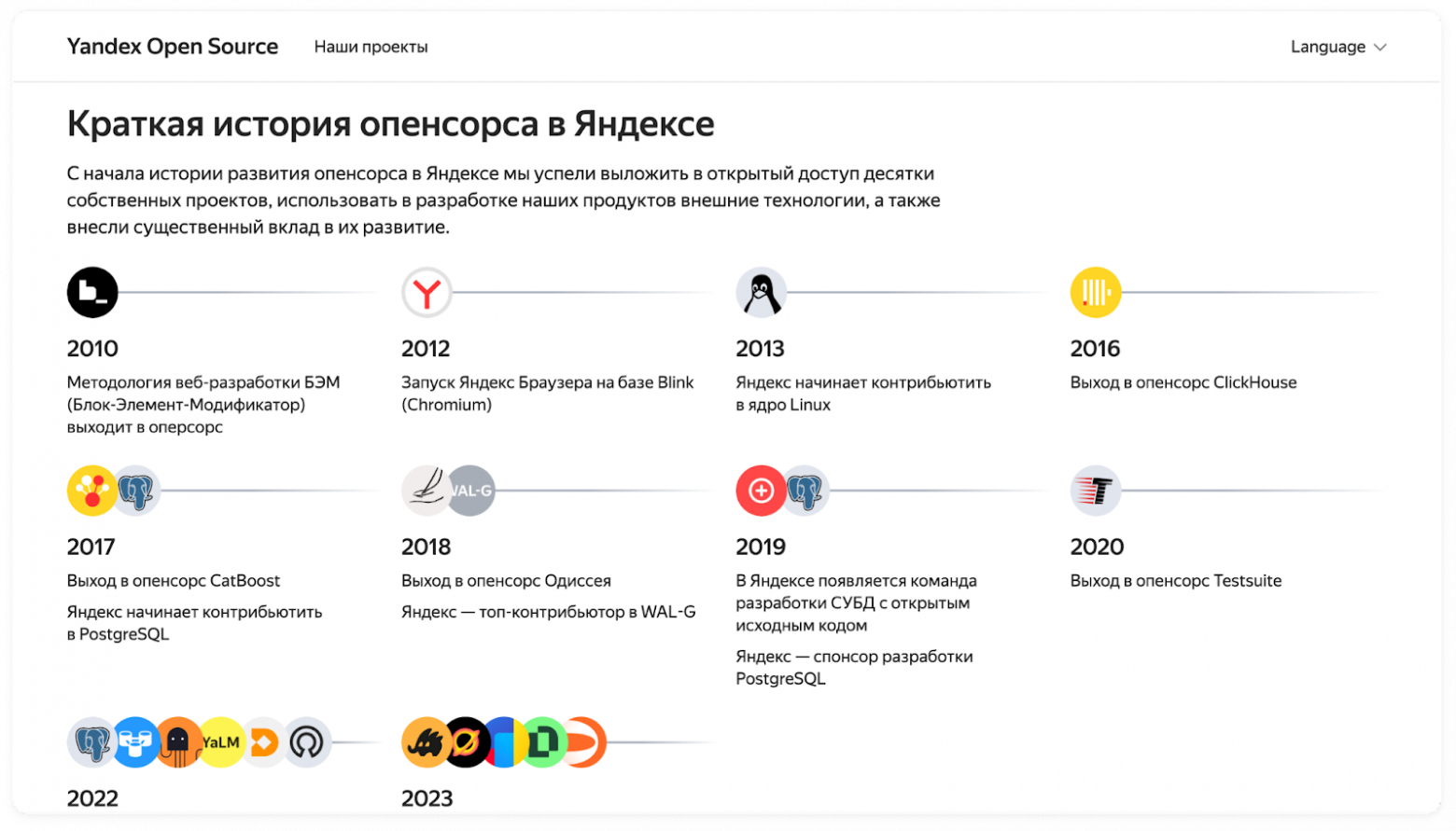
And this is an example of a website you can also build with our design system
More than 150 contributors
Our ecosystem is constantly evolving and improving. In addition to feedback from our developer community, we receive suggestions from more than 100 services that already use our design system.
Here’s an example. Initially, we had two themes — dark and light. But we started receiving feedback from teams that broadcast the interface to TVs for viewing charts or during stand-ups. The issue is that the interface is hard to see on a TV. A similar problem also occurs for users with old or low-quality monitors.
As a result, we developed increased contrast for each theme. It increases the brightness of dark and light colors as well as semantic colors. This is configured via CSS styles and controlled in user settings.
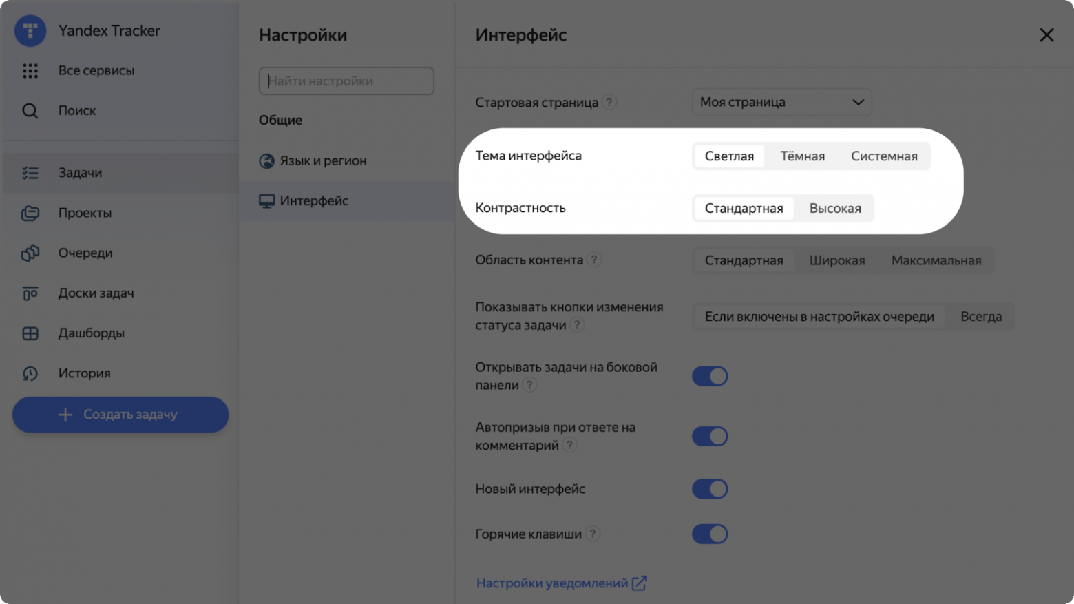
Example of the Yandex Tracker interface, also built with Gravity UI components, with the option to enable increased contrast
By the way, now you can contribute too. Send PRs on GitHub or leave comments in Figma.
How to work with Gravity UI
Customizing the interface for your brand
Next, I’ll talk about what else you can do with Gravity UI. I’ll start with the ability to customize the design system to match your brand. For example, when YDB went open source, we faced the task of keeping a unified design system while also making it distinctive for different brands. To do this, we created a separate group of CSS variables. It includes brand colors, fonts, and border radii. In code, it looks like a small block:
.g-root {
    --g-font-family-sans: 'Inter', sans-serif;

    --g-text-header-font-weight: 600;
    --g-text-subheader-font-weight: 600;
    --g-text-display-font-weight: 600;
    --g-text-accent-font-weight: 600;

    --g-color-base-brand: rgb(117, 155, 255);
    --g-color-base-brand-hover: rgb(99, 143, 255);
    --g-color-base-selection: rgba(82, 130, 255, 0.05);
    --g-color-base-selection-hover: rgba(82, 130, 255, 0.1);
    --g-color-line-brand: rgb(117, 155, 255);
    --g-color-text-brand: rgb(117, 155, 255);
    --g-color-text-brand-contrast: rgb(255, 255 ,255);
    --g-color-text-link: rgb(117, 155, 255);
    --g-color-text-link-hover: rgb(82, 130, 255);

    --g-border-radius-xs: 3px;
    --g-border-radius-s: 5px;
    --g-border-radius-m: 6px;
    --g-border-radius-l: 8px;
    --g-border-radius-xl: 10px;
    --g-border-radius-2xl: 16px;
}
In this group, you can replace the font, the color of accent buttons, and the rounding radii. This way, you can use a single design system for different brands while preserving each brand’s identity. If this option doesn’t work for you, you can create your own color scheme. There’s a detailed guide in the documentation.
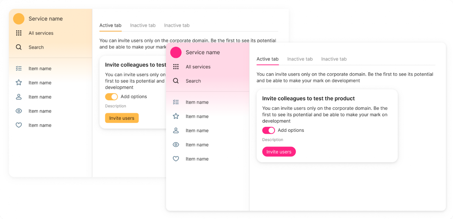
Example interfaces with different brand variables
It’s worth noting that changing brand colors won’t affect the core interface. This is especially important for elements that use semantic colors: for example, red will still mean an error, and green will still mean success.
Components in Figma
For convenience, our design team prepared and uploaded all component states to Figma. If you want, you can make a copy of the library and try building an interface directly in the tool.
With the latest update, the library no longer duplicates all four themes. By default, you work in the light theme, but in the Layer section you can switch any element — or the whole page — to another theme.
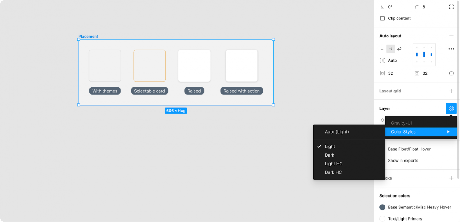
How to preview an element in different themes
All library elements are presented on the Overview page. Here you can find the component you need and go to the page with all its states. In addition, each component has a usage example.
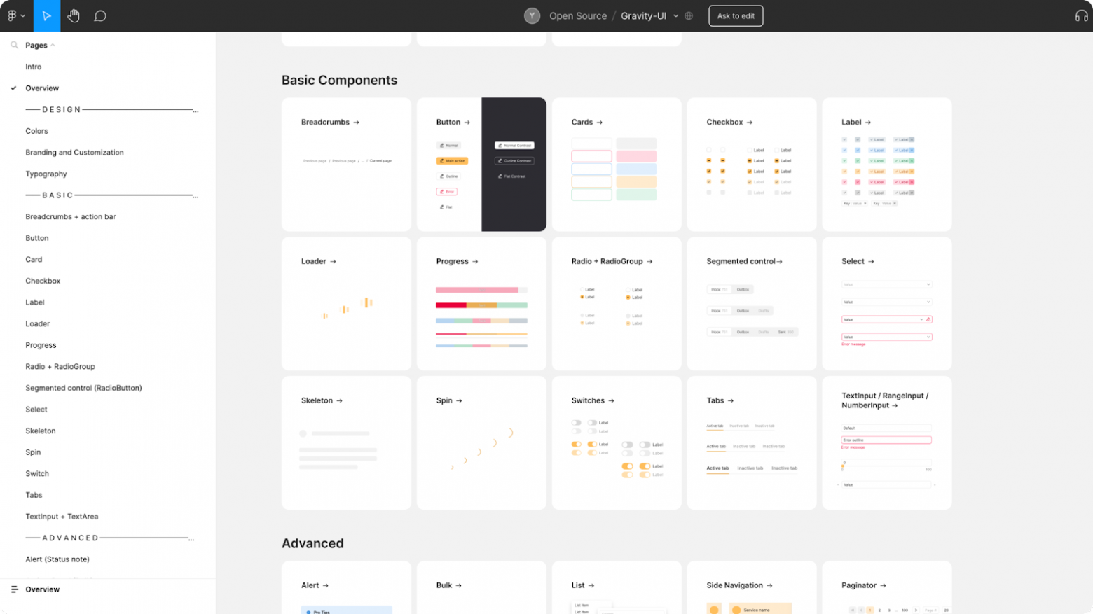
A page with all Gravity UI elements
Nearly 600 icons
Icons are an essential part of design and usability. They help organize and structure content, set accents, and improve how information is perceived. At first glance, creating an icon pack doesn’t seem too hard. But we faced a challenge when creating icons for complex metaphors such as virtual machines, databases, and various chart types.
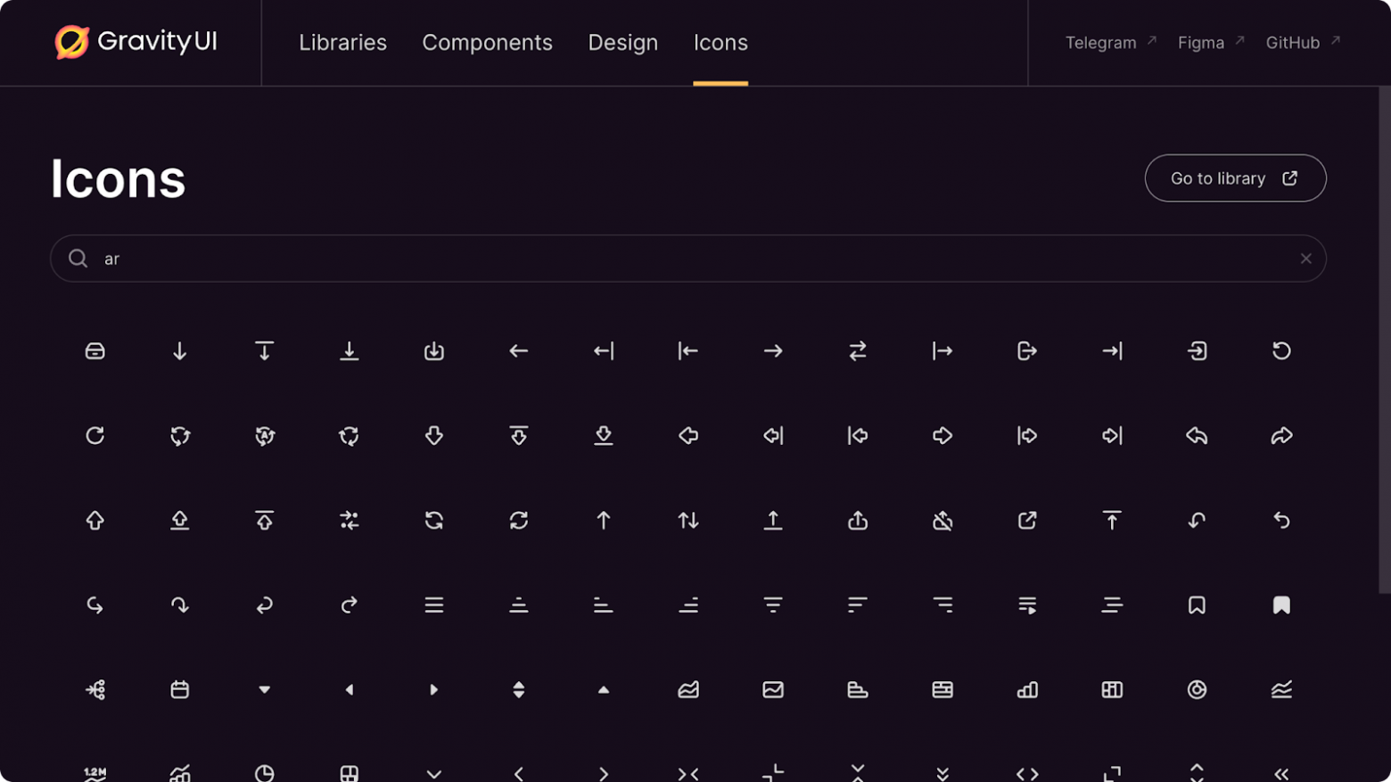
We currently have 594 icons, but there will be more soon
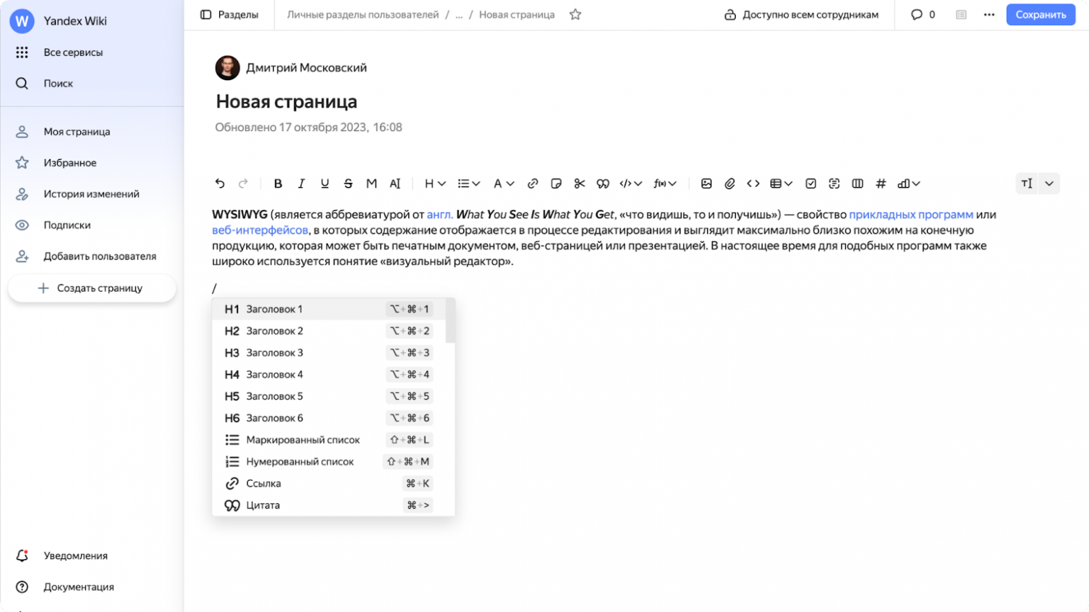
Developing icons for a WYSIWYG content editor was also a special challenge — it’s being integrated in various places for text formatting
To make icon search more convenient, we used a special naming system. Now you can find the same icon by typing different names. For example, to find an arrow-like icon, you can type any of these words: arrow, enter, move, login.
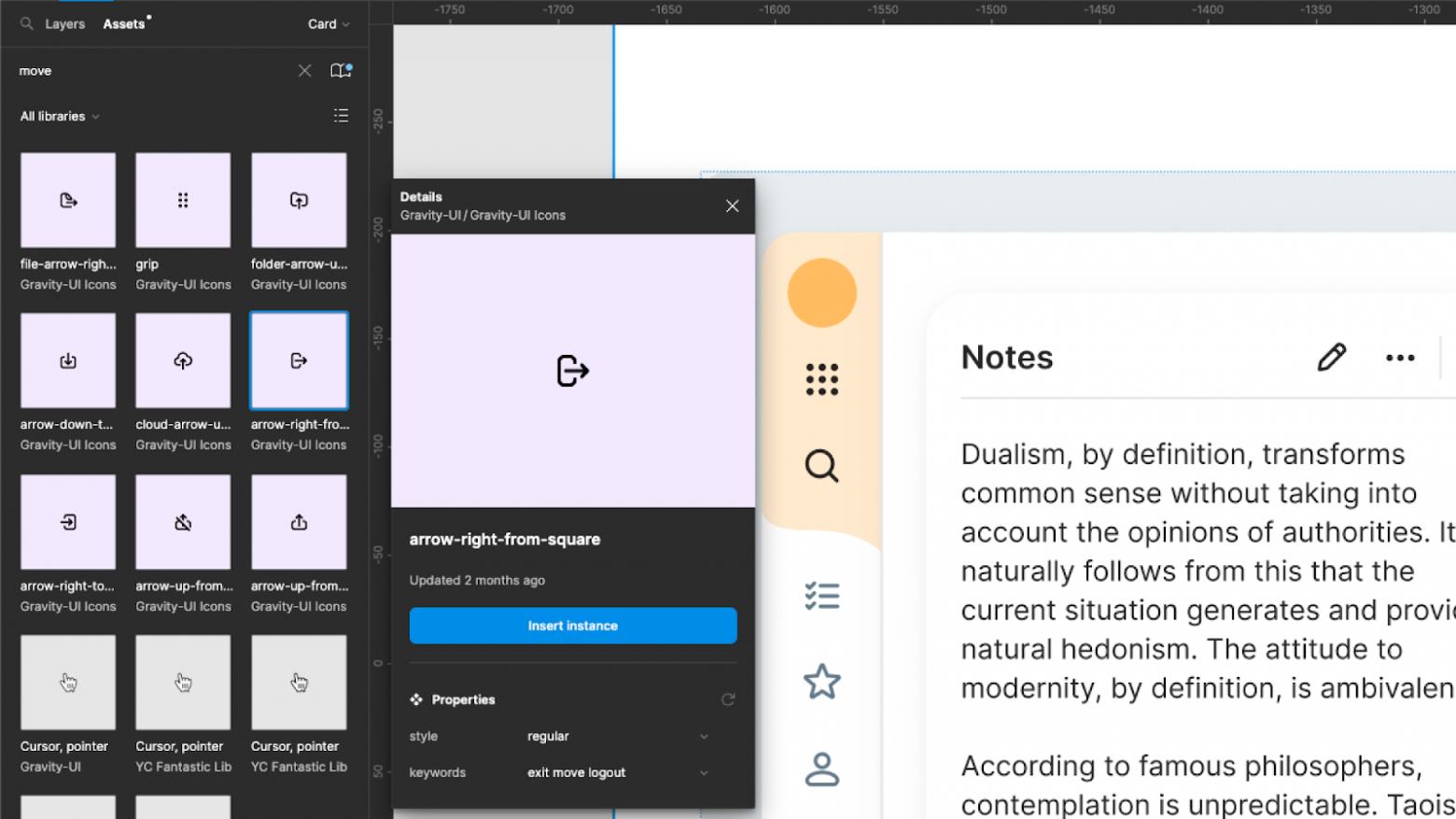
All icons are available on a separate page. You can copy the SVG or download any icon
Guides
As I wrote above, our goal was to make it easy for developers to build standard interfaces using component descriptions in our guide. We aimed to make this process simple, without the need to contact a designer for every single element. At the moment, we already have five examples of internal services that were fully built by developers using only the guides.
Of course, you can’t solve this task with developers’ hands alone: in any case, there are complex scenarios that require the attention of a UX/UI specialist. Nevertheless, we managed to remove a significant portion of the load from our designers.
In the guides, the design team described the components and provided recommendations on how to use them, showing examples of the right and wrong approach. You can view them on this page.
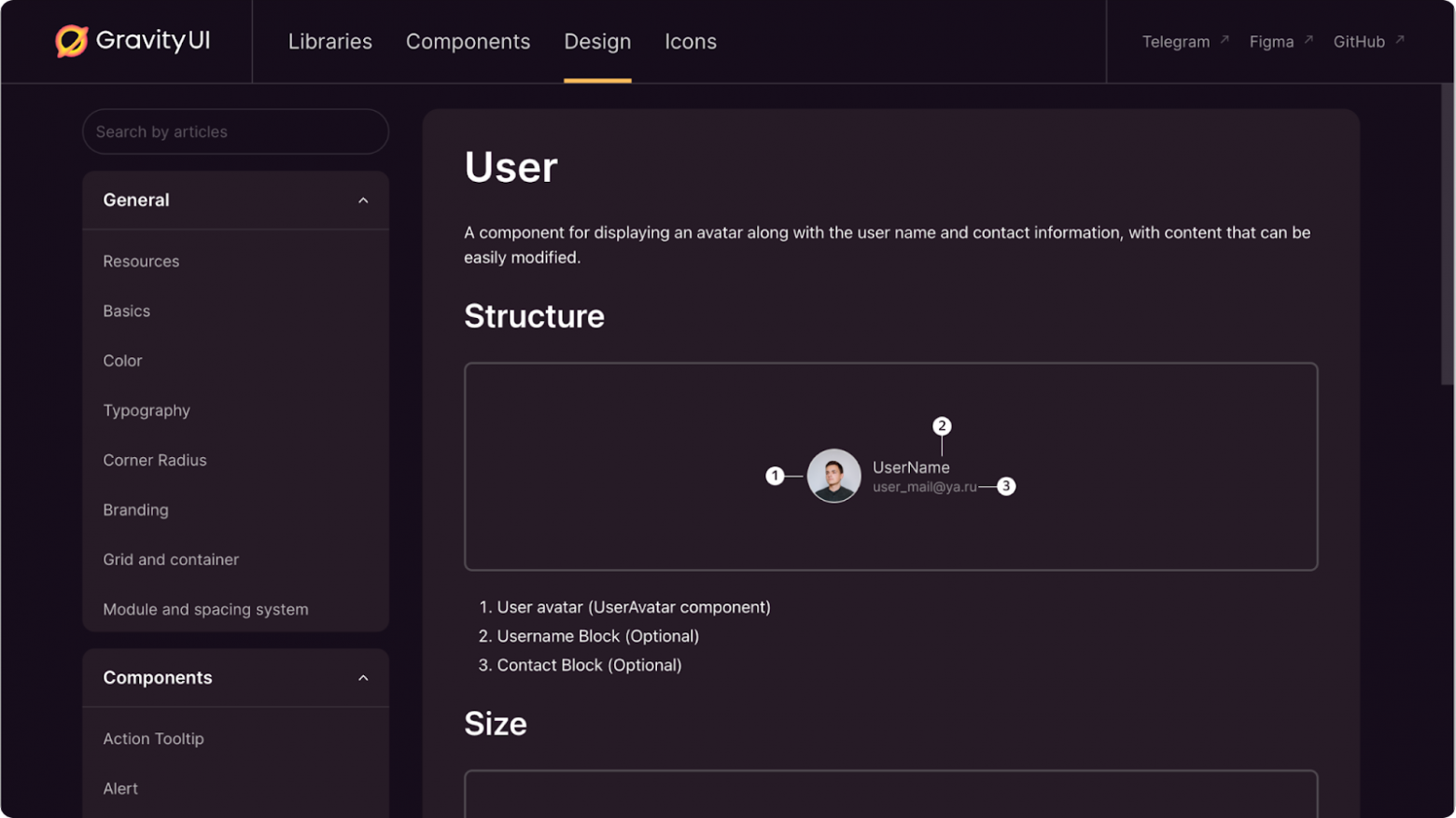
How to use Gravity UI
All you need to do is run the command in the terminal:
git clone git@github.com:gravity-ui/uikit-example-cra.git my-project && cd my-project
npm i
npm run start
More detailed instructions are available on the repository’s main page on GitHub.
You can browse all Gravity UI components in UIkit, and connect the library you need for your use case in Libraries.
To sum it up, I’d like to emphasize once again: Gravity UI is a design system that grew out of the real experience of our users, developers’ needs, and designers’ expertise. This makes it practical and effective. And now anyone can use it for free.
We strive to make the project even better by taking into account our users’ needs and feedback. Visit us on GitHub, submit PRs, leave comments in Figma, and share examples of how you use it.
