Navigation
@gravity-ui/navigation · 


Aside Header Navigation · Preview →
Install
npm install @gravity-ui/navigation
Ensure that peer dependencies are installed in your project
npm install --dev @gravity-ui/uikit@^7.2.0 @gravity-ui/icons@^2.2.0 @bem-react/classname@^1.6.0 react@^19.0.0 react-dom@^19.0.0
Usage
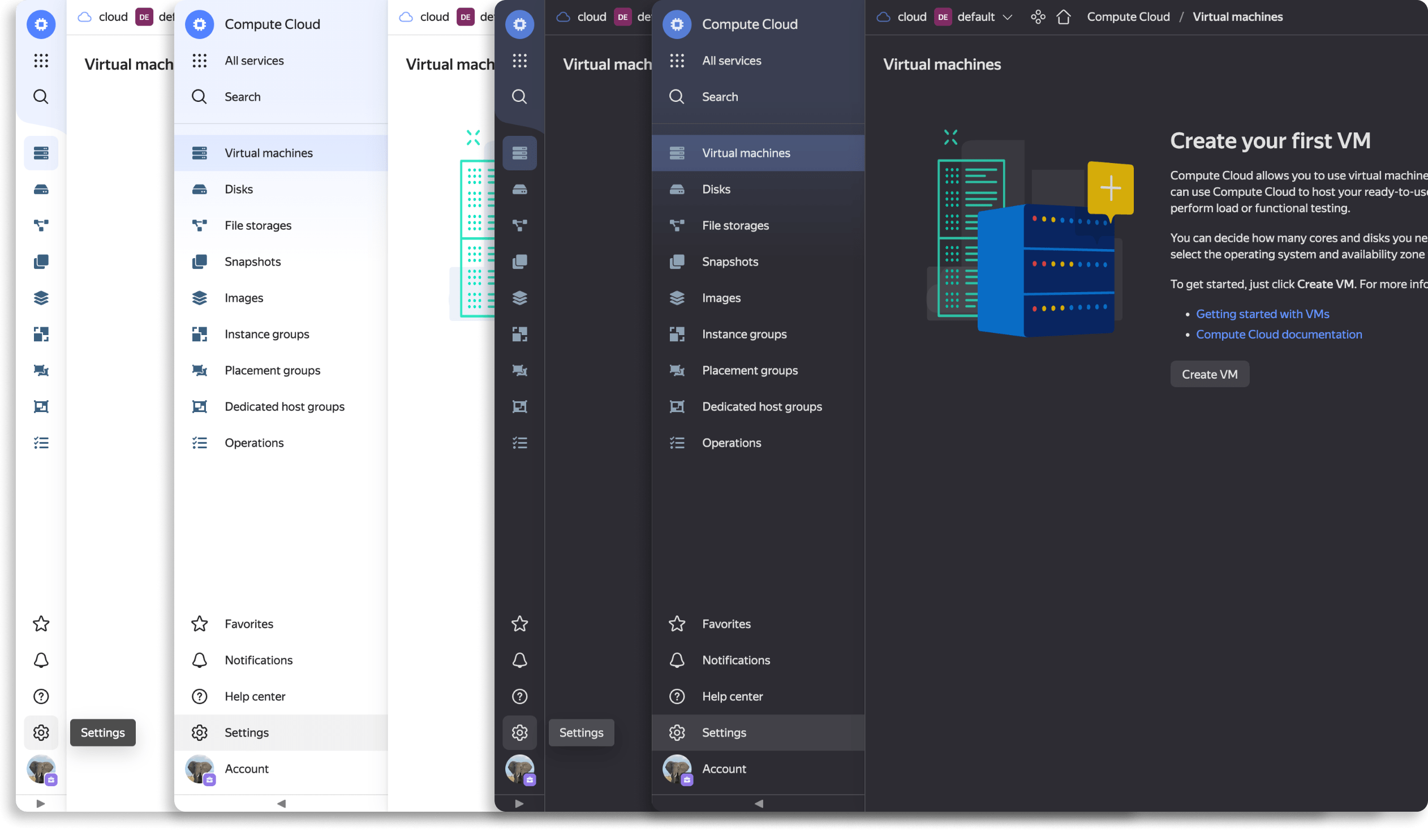
Render AsideHeader as the app shell. It is a controlled component — you own the collapsed state via compact/onChangeCompact — and your page content goes through renderContent. Set up @gravity-ui/uikit styles and ThemeProvider first (see the uikit styles guide).
import React from 'react';
import {AsideHeader} from '@gravity-ui/navigation';
import {Gear, House} from '@gravity-ui/icons';
import {ThemeProvider} from '@gravity-ui/uikit';

import '@gravity-ui/uikit/styles/styles.css';

export function App() {
  const [compact, setCompact] = React.useState(false);

  return (
    <ThemeProvider theme="light">
      <AsideHeader
        logo={{text: 'My App', href: '/'}}
        compact={compact}
        onChangeCompact={setCompact}
        menuItems={[
          {id: 'home', title: 'Home', icon: House, current: true},
          {id: 'settings', title: 'Settings', icon: Gear},
        ]}
        renderContent={() => <main>Page content</main>}
      />
    </ThemeProvider>
  );
}
Sandboxes
Basic https://codesandbox.io/p/devbox/navigation-demo-simple-x9k5sd
Advanced https://codesandbox.io/p/devbox/recursing-dawn-6kc9vh
Roadmap 2025
- Support SSR
- Add more docs, examples to Gravity UI
- Support Navigation at UIKit themer
- Unify subheaderItem, menuItem, footerItem API
Components
- AsideHeader
- AllPagesPanel
- PageLayout
- PageLayoutAside
- AsideFallback
- FooterItem
- Logo
- Drawer
- DrawerItem
- MobileHeader
- MobileHeaderFooterItem
- MobileLogo
- HotkeysPanel
- Footer
- MobileFooter
- ActionBar
- Settings
CSS API
Used for themization Navigation's components
License
Distributed under the MIT License. See LICENSE for details.
For AI agents
Application-shell navigation components for Gravity UI apps — the collapsible AsideHeader sidebar plus footers, drawers, logo, hotkeys and settings panels that frame a whole page.
When to use
- The app's primary navigation frame:
AsideHeader(collapsible side navigation) withmenuItems, subheader, and footer sections. - Supporting shell UI:
Drawer/DrawerItem,Footer/MobileFooter,MobileHeader,HotkeysPanel,Settings,ActionBar,Logo. - Laying out page content inside the navigation frame via
renderContent/PageLayout.
When not to use
- Generic in-page controls (buttons, tabs, menus, breadcrumbs) — use
@gravity-ui/uikit; this package is the outer app chrome, not general components. - Rendering the page body itself from config — use
@gravity-ui/page-constructor. - Client-side routing — this provides the navigation UI only; wire clicks to your own router.
Common pitfalls
AsideHeaderis controlled. You must own the collapsed state withcompactand update it inonChangeCompact; passingcompactwithout the handler freezes the sidebar.- Menu items are
menuItems, keyed byid. Each item is{id, title, icon, current, onItemClick};icontakes an icon component (e.g. from@gravity-ui/icons), not a string name. - Peer dependencies are required.
@gravity-ui/uikit,@gravity-ui/icons, and@bem-react/classnamemust be installed alongsidereact/react-dom. - Needs uikit setup. Render inside
ThemeProviderand import@gravity-ui/uikit/styles/styles.css, or the shell renders unstyled. - Page content goes through
renderContent. Render your routed content via therenderContentprop /PageLayout, not aschildren.
Documentation for AI agents
Agent-readable documentation for the installed version is located in node_modules/@gravity-ui/navigation/build/docs/INDEX.md.


