Timeline
@gravity-ui/timeline 


Canvas 렌더링을 사용하여 대화형 타임라인 시각화를 구축하기 위한 React 기반 라이브러리입니다.
문서
자세한 내용은 문서를 참조하세요.
미리보기
이벤트와 축이 있는 기본 타임라인:
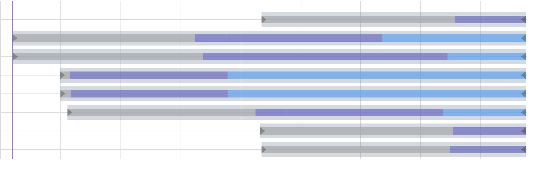
확장 가능한 중첩 이벤트가 있는 사용자 정의 렌더링 (NestedEvents 예시):
기능
- 높은 성능을 위한 Canvas 기반 렌더링
- 확대/축소 및 이동 기능이 있는 대화형 타임라인
- 이벤트, 마커, 섹션, 축 및 그리드 지원
- 시각적 구성 및 시간대 강조 표시를 위한 배경 섹션
- 스마트 마커 그룹화 및 자동 확대/축소 - 그룹화된 마커를 클릭하여 개별 구성 요소로 확대/축소
- 대규모 데이터셋에 대한 성능 향상을 위한 가상화 렌더링 (타임라인 콘텐츠가 뷰포트를 초과할 때만 활성화)
- 사용자 정의 가능한 모양 및 동작
- 전체 타입 정의를 갖춘 TypeScript 지원
- 사용자 정의 훅을 사용한 React 통합
설치
npm install @gravity-ui/timeline
사용법
타임라인 컴포넌트는 다음과 같은 기본 설정으로 React 애플리케이션에서 사용할 수 있습니다.
import { TimelineCanvas, useTimeline } from '@gravity-ui/timeline/react';

const MyTimelineComponent = () => {
  const { timeline, api, start, stop } = useTimeline({
    settings: {
      start: Date.now(),
      end: Date.now() + 3600000, // 지금으로부터 1시간 후
      axes: [],
      events: [],
      markers: [],
      sections: []
    },
    viewConfiguration: {
      // 선택 사항인 보기 구성
    }
  });

  // timeline - Timeline 인스턴스
  // api - CanvasApi 인스턴스 (timeline.api와 동일)
  // start - 캔버스로 타임라인 초기화 함수
  // stop - 타임라인 삭제 함수

  return (
    <div style={{ width: '100%', height: '100%' }}>
      <TimelineCanvas timeline={timeline} />
    </div>
  );
};
축 구조
각 축은 다음 구조를 가집니다.
type TimelineAxis = {
  id: string;          // 고유한 축 식별자
  tracksCount: number; // 축의 트랙 수
  top: number;         // 수직 위치 (px)
  height: number;      // 트랙당 높이 (px)
};
섹션 구조
각 섹션에는 다음 구조가 필요합니다.
type TimelineSection = {
  id: string;               // 고유한 섹션 식별자
  from: number;             // 시작 타임스탬프
  to?: number;              // 선택 사항인 종료 타임스탬프 (기본값은 타임라인 종료)
  color: string;            // 섹션의 배경색
  hoverColor?: string;      // 섹션에 마우스를 올렸을 때의 선택적 색상
  renderer?: AbstractSectionRenderer; // 선택 사항인 사용자 정의 렌더러 (패키지에서 내보냄)
};
섹션은 시간대에 배경색을 제공하고 타임라인 콘텐츠를 시각적으로 구성하는 데 도움이 됩니다.
const MyTimelineComponent = () => {
  const { timeline } = useTimeline({
    settings: {
      start: Date.now(),
      end: Date.now() + 3600000,
      axes: [],
      events: [],
      markers: [],
      sections: [
        {
          id: 'morning',
          from: Date.now(),
          to: Date.now() + 1800000, // 30분
          color: 'rgba(255, 235, 59, 0.3)', // 반투명 노란색
          hoverColor: 'rgba(255, 235, 59, 0.4)'
        },
        {
          id: 'afternoon',
          from: Date.now() + 1800000,
          // 'to'가 지정되지 않음 - 타임라인 끝까지 확장
          color: 'rgba(76, 175, 80, 0.2)', // 반투명 녹색
          hoverColor: 'rgba(76, 175, 80, 0.3)'
        }
      ]
    },
    viewConfiguration: {
      sections: {
        hitboxPadding: 2 // 마우스 감지 패딩
      }
    }
  });

  return <TimelineCanvas timeline={timeline} />;
};
마커 구조
각 마커에는 다음 구조가 필요합니다.
type TimelineMarker = {
  time: number;           // 마커 위치의 타임스탬프
  color: string;          // 마커 선의 색상
  activeColor: string;    // 마커가 선택되었을 때의 색상 (필수)
  hoverColor: string;     // 마커에 마우스를 올렸을 때의 색상 (필수)
  lineWidth?: number;     // 마커 선의 선택적 너비
  label?: string;         // 선택적 레이블 텍스트
  labelColor?: string;    // 선택적 레이블 색상
  renderer?: AbstractMarkerRenderer; // 선택 사항인 사용자 정의 렌더러
  nonSelectable?: boolean;// 마커를 선택할 수 있는지 여부
  group?: boolean;        // 마커가 그룹을 나타내는지 여부
};
마커 그룹화 및 확대/축소
타임라인은 서로 가까이 있는 마커를 자동으로 그룹화하고 확대/축소 기능을 제공합니다.
const MyTimelineComponent = () => {
  const { timeline } = useTimeline({
    settings: {
      start: Date.now(),
      end: Date.now() + 3600000,
      axes: [],
      events: [],
      markers: [
        // 이 마커들은 함께 그룹화됩니다.
        { time: Date.now(), color: '#ff0000', activeColor: '#ff5252', hoverColor: '#ff1744', label: '이벤트 1' },
        { time: Date.now() + 1000, color: '#ff0000', activeColor: '#ff5252', hoverColor: '#ff1744', label: '이벤트 2' },
        { time: Date.now() + 2000, color: '#ff0000', activeColor: '#ff5252', hoverColor: '#ff1744', label: '이벤트 3' },
      ]
    },
    viewConfiguration: {
      markers: {
        collapseMinDistance: 8,        // 8픽셀 이내의 마커 그룹화
        groupZoomEnabled: true,        // 그룹 클릭 시 확대/축소 활성화
        groupZoomPadding: 0.3,        // 그룹 주변 30% 패딩
        groupZoomMaxFactor: 0.3,      // 최대 확대/축소 비율
      }
    }
  });

  // 그룹 확대/축소 이벤트 수신
  useTimelineEvent(timeline, 'on-group-marker-click', (data) => {
    console.log('그룹 확대/축소됨:', data);
  });

  return <TimelineCanvas timeline={timeline} />;
};
작동 방식
타임라인 컴포넌트는 React를 사용하여 구축되었으며, 인터랙티브한 타임라인 시각화를 유연하게 생성할 수 있는 방법을 제공합니다. 작동 방식은 다음과 같습니다.
컴포넌트 아키텍처
타임라인은 두 가지 주요 객체를 통해 구성할 수 있는 React 컴포넌트로 구현됩니다.
-
TimelineSettings: 핵심 타임라인 동작 및 모양을 제어합니다.
start: 타임라인 시작 시간end: 타임라인 종료 시간axes: 축 구성 배열 (아래 구조 참조)events: 이벤트 구성 배열markers: 마커 구성 배열sections: 섹션 구성 배열
-
ViewConfiguration: 시각적 표현 및 상호 작용 설정을 관리합니다.
- 모양, 확대/축소 수준 및 상호 작용 동작을 제어합니다.
- 사용자 정의하거나 기본값을 사용할 수 있습니다.
이벤트 처리
타임라인 컴포넌트는 여러 가지 인터랙티브 이벤트를 지원합니다.
on-click: 타임라인 클릭 시 트리거됩니다.on-context-click: 마우스 오른쪽 클릭/컨텍스트 메뉴 시 트리거됩니다.on-select-change: 선택 항목이 변경될 때 발생합니다.on-hover: 타임라인 요소 위로 마우스를 올렸을 때 트리거됩니다.on-leave: 마우스가 타임라인 요소를 벗어날 때 발생합니다.
이벤트 처리 예시:
import { useTimelineEvent } from '@gravity-ui/timeline/react';

const MyTimelineComponent = () => {
  const { timeline } = useTimeline({ /* ... */ });

  useTimelineEvent(timeline, 'on-click', (data) => {
    console.log('타임라인 클릭됨:', data);
  });

  useTimelineEvent(timeline, 'on-select-change', (data) => {
    console.log('선택 항목 변경됨:', data);
  });

  return <TimelineCanvas timeline={timeline} />;
};
React 통합
컴포넌트는 타임라인 관리를 위해 사용자 정의 훅을 사용합니다.
-
useTimeline: 타임라인 인스턴스 및 해당 수명 주기를 관리합니다.- 타임라인을 생성하고 초기화합니다.
- 컴포넌트 언마운트 시 정리 작업을 처리합니다.
- 타임라인 인스턴스에 대한 액세스를 제공합니다.
-
useTimelineEvent: 이벤트 구독 및 정리를 처리합니다.- 이벤트 리스너 수명 주기를 관리합니다.
- 언마운트 시 리스너를 자동으로 정리합니다.
컴포넌트는 언마운트 시 타임라인 인스턴스의 정리 및 파괴를 자동으로 처리합니다.
이벤트 구조
타임라인의 이벤트는 이 구조를 따릅니다.
type TimelineEvent = {
  id: string;             // 고유 식별자
  from: number;           // 시작 타임스탬프
  to?: number;            // 종료 타임스탬프 (포인트 이벤트의 경우 선택 사항)
  axisId: string;         // 이 이벤트가 속한 축의 ID
  trackIndex: number;     // 축 트랙에서의 인덱스
  renderer?: AbstractEventRenderer; // 선택 사항인 사용자 정의 렌더러
  color?: string;         // 선택 사항인 이벤트 색상
  selectedColor?: string; // 선택 사항인 선택 상태 색상
};
직접 TypeScript 사용
Timeline 클래스는 React 없이 TypeScript에서 직접 사용할 수 있습니다. 이는 다른 프레임워크 또는 일반 JavaScript 애플리케이션과 통합하는 데 유용합니다.
import { Timeline } from '@gravity-ui/timeline';

const timestamp = Date.now();

// 타임라인 인스턴스 생성
const timeline = new Timeline({
  settings: {
    start: timestamp,
    end: timestamp + 3600000, // 지금으로부터 1시간 후
    axes: [
      {
        id: 'main',
        tracksCount: 3,
        top: 0,
        height: 100
      }
    ],
    events: [
      {
        id: 'event1',
        from: timestamp + 1800000, // 지금으로부터 30분 후
        to: timestamp + 2400000,   // 지금으로부터 40분 후
        label: '샘플 이벤트',
        axisId: 'main'
      }
    ],
    markers: [
      {
        id: 'marker1',
        time: timestamp + 1200000, // 지금으로부터 20분 후
        label: '중요한 지점',
        color: '#ff0000',
        activeColor: '#ff5252',
        hoverColor: '#ff1744'
      }
    ],
    sections: [
      {
        id: 'section1',
        from: timestamp,
        to: timestamp + 1800000, // 처음 30분
        color: 'rgba(33, 150, 243, 0.2)', // 연한 파란색 배경
        hoverColor: 'rgba(33, 150, 243, 0.3)'
      }
    ]
  },
  viewConfiguration: {
    // 선택 사항: 보기 설정 사용자 정의
    zoomLevels: [1, 2, 4, 8, 16],
    hideRuler: false,
    showGrid: true
  }
});

// 캔버스 요소로 초기화
const canvas = document.querySelector('canvas');
if (canvas instanceof HTMLCanvasElement) {
  timeline.init(canvas);
}

// 이벤트 리스너 추가
timeline.on('on-click', (detail) => {
  console.log('타임라인 클릭됨:', detail);
});

timeline.on('on-select-change', (detail) => {
  console.log('선택 항목 변경됨:', detail);
});

// 완료 시 정리
timeline.destroy();
Timeline 클래스는 타임라인을 관리하기 위한 풍부한 API를 제공합니다.
- 이벤트 관리:
// 이벤트 리스너 추가
timeline.on('eventClick', (detail) => {
  console.log('이벤트 클릭됨:', detail);
});
```markdown
# @gravity-ui/timeline

A flexible and powerful timeline component for React.

## Installation

```bash
npm install @gravity-ui/timeline
# or
yarn add @gravity-ui/timeline
Usage
import { Timeline } from '@gravity-ui/timeline';

function App() {
  return (
    <Timeline
      events={[
        {
          id: 'event1',
          from: new Date('2023-10-26T10:00:00Z'),
          to: new Date('2023-10-26T12:00:00Z'),
          label: 'Meeting',
          axisId: 'main',
          trackIndex: 0,
        },
        // ... more events
      ]}
      axes={[
        {
          id: 'main',
          tracksCount: 2,
          top: 0,
          height: 80,
        },
        // ... more axes
      ]}
      // ... other props
    />
  );
}
API
Props
| Prop Name | Type | Default | Description |
|---|---|---|---|
events | Array<Event> | [] | An array of timeline events. |
axes | Array<Axis> | [] | An array of timeline axes. |
markers | Array<Marker> | [] | An array of timeline markers. |
sections | Array<Section> | [] | An array of timeline sections. |
viewConfiguration | ViewConfiguration | {} | Configuration for the timeline view. |
onEventClick | (event: Event) => void | undefined | Callback function when an event is clicked. |
onEventHover | (event: Event) => void | undefined | Callback function when an event is hovered. |
onEventOut | (event: Event) => void | undefined | Callback function when an event hover ends. |
onMarkerClick | (marker: Marker) => void | undefined | Callback function when a marker is clicked. |
onMarkerHover | (marker: Marker) => void | undefined | Callback function when a marker is hovered. |
onMarkerOut | (marker: Marker) => void | undefined | Callback function when a marker hover ends. |
onSectionClick | (section: Section) => void | undefined | Callback function when a section is clicked. |
onSectionHover | (section: Section) => void | undefined | Callback function when a section is hovered. |
onSectionOut | (section: Section) => void | undefined | Callback function when a section hover ends. |
onRangeChange | (range: { from: Date, to: Date }) => void | undefined | Callback function when the visible time range changes. |
onZoom | (zoom: number) => void | undefined | Callback function when the timeline is zoomed. |
onScroll | (scroll: { x: number, y: number }) => void | undefined | Callback function when the timeline is scrolled. |
onReady | (api: TimelineApi) => void | undefined | Callback function when the timeline is ready and the API is available. |
Types
interface Event {
  id: string;
  from: Date;
  to: Date;
  label: string;
  axisId: string;
  trackIndex: number;
  color?: string;
  hoverColor?: string;
  activeColor?: string;
  // ... other properties
}

interface Axis {
  id: string;
  tracksCount: number;
  top: number;
  height: number;
  // ... other properties
}

interface Marker {
  id: string;
  time: Date;
  label: string;
  color?: string;
  hoverColor?: string;
  activeColor?: string;
  // ... other properties
}

interface Section {
  id: string;
  from: Date;
  to: Date;
  color?: string;
  hoverColor?: string;
  // ... other properties
}

interface ViewConfiguration {
  hideRuler?: boolean;
  // ... other view configurations
}

interface TimelineApi {
  setEvents: (events: Event[]) => void;
  setAxes: (axes: Axis[]) => void;
  setMarkers: (markers: Marker[]) => void;
  setSections: (sections: Section[]) => void;
  setViewConfiguration: (config: ViewConfiguration) => void;
  // ... other API methods
}
Methods
The Timeline component exposes an API through the onReady prop.
// Get the timeline API
const timelineApi = useRef<TimelineApi | null>(null);

const handleReady = (api: TimelineApi) => {
  timelineApi.current = api;
};

// ... in your component
<Timeline onReady={handleReady} />

// Example usage of the API
if (timelineApi.current) {
  // Add a new event
  timelineApi.current.setEvents([
    {
      id: 'newEvent',
      from: new Date(),
      to: new Date(Date.now() + 3600000),
      label: 'New Event',
      axisId: 'main',
      trackIndex: 0,
    },
  ]);
}
Event Handling
You can listen to various events emitted by the timeline component.
// Remove event listener
const handler = (detail) => console.log(detail);
timeline.on('eventClick', handler);
timeline.off('eventClick', handler);

// Emit custom events
timeline.emit('customEvent', { data: 'custom data' });
- Timeline Control:
// Update timeline data
timeline.api.setEvents([
  {
    id: 'newEvent',
    from: Date.now(),
    to: Date.now() + 3600000,
    label: 'New Event',
    axisId: 'main',
    trackIndex: 0
  }
]);

// Update axes
timeline.api.setAxes([
  {
    id: 'newAxis',
    tracksCount: 2,
    top: 0,
    height: 80
  }
]);

// Update markers
timeline.api.setMarkers([
  {
    id: 'newMarker',
    time: Date.now(),
    label: 'New Marker',
    color: '#00ff00',
    activeColor: '#4caf50',
    hoverColor: '#2e7d32'
  }
]);

// Update sections
timeline.api.setSections([
  {
    id: 'newSection',
    from: Date.now(),
    to: Date.now() + 1800000,
    color: 'rgba(255, 193, 7, 0.2)', // Light amber background
    hoverColor: 'rgba(255, 193, 7, 0.3)'
  }
]);

// Update view configuration (merges with current config)
timeline.api.setViewConfiguration({ hideRuler: true });
Live Examples
Explore interactive examples in our Storybook:
- Basic Timeline - Simple timeline with events and axes
- Endless Timeline - Endless timeline with events and axes
- Markers - Timeline with vertical markers and labels
- Custom Events - Timeline with custom event rendering
- Integrations - RangeDateSelection, DragHandler, NestedEvents, Popup, List
Development
Storybook
This project includes Storybook for component development and documentation.
To run Storybook:
npm run storybook
This will start the Storybook development server on port 6006. You can access it at http://localhost:6006.
To build a static version of Storybook for deployment:
npm run build-storybook
License
MIT